Showing posts with label licensing. Show all posts

Tuesday, May 9, 2023

Happy Birthday Mr Padre - 2023 edition

It has been a long few months since I last posted, way back in September 2022. But as it's Tony's birthday (and this blog's anniversary), I thought it would be nice to add a new post. 

My collecting has slowed down somewhat. I tend to collect in fits and starts - I get really into things and then my enthusiasm wavers. To be honest, the longevity of this blog project has surprised me. Circumstances have changed quite a lot since I started Point 394 a couple of months into the pandemic lockdown. I have changed jobs and am about to change jobs again. The world has reopened up and I have been going to a lot of soccer matches. Generally, things have just been busy.

I have acquired one "new" card so far in 2023. It's 30 years old this year so it's new to me but not newly printed!

Card Number 1045: Kraft Singles Superstars '93; #23


I'm not sure which one of these counts as the front! Pulling the little tab would make Tony pop out and stand up, but that would ruin the card. In other design notes, I  like the way the card includes a batting and a fielding pose. This also fits into a collection subset of 'green cards'.

This came in a set of the Kraft Singles cards within a much bigger box of 'junk wax' that someone was offering on the UK Facebook Group for postage only. There were several other cards of Tony in the box that have gone in with the other doubles.

I presume these cards were included in packets of cheese. From an historical point of view this was about the era when the companies producing oddball cards started airbrushing out team logos but still used the team names on 'unlicensed' cards.

Even though I have not been buying many cards lately, I have got a little stack to blog so hope to get back into the blogging groove soon. 

(I'd like to say thanks to Richard (YoRicha) who noticed I hadn't been blogging and got in touch to ask if everything was OK a few months back. Thanks Richard, it meant a lot to me.)

Total: 1,045 cards


Monday, November 8, 2021

Modern Monday - shiny Donruss

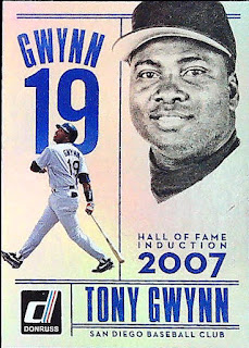
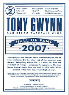
Card number 837: DonRuss "Tony Gwynn Tribute", 2015; #2

I've already blogged about four fifths of this shiny little insert set. The fifth and final shiny card is about Tony's induction in the Hall of Fame.


This is the first of these cards that I have scanned using the overhead scanner, which properly captures it's sheer shininess!


If you've ever watched the video of Tony getting the call to say he was in the Hall of Fame, you can see how much it meant to him, and how nervous he was. According to He Left His Heart in San Diego, Tony thought he might not have done enough in his career to get elected. He is quite obviously overcome by emotion when he actually takes the call.

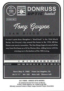
Card Number 838: DonRuss Optic, 2017; #164

'Optic' is the Panini-era DonRuss version of Chrome. Although this comes as a standalone set, it's basically the same cards as the regular DonRuss set with a shiny coating. 


There is also an Optic logo on the front and a different card number on the back. They chose an interesting vignette from Tony's career for the factoid. 


Tony had a good season in 1994. In addition to his post-war record batting average, he also nabbed the winning run in the All-Star Game. It was the first time the National League won the game after six defeats on a row. You can watch Tony's game-winning slide on YouTube - it starts at 4 minutes, 52 seconds on this video!

Panini get a bit of stick for their unlicensed baseball cards issued under various 'zombie brands', but their cards are a decent level of quality and their attention to detail in terms of factoids is very good as well. It's nice to read about something a bit different on a cardback!

Total: 838 cards

Wednesday, October 6, 2021

Toppeechee cards from the 80s

I was surprised when I first researched O-Pee-Chee cards that the name came from an Ojibwa word meaning 'robin' . The Ojibwe are Canada's second largest First Nations tribal people and a large number live in the USA as well. In Canada they tend to live in a large area that stretches from Quebec to British Columbia. 

In my ignorance, I just assumed it was a way of phonetically spelling 'Oh, peachy!' But, no, it has a much deeper meaning, and in terms of languages on baseball cards, it has to count as another one along with English, French, Spanish and Chinese characters. Technically, the Ojibwe people speak one of the Algonquian languages, but for the purpose of this blog, I'm just going to count it as Ojibwe. 

For most of the 1980s, O-Pee-Chee had a licence to reprint Topps cards. They often released smaller sets, added their logo on the front and changed the cardbacks so they had information in English and French. The cards were sold in Canada but seem to have travelled reasonable quickly to collectors in the USA.

I've blogged a few of these "Toppeechee" cards before - here is Tony's rookie card, and also his card from the 1986 set. Richard included a few more in his recent parcel, which I mentioned in the box opening video, and here I am, blogging about them today.

Card Number 762: O-Pee-Chee, 1985; #383


As I noted when I blogged about the Topps release of this card, Tony has a visible wad of chewing tobacco in his cheek. Tony started 'dipping' when he was in the minor leagues at Walla-Walla, and was never able to shake the habit although he apparently tried several times. This card foreshadows his early death from oral cancer. 

In terms of being bilingual, most stuff on the back is translated. However, this would not pass the requirements for translation in my workplace where everything has to be fully bilingual.


Card Number 763: O-Pee-Chee, 1987; #198

This is my favourite ever Topps set (for sentimental reasons!) and the Topps version of this card was the very first card on this blog.


Even though this is my favourite card set, this is one of the worst photos of Tony ever used by Topps on a card. And that is a very low bar to clear!

The back is very crisply printed. The 'On this Date' factoid is also in French as 'Une Date Memorable'.


Card Number 764: O-Pee-Chee, 1988; #360


There is something about the way Tony's stance perfectly frames whoever that person is sat in the dug out that makes me chuckle every time I see it. Tony's pinstripes look absolutely pristine in this photo as well.

The little baseballs in the background make the top of the cardback a bit hard to read, but it's a nice design. 


I am pretty sure I have pointed out Topps's obsession with recycling factoids about Tony's minor league achievements on their cardbacks. On this card they don't mention that Tony was batting champion the previous season, with an outstanding .370 batting average - the highest so far in his career. Instead, we learn about how Tony won the MVP in the Northwest League in 1981, in both English and French.

From 1989 O-Pee-Chee started releasing the full Topps sets complete with the Topps logo on the front and bilingual cardbacks. They did that for three years, then started releasing their own flagship sets. In 1994 they released their last set of Major League Baseball cards. Since then the brand has been through a few different owners and now is licensed out to other companies for use when releasing trading cards. 

Total: 764 cards


Friday, September 17, 2021

Eat cake by the ocean

Well, that's what the Padres hoped to be doing this year. It feels less and less likely to happen.

But talking of the ocean, here's a couple of Pacific cards from the last year the Padres got to the World Series.

Card Number 732: Pacific Crown Collection, 1998; #427


Somehow this card design manages to look both fancy and still very clean. The logo and player name are in gold foil. 

Pacific's USP was targeting Spanish-speaking collectors. They also included the English translation on the back. That didn't leave much room for any stats. Somehow they managed to fit everything in, including Tony posing with one of his bats. 


The orange background locates this firmly in the late 1990s. As ever, Pacific get a bonus point for putting the detail of the set name in the little circle with the card number. It's a great help to collectors like me over two decades later!

Card Number 733: Pacific Aurora, 1998; #191

Such a green card!


The 1990s was the decade when PhotoShop became a thing and this card design is almost Photoshopped to death. I appreciate the halo around Tony's head in the top right image. 

Also, you may have noticed this just says San Diego on the front. It repeats that on the back. The Aurora range was only licensed by the Player's Association so they didn't include franchise names. I presume Pacific had a license from MLB to print a limited number of sets, or perhaps there was a stipulation in their contract that they could only produce Spanish language sets - and this is just in English. 


There is a trivia question on the back about how many seasons Tony recorded more than 200 hits. To save readers from craning their necks, here's the answer.


Tony didn't record a 200-hit season after 1997 so that answer (5) is still the correct answer. 

The photo on the back is quite similar to the one on the back of the Topps Stars card I blogged about yesterday. Serious cardback photos must have been the fashion in 1998!

Total: 733 cards


Tuesday, July 6, 2021

Karefully Kut Kraft (Kard #700)

In terms of milestone cards on this blog, this is probably the kookiest.

Card Number 700: Kraft Home Plate Heroes, 1987; #44

This card was originally part of food packaging - most likely a famous Mac'n'Cheese packet. The original Kraft Dinner, as serenaded by Barenaked Ladies in their song, If I Had a Million Dollars. Back in 1987, someone very carefully cut along the dotted lines and voila, created a baseball card!


This card image was licensed from the Player's Association rather than Major League Baseball, through Michael Schechter Associates, who specialised in this sort of promotional material. The lack of a Major League Baseball licence explains why Tony's hat is heavily airbrushed. 

The cardback is... well, it would have been the inside of the box.


I think that scan might be upside down. How coud you tell?

Kraft printed two players on each box, but mixed and matched them a bit, so pairings exist of Tony with a few other players, including George Brett from the Royals and Jim Rice from the Red Sox. I'm sure someone is trying to collect all the different pairings of all the cards. There are 122 listed on Trading Card Database. 

So, although you would know which players you were getting when you picked up the box, it wouldn't be as easy as just looking for two players you didn't already have. You might end up having to buy a dupe of one player to get the other one you didn't already have. That was a bit of marketing kunning from Kraft, there.

As you have probably guessed, I am a fan of oddball cards like these. In one way they recapture the essential essence of trading cards - even down to being part of the packaging that would usually get thrown away. (The first cigarette cards were printed on the cardboard stiffeners inserted to prevent the packets from getting crushed. How many ended up in the bin?) Great care has been taken to preserve something that is quite literally garbage. One person's trash is another's treasure... quite literally. 

For comparison purposes here are the other milestone cards on my blog.

#100 - DonRuss "Tony Gwynn Tribute", 2015; #4 (June 2020)

#200 - Topps, 2000; #468 (July 2020)

#300 - Pinnacle. 1996; #336 (August 2020)

#394 (my blogging target) - Topps, 1985 All Star Card; #717 (October 2020)

#400 - Pacific Invincible Seismic Force (running photo variant), 1999; #16 (October 2020)

#500 - Topps Rookie of the Week, 2006; #22 (November 2020)

#600 - Topps Power Boosters, 1996; #1 (February 2021)

Total: 700 cards

Wednesday, June 16, 2021

Cereal freebies: Part 1

These"oddball" cards by Post arrived in the post from Gawain last week. 

Post is a massive cereal company - currently the third largest in the world. C.W. Post who founded the company spent time at the sanatorium run by John Harvey Kellogg and was inspired to develop his own breakfast cereal. The first cereal sold by Post was Grape Nuts, one of the few America brands readily available in the UK. I always think it's the most misleading brekfast cereal, as it contains neither grapes nor nuts, and is more like eating shards of concrete rather than food. Still, to each their own. 

For several years in the early 90s, the Post company included baseball cards as giveaways in their cereal. (They'd actually first done this in the early 1960s as well.) I've previously blogged cards of Tony that Post produced in 1990(#413) and in 1991(#46).

Card Number 688: Post Cereal, 1992; #26


These cards were licensed by the Major League Baseball Player's Association (MLBPA) rather than Major League Baseball, so the logos and team names have been rather skillfully erased from the photos of Tony. These cards were printed by Michael Schechter Associates (MSA) who arranged print runs of promotional baseball cards for a lot of companies back in the 1980s and 90s.

The back is a fairly solid design, with a photo of Tony and a decent stats box.


Major League Baseball was less protective of franchise names in the early 90s so even though the Padres name and logo have been removed from the photos, the word 'Padres' appears on the front and back of the card. 

Card Number 689: Post Cereal, 1993; #8
Wonky scan! Sorry.


A bunt photo! 

Tony was quite happy to bunt when necessary. He devotes a section in his book Tony Gwynn's Total Baseball Player to "The Art of Bunting". Tony felt it gave opponents something else to worry about, causing the infield to shift and opening up holes a batter could punch a ball through. Tony went on to list the five type of bunt - can you name all five? Answers at the bottom of the post!

This is a nice looking card, with a black border similar to the Pinnacle cards issued in the same year. The back has dispensed with the big stats box and has added a little write-up, which mentions his option to play in the NBA with the Clippers.


Somehow in this joblot of oddball cards I managed a complete run of the three Post Cereal cards that I didn't have already.

Card Number 690: Post Cereals, 1994; #13
Another slightly wonky scan. My bad!


This design looks like the love-child of a DonRuss card and a Fleer Ultra card. It is very green. The designer has also gone for a fancier logo for the set - this is part of the "Post 94 Collection".

The back really emphasises the write up at the expense of the stats. There's some slightly confusing syntax in the first sentence, though. The Padres were playing the Rockies when Tony recorded his 2000th career hit, but it wasn't his 2000th career hit against the Rockies. (Who were in their debut season in the Major Leagues!)


For two years in a row the cardback write-up predicted Tony's eventual election to the Hall of Fame. 

Come back tomorrow for Cereal freebies: Part 2!

Total:690 cards


Answer: According to Tony, the five types of bunt were: The Sacrifice; The Drag; The Push; The Slug; and The Swinging Bunt. - Tony Gwynn's Total Baseball Player pp 49-53.

Monday, May 17, 2021

Modern Monday - The Art of Hitting

I mentioned yesterday how two fellow collectors contacted me on the same day last week to ask if I wanted a Tony Gwynn card they had available. Russell was a bit hesitant in his offer because the card in question was unlicensed. However, that isn't an issue for me, and when an unlicensed card looks as good as this one, who cares about logos?

Card Number 676: Panini Diamond Kings Art of Hitting insert, 2021; #AOH6


There are 10 cards in this insert series. It's especially relevant to Tony who wrote a book called The Art of Hitting. I remember reading a comment that Tony should have called his book the Science of Hitting instead of the Art, because he took a very methodical approach to the game and applied trial and error to everything. However, Ted Williams had already used that title for his book about hitting, which Tony read and re-read multiple times.

Diamond Kings cards are all 'illustrated' in a similar style now and no artist is credited with designs like these. I like the way the image has been replicated on the cards in this insert series, although in this case it does look a little bit like a chorus line. (My wife, Cathy, said "Ooh, he's dancing!" when she saw it.)

The image features on the back as well.


Now I'm known as someone who reads cardbacks and has a passing interest in cardbacks that feature other languages besides English. Have a close look at the copyright notice and it looks like there are some hanzi or kanji letters there.


I would like to know if that is Chinese or Japanese, or neither. I'd be very happy to add that tiny bit of non-English to my list of languages that feature on Tony's baseball cards.

A big thank you to Russell for sending me this card. It takes me up to 6 cards issued in 2021 in my collection.

Total: 676 cards

Friday, April 23, 2021

Set lasers to cut!

 A theme post featuring two cards with holes in.

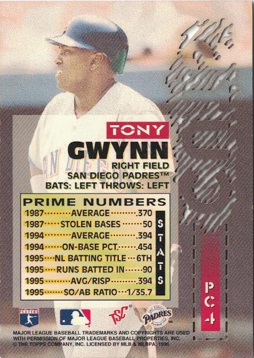
Card Number 650: Topps Stadium Club Prime Cuts, 1996; #PC-4

Topps used the same technology as in their Topps Laser set from the same year for this 8 card insert series in Stadium Club.


The photo shows Tony's brief mid-nineties flirtation with a beard.

The white lines around the solid gold 'CUTS' are all holes through the card.... as you can see from the back view.


Tony is cleanshaven in the photo on the back. I find it slightly amusing that this juxtaposition happens on a card along the theme of 'cuts'.

These cards are 'Prime Cuts' and the stats on the back are 'Prime Numbers', except none of them are actually prime numbers in the proper mathematical sense.

Yet again, the sheer paucity of strike outs in Tony's career is remarkable. I've not seen a strike out to at bat ratio on a cardback before, but card companies should have included it more often. In 1995, Tony struck out once every 35 at bats. If he had 5 at bats in a game that would be one strike out every seven games.

The only confusing stat on the back is the batting title one. They are trying to say that Tony won his sixth National League batting title, but it looks like they are saying he was sixth in the batting tables. However, I'm not going to quibble too much with that, given how good this stats box is overall. 

Card Number 651: Pacific Aurora On Deck Laser Cuts, 1998; #14

A couple of years after the Stadium Club Prime Cuts card, Pacific lasered bits out of these insert sets from their Aurora set.


The card front is a rather glorious mish-mash of photoshop elements and the cut out 'rings' in the centre of the card. There is some gold foil applied as well for good measure.

The back has a big picture of Tony and a tiny write up underneath the lasered out section.


I have grown to love Pacific cards. True, they are gaudy and the designers never seemed to know when to stop adding stuff, but that is part of the charm. Plus they were absolutely brilliant at including the years and set names in those little circles with the card number on. It makes them so easy to identify and for that reason alone, I could forgive any excess in the design.

Aurora cards were one of the sets Pacific produced without a licence initially, which is why it just says San Diego on the card. However, this was before companies with licences got really protective about the official MLB team logos and icons, which is why the logos on Tony's shirt and helmet haven't been airbrushed out of the photo on the front. Those dark days of airbrushed jerseys were coming. 

Total: 651 cards

Friday, April 16, 2021

The last days of DonRuss

DonRuss is now one of several trading card brands owned and run by the Panini corporation. I sometimes refer to it as a "zombie brand" because it feels like it's being kept animated but isn't really alive. 

Panini acquired DonRuss in 2009 when they bought Playoff, the company that had salvaged DonRuss as it headed towards collapse at the turn of the millennium and then issued sets in the first decade of the 21st Century. Today's post features cards from the Playoff era of DonRuss's history.

Card Number 644: DonRuss Champions, 2005; #46

There were actually three Tony Gwynn cards in this set, all with slightly different photos on the front.


The card is designed in such a way that it would be easy to insert a relic or an auto into the space on the right. This was a set with lots of relics and autos, with base cards like this filling the gaps. 

There's a great factoid on the back comparing Tony to Ty Cobb. There is also a very interesting stats box with a line of Tony's career highs and his career totals. I don't remember seeing another stats box like that, so it gives this card something unique. 


The big D in an oval is the DonRuss logo during the Playoff era. It's usually a red oval.

Card Number 645: DonRuss Threads Century Stars, 2008; #CS-6

I have blogged a DonRuss Threads base card before. This is rather a bland insert card from the same set. Tony is sticking his tongue out while running in the photo.


For an insert series called Century Stars, there are very few stars on this card. I would have put on more. The stencil font is an unusual choice. I find stencil fonts remind me of two things from my chldhood in the 1980s - the A-Team logo, and the toys called Action Force, which was the last great toyline to be developed in the UK by the toy company Palitoy (as described in this YouTube video by the very knowledgeable Analog Toys). 

The back says it was only fitting that Tony was inducted to the Hall of Fame with Cal Ripken Jr, but then doesn't say why. I know the similarities between the two, and DonRuss clearly expacted everyone who pulled this card to know them too. 


In 2008 Playoff had lost their Major League Baseball licence, and this card claims it was directly licensed by the player depicted. This form of licensing explains the obvious airbrushing on the front. The SD logo is still intact on Tony's helmet, partially obscured by some reflective glare. Weirdly, it only says San Diego on the left hand side of the cardback, but it mentions the Padres by franchise name in the write up on the right hand side. 

This card was from the last year before DonRuss was acquired by Panini. All subsequent cards released with the DonRuss branding have also been unlicensed so this was a portent of things to come.

Total: 645 cards

Saturday, April 3, 2021

Champions! (My 300th blog post)

I like marking milestones on my blog. This is my 300th blog post since starting on 9th May last year. I thought I'd celebrate by blogging my first card with a picture of Tony as a basketball player.

Card Number 630: Upper Deck Goodwin's Champions, 2013; #101


Most photos I've seen of Tony playing college basketball he is wearing a white jersey. The blue top he's wearing in this photo doesn't seem to say Aztecs on it, so I don't know the provenance of this photo.

However, it's worth recounting that Tony attended university in San Diego on a basketball scholarship and wasn't allowed to play baseball in his first year. He still holds the San Diego State University record for assists. And when he graduated, Tony was drafted by both the Padres and the local NBA franchise, the San Diego Clippers (now the Los Angeles Clippers). Several people who contributed to the book He Left Hs Heart in San Diego opine that Tony preferred basketball as a sport to watch. He regularly watched the Indiana Pacers, as his family often spent a lot of time in Indianapolis in the winter.

None of this is mentioned on the cardback.


In the eight years since this card was printed, Tony has dropped to 20th on the all-time ranking for career hits. He was overtaken by Derek Jeter, who reached number 6 in the rankings before retiring, and Albert Pujols, who needs less than 100 hits this season to climb to 9th in the all time rankings.

One reason why Upper Deck printed this card with a photo of Tony posing with a basketball is because it was a neat way to get around the lack of licensing. A few years previously, Upper Deck reacted to Topps buying sole licensing rights to Major League Baseball by printing cards anyway. They thought they could do that with the rights granted by the Major League Baseball Players Association, but then Topps sued them for using MLB logos and team names.

One of the cards in the middle of this legal tussle would have been from the first Goodwin's Champions set released in 2009.

Card Number 631: Upper Deck Goodwin's Champions, 2009; #135


This retro card set is printed on old-fashioned card stock. This is very noticeable when the card is turned over.


The alignment of factoid and one-line stat box earn this card a bonus point. If a card mentions a particular year, it makes perfect sense to just show that year's stats. 

There are five lines of boilerplate legalese at the bottom of the card and the logos of two licensing organisations - the MLBPA and the Cooperstown Collection, which I think sells rights to retired players who have been inducted into the Hall of Fame. All that wasn't enough to protect Upper Deck from getting sued, however. They haven't released a baseball set since. The later Goodwin's Champion sets have included leading sportsmen and women from a range of sports, with a few baseball players included.

Total: 631 cards


Wednesday, March 31, 2021

Hometown Hero

Panini products generally get very little love from the collecting community, mainly because they don't have an official MLB license, so can't put team logos on their cards. However, as they have consistently shown with their 'zombie' DonRuss and Diamond Kings ranges, Panini can produce some nice cards. 

Hometown Heroes was a set released in 2013. It is a deliberately retro-feel set printed on thick card stock with an unfinished back.

Card Number 625: Panini Hometown Heroes, 2013; #73


The pennant and starry background make this card look very retro. If I had one criticism it would be that I don't see much point having a set logo including the year of the set if the photo then obscures part of it! Maybe the designer wanted to make sure all the bat was on the card.

The back is bright and colourful. I'd query the wording. Tony might have played all 2,440 games for San Diego, but he didn't play them all in San Diego.


In addition to the 300 base cards in the set, there were some insert series as well.

Card Number 626: Panini Hometown Heroes City Hall insert, 2013; #12


I like this a lot. True, Tony seems to have a bit of a snarl on his face, but overall the impact of this is striking. I'd easily have this on the wall as a poster. Bonus point for having the year in the set logo and having it visible.

The back is equally visually bold. The write up basically says the same thing as on the base card but worded slightly differently. 


Given that Panini put the year in the set name, I surmise they were hoping the set would take off and become an annual release. As it happens, this was a 'one and done' set and never reappeared again. The 'Hometown Heroes' brand has featured in some other Panini releases (National Trasures in 2017 and 2018, and in Chronicles in 2019), but not as a set.

I think that is a bit of a shame, although I can understand why this set failed to make an impact when it came out. Panini were still feeling their way into the baseball card market. They had launched Panini Prizm the previous year, which appealed to the magpies who like shiny parallels. They also tried a Pinnacle relaunch in 2013 that was another one and done. They swapped out the Pinnacle brand for DonRuss in 2014, which managed to stick the landing and is now a key range for them. 

As a retro brand, Hometown Heroes was going up against the licensed cards Topps were releasing in their Archives and Heritage ranges and their Allen & Ginter and Gypsy Queen sets, and the unlicensed retro cards in Upper Deck's Goodwin's Champions, so there was a lot of competition for a set like this. However, given the crisp design-work, I wish Panini had persevered with Hometown Heroes because these are two really nice cards that still look good eight years later.

Total: 626 cards

Sunday, December 20, 2020

One Card Only: life without logos

Today's blog post contains opinions. Feel free to tell me I'm wrong in the comments!

Card Number 546: Panini Classics, 2014; #134


Panini have been producing cards without a Major League Baseball license for a number of years now. They have signed contracts with the Major League Baseball Players Association (MLBPA) and with the National Baseball Hall of Fame and Museum, so they have access to photos and player likenesses. But they can't include the franchise name or any franchise logos.

And so we get cards like this. But looking at this objectively, there is nothing particularly bad about this card. You can see Tony's name and number on his shirt and as much of his face as is visible in, say, his Topps base card from 1987 or the main photo in his Topps rookie card from 1983. In terms of visible logos it is about parallel with the Topps Stadium Club card from 2020, which was a fully licensed card.

Panini are operating at a disadvantage, but, honestly, with the exception of the word 'Padres' not being included, this card is absolutely fine. It's nicely designed. The cardback is neatly laid out, and includes a factoid that I didn't remember until I read it. The set year is included on the front (bonus point!), and this is actually one of the few cards issued the year that Tony died.

I have mentioned this a few times when reviewing Panini output - they own the DonRuss stable of brands and now produce the Diamond Kings cards as Panini Diamond Kings - but given what the company achieves without a MLB license, it would be very interesting to see what Panini could do if they had a license that meant they didn't have to airbrush batting helmets and shirt sleeves to remove logos.

Only one card company - Topps - holds a MLB license at the moment. I don't think that is particularly good for the hobby. For one thing it limits innovation. Very few major advances in card production have been introduced into the hobby by Topps, and those that have were introduced in reaction to pressure. In fact I'd go as far as saying that being the sole licensee isn't just bad for the hobby, it's also bad for Topps. They don't need to try as hard, and so, let's be real, they don't.

With the exception of the Topps 2020 product this year, and that product is divisive among collectors, there has been little to show that Topps are the dominant card company. Their flagship set was OK, their archives set wasn't bad, but their other sets like Allen & Ginter and Gypsy Queen are looking tired. Museum, Gallery, Gold Label... they feel like they are treading water. And the decidedly average UK Edition was welcome for being baseball cards released in the UK (hurray!), but has a weaksauce checklist and an England-centric insert set, which I'll be blunt, turned a "United Kingdom" edition into an "England Only" edition. (It's not like Topps don't know Wales exists -  there were two Welsh castles in their Allen & Ginter fortresses subset!)

The Panini Classics card in this post is six years old, and it shows that Panini have known what they are doing for some time now. Despite being at a tremendous disadvantage, they are not as far behind Topps as Topps would like. It may seem counter-intuitive, but maybe the way forward for the Topps company is to relinquish their monopoly on the MLB license and allow other companies to compete on level ground. I think that would help Topps to rediscover the need to innovate and explore new things. There would be risk, but that will keep them sharp. 

It would also be good for the hobby, and what is good for the hobby will also be good for Topps.

In the meantime, if you can bear cards without logos, Panini cards are less expensive to collect, and are often more interesting too. If you collect a player, like I do, then the pictures on the cards are what matter, and they tend to be as good as the pictures that Topps choose anyway. With the archive of DonRuss, Leaf, Score and Pinnacle templates available to them, Panini can match Topps in the nostalgia stakes as well.

And if they produce cards that are as nice in hand as this one, I will be happy to add them to my collection.

Total: 546 cards

Sunday, December 6, 2020

One card only: Price guide in your pocket

I have never seen a copy of Sports Collector's Digest, but Wikipedia reliably informs me that it once had a key role connecting collectors and helping them to buy, sell and trade cards. Like all magazines, the Internet has hit it hard. At it's peak the weekly mag was over 300 pages, but more recent copies have had fewer than 40 pages. It also has its own website with price guides and so on.

But back in the 1990s, SCD also produced their own cards. They weren't licensed (as far as I can tell) and they were produced on rather flimsy card. Billed as 'pocket price guides' they were freebies to promote the magazine.

Card Number 522: Sports Collector's Digest, 1993; #51

The card design is reminiscent of those produced by actual card companies. 


The back is a real mix of biographical data, rookie card prices, and a weird cartoon tied to a factoid. The biographical data has a mistake in it. Long Beach Poly was Tony's high school, not his college.


1993 was at the peak of the first boom of the baseball card collecting hobby and the prices on the card reflect that. Tony's 1983 cards from Donruss and Topps (both of which appear in my second ever blog post) are valued at $25 and $40 respectively. They haven't held their value as I'm pretty sure you could pick them both up for less than that now, 27 years later.

Tony's DonRuss card from 1984 is on my wanted list, but $18 would be well over market value now, and I don't think his Fleer card from 1984 would realise $12. If my cards were mint and still worth these values I would have $77 worth of cards sat in my binders. My cards are in good shape but the values aren't.

This card didn't cost me much either. It was an add-in on a purchase from my main card supplier, Gawain. It feels nicely ironic that it is still changing hands as a freebie bonus.

Total:522 cards


Thursday, November 19, 2020

80s week: Classic debut and Pacific confusion

I own some Classic Baseball cards for other players, but didn't have a Tony Gwynn one until the joblot that prompted me to launch 80s week. So this is a debut for a card company that hasn't featured on the blog yet. 

It's also unusual because it actually comes from a board game. According to Baseballcardpedia, the Classic Baseball trivia game was produced by a company in Alabama called Game Time, and the game was sold in toy shops as well as through card dealers. Later Classic sets were released as supplemental sets for the game.

I have blogged about a number of cards that have a game element to them, but this is the first time I have blogged about a card that has been removed from an actual game.

Card Number 491: Classic Baseball, 1987; #26


The cardback includes some trivia questions to ask while playing the game. There's also a box for the card owner to collect the player's autograph.


Someone somewhere must have an autographed version of this card.

And now on to another 'debut', this time a card released by Pacific... or so I thought.

Card Number 492: Pacific Cards & Comics Big League All Stars, 1989; #19
This card confused me. I initially thought it was an early release from the company that would become Pacific, but the Pacific Company was based in Lynnwood near Seattle, and this card says the publisher was in Los Angeles. 

The Trading Card Database lists Pacific Cards & Comics separately to Pacific, who were also issuing sets around this time. The Pacific Legends sets released the same year have a company logo on them, which is another reason why I think this is a different 'Pacific'. 

(There was a comic publishers called Pacific that operated out of San Diego in the early 1980s that had a chain of stores. I doubt this is linked to that company either as 1989 is a few years after the publishers went bust, but one of the shops might have carried on trading.)

Regardless of who produced them, these cards show what could be done without a license back in the day and they get 19 bonus points for giving Tony the 19th card in their 20 card set.


It's a really nice photo. It would have been even better if the photographer had waited a few seconds for the chap in the blue cap in the background to walk past.

The back is basic, with just a tiny reference to the manufacturer.


One of the eternal mysteries of card collecting is wondering how a joblot of cards got grouped together. How did this end up in with a bunch of Topps, Fleer, and DonRuss cards?

I simply have no information about how many of these cards were produced, or how they were distributed. Until I started researching this blog post I thought I would have been writing about the Pacific Trading Card Company (and there are lots of stories to tell, like how they might have accidentally outed Manny Ramirez for using a corked bat when they cut a bat up for some of their relic cards). Instead, I can show you a card that I am none the wiser about!

Total: 492 cards