Showing posts with label retro cards. Show all posts

Monday, May 9, 2022

Happy birthday Mr Padre (redux)

Two years ago I started this blog on what would have been Tony Gwynn's 60th birthday. My plan then was to collect and blog about 394 different Tony Gwynn baseball cards. Now, two years and over 500 blog posts later, there are over 1,000 different Tony Gwynn cards chronicled on this blog. 

The first card I posted was from the Topps set in 1987. I chose that card because the first baseball cards I ever bought, while on a childhood holiday to America in 1987, were from that set. The card has a terrible photo of Tony on it where he has no visible distinguishing features.

Two years later, and I have a chance to revisit those cards from 1987 with the most recent card to arrive in my collection. Marc sent me the card (thanks, Marc!) and it arrived towards the end of April. The card is from the most recent Topps flagship set where the company are marking the 35th anniversary of the release of the set in 1987. That makes me feel a bit old, thinking that me buying those cards in Florida was 35 years ago!

Card Number 1009: Topps 1987 Throwback, 2022; #T87-57

Unlike the card from the 1987 set, at least Tony's face is visible in this photo. It would have looked better with the 1987 style logo. The photo is also from the 90s rather than from 1987. It's all setting off the anachronism klaxon!

Topps really bodged the back as well. It looks like the back of a card from 1987, but the designer only included a selection of years on the back. Given that Tony was active in 1987, they only needed to include the years from 1982 to 1986. They would have had space for a factoid then!


Even though the card has limitations, it felt like a nice way of marking the anniversary of my blog, and, of course, celebrating what would have been Tony's 62nd birthday!

Total: 1009 cards

Monday, February 28, 2022

Modern Monday - recent retro with Topps Archives

I have some cards from the new 2022 Topps release on their way to me in the mail! In the meantime, here is a card from last year that looks a bit older.

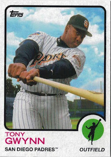
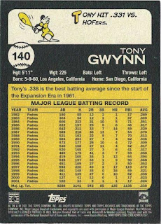
Card Number 975: Topps Archives, 2021; #140

Topps used seven different former card templates in their 2021 release of Topps Archives. Tony appears on a card laid out in the 1973 template. 


I have zero complaints about that card front. It's a great photo that works well with the design. Tony's face is visible and so is the team name on his chest. Neither of those things are a guarantee with photos that Topps put on cards!

On the back we have a little cartoon guy wielding a bat that looks like a bowling pin, and a succinct factoid. I'm going to award this card a bonus point for that. There's a second concise factoid just above the stats box.


I like cardbacks with clean and complete stats boxes and relevant factoids that don't go overboard with flowery language.

I am sometimes critical of Topps, but this is probably as close as it gets to the perfect baseball card. 

A big thank you goes out to Gawain for sending me this card!

Total: 975 cards

Thursday, February 10, 2022

FFF - late career random Fleer

2001 was Tony's final season as a player. It was also a year when Fleer were releasing sets that are now long-forgotten. One of the glorious aspects of collecting a player who was active during so many card hobby bubbles is finding cards from sets that nobody ever talks about!

Card Number 935: Fleer Platinum, 2001; #140

These retro cards deserve more recognition in my opinion. The set recreates the Fleer 1981 design and yet somehow this card looks like they could have been pulled from a pack today - even though we are 20 years on from the 20 year anniversary these cards were celebrating!


The back is glorously retro too, with the proper Fleer 80s look.


And graphs along the bottom! A bonus point per graph, so that's 4 bonus points for this card!

Card Number 936: Fleer Authority, 2001; #79
This set name makes me think of Cartman insisting "You will respect my authority!"

I think this is the only card I have with a picture of Tony wearing a camo uniform. It was around about this time that the Padres started wearing their uniforms in tribute to men and women serving in the military.


The foil stamp says 'Baseball Authority', but the set was just called Fleer Authority. Like most cusp-of-the-century Fleer ranges, this set mainly served as a vehicle for memorabilia cards. There was a hit rate of 1 relic per 36 packs, and the list of what was cut up and stuck into cards includes the usual shirts and bats, but also includes gloves, pants, shoes, hats, wristbands and even actual bases from the diamond.

The way Tony's face is framed on the back is a little odd, and somehow accentuates his heavy stature in his final year in the game. It doesn't help that he has relaxed in his seat so isn't sitting upright. Fleer weren't afraid to guesstimate Tony's weight at 225 pounds as well - that is one of the highest weights printed for him on a baseball card. 


The stats box would win the 'extreme minimalist stats box award, if such an award existed. It's a bit quirky. I kind of like it. 

Card Number 937: Fleer Showcase, 2001; #1
A shiny card to finish off the post - and it's the first card in the set! On the front Tony is pictured in the middle of a full bodied throw from the outfield. 


The back of the Fleer Authority card above was an exercise in stats box minimalism, but this cardback manages to look full of stats and yet strangely it only goes back to 1988. 


Tony's expression in the photo makes me think of the word 'peeved'. Like he's just spotted a photographer taking a photo of him and isn't best pleased. 

This isn't all the Fleer cards from 2001 that are waiting to be blogged, but I am saving some for a special post in the second week of Fabulous Fleer Fortnight!

Total: 937 cards


Friday, February 4, 2022

Millennium Bowmans

A couple of Bowman cards from the year 2000! (Ah, Y2K, a simpler time. When all that was going to kill us was the imminent technological meltdown.)

Card Number 918: Bowman, 2000; #80

I've never really got the point of Bowman. It's a mid-point range, maybe a little more upmarket than Topps flagship. Pitched at true fans. Worthy, but dull. And never more dull than on the cusp of the 21st century when the designers thought grey would be the perfect colour for the borders on their cards. (Had they learned nothing from 1989 Fleer?)

Then there's the thing about reproducing the player's signature on the side of the card. It's Tony's signature from back when he was a rookie. However, in his career Tony signed so much stuff we know that isn't what his signature looks like. At all. 

Grey shabby chic look aside, I like the Bowman Briefing that was on the back of Bowman cards.

I checked out that 'evolution' stat. Technically, it's true (although Baseball Reference lists his batting average for 1981 at .376), but it feels slightly misleading saying it was his "first pro season" without mentioning that it was low down in the minor leagues with Amarillo and Walla-Walla.

Card Number 919: Bowman (Retro/Future parallel), 2000; #80

One of these parallels was included in every pack. They are shiny homages to the famous 1955 Bowman design where all the player's pictures were on images of televisions. It was futuristic back then, and decidedly retro by 2000.

It's the same picture of Tony on the front, cropped to fit in the television screen.

The back has the same photo and the Bowman Briefing. However the layout is different. The grey borders are gone!

The Retro/Future parallels are much more interesting than the base cards and would be a nice set to collect, although their relative scarcity compared to the regular versions of the cards might make it a bit harder to build the set.

Total: 919 cards


Thursday, September 30, 2021

Revisiting Tony's Topps rookie card...

To celebrate their 50th anniversary in 2001, Topps picked 50 cards to reprint in a large insert series. Naturally, they included Tony's "iconic" rookie card from 1983.

Card Number 752: Topps Through the Years, 2001; #36


Topps added a gold foil 50th Anniversary stamp to the front. Although it's instantly noticeable that this is printed on much better card stock than Tony's actual rookie cards ever were.

Ignore the number '482' on the back - that was the number of Tony's card in the 1983 set. There is a little line below the 1982 highlights that says it's card number 36 of 50.


I wish Topps still did a highlight for players on cardbacks. 

A few years later Topps dusted off the 1983 template again.

Card Number 753: Topps Archives, 2015; #201


This card is in danger of setting off the Anachronism Klaxon for having photos of Tony late on in his career in the design template from the beginning of his career. If the cameo photo looks familiar, it's because it had been used by Topps before, for example, on Tony's Allen & Ginter card in 2013.

The retro styling extended to the back with the little outline of the batter next to the number. However, by this point there was no room for factoids next to the giant stats box!


The card stock, however, was in keeping with the 1983 design.

I have a small but growing collection of reprints and reimaginings of this card (and the O-Pee-Chee version from 1983 as well). I won't be surprised if Topps print even more in future. 

Total: 753 cards


Monday, September 27, 2021

Modern Monday - colourful "DonRuss"

I've put DonRuss in scare quotes in the title, because this is Panini zombie brand DonRuss not actual DonRuss from back in the day. 

These cards were in the box from YoRicha that arrived at the end of last week.

Card Number 747: DonRuss 2020 Holo Orange Parallel; #218

Panini are unmatched in their commitment to parallels, and this is one of the colour variations available for the retro-looking insert series in last years DonRuss set that revived the classic design from 1986. (Blogged in June 2020!)


It's shiny. I like the design. You can barely tell it's unlicensed. 

The back is the same as the regular release and also looks quite retro. 


Card Number 748: DonRuss 2020 Holo Pink Parallel Name Variation; #218

And Panini unleashed a new level of parallel hell, by also making colour parallels of their name variation parallels. So, this is a parallel of a parallel. In shiny pink.


He is Anthony, not Tony on this one.

The back is marked as a parallel by the black baseball with the number in. Personally, I prefer that look for a card number. Also, it helps to distinguish it as a parallel. 


I realised halfway through this post that I should have used card number 747 for a "jumbo" card. But that wouldn't have fitted in with the Modern Monday theme. There's only so much co-ordination I can do with the numbering!

Total: 748 cards

Monday, September 20, 2021

Modern Monday - slightly anachronistic All Star

This is a card freshly pulled from a Topps 2021 Series 2 pack, and sent to me by Gawain. He has sent me a brand new card two weeks running now!

Card Number 737: Topps 35th Anniversary All-Star, 2021; #86AS2


This is a really nice looking card, using the template of the All Star cards in the set that Topps released in 1986. There are a few things that trip the Anachronism Klaxon, though!

The obvious thing that sets off the klaxon is that Tony didn't have an All Star card in the 1986 set. He had one at bat in the 1985 game but wasn't deemed worthy of a card. 

That uniform is wrong for a card in 1986 as well. The Padres ditched the classic brown, yellow and orange after the 1984 World Series and went to white pinstripes. 

And then there's the back...


Topps have put Tony's stats from 1994 on the back of this card that replicates the 1986 card design. It's odd, even by Topps's standards for doing odd things. Yes, that was an amazing year in terms of Tony's achievements - this blog is called "point 394" because of that season - but why highlight that season on this card? Who knows? Like the Almighty, Topps moves in mysterious ways far beyond the understanding of mere collectors. 

However, this is a really nice looking card and I can tune out the klaxon. It is also particularly noteworthy because it is the 19th card from 2021 to make it into my collection. 19 is a very special number around here. Thank you Gawain for sending me this card!

Total: 737 cards 


Friday, April 9, 2021

There's that photo again

Last week Glenn from Glasgow sent me a photo of a card asking if I had it. The answer was 'no' although the photo on the card is one that is becoming more familiar. In fact, I blogged a card that uses the same photo last week, and a different card that used it a fortnight ago! Glenn kindly sent it to me and here it is:

Card Number 638: Topps Minis, 2014; #TM-4

This card was part of a 100-card insert set of die-cut minis that reused the Topps template from 1989. I've always liked that card design.


Yes, that is the same photo that was used in the Gypsy Queen set in 2014 and in an insert series in the Topps Update set in 2019 and again in Topps Update in 2020.

There's reusing photos and there's reusing photos. 

The cardback on this is great though, with a tip-top factoid about Tony's dual sporting Collegiate career, on a pink background like the cards from Topps 1989 set.


So, there are a lot of plus points to this card to counterbalance Topps reusing the same photo: the 1989 swoosh design, the great cardback factoid, being a die-cut card, even the coloured edging around the border. 

And I suppose it does fit in my developing gallery of cards that use this photo. I am up to five now!


When I messaged Glenn to tell him the card had arrived we started chatting about photo reuse, and he sent me a picture of some of his vintage Tigers cards, showing how Topps had been doing this since the 60s. At least they have been consistent in their practice for a long time!

Total: 638 cards


Saturday, April 3, 2021

Champions! (My 300th blog post)

I like marking milestones on my blog. This is my 300th blog post since starting on 9th May last year. I thought I'd celebrate by blogging my first card with a picture of Tony as a basketball player.

Card Number 630: Upper Deck Goodwin's Champions, 2013; #101


Most photos I've seen of Tony playing college basketball he is wearing a white jersey. The blue top he's wearing in this photo doesn't seem to say Aztecs on it, so I don't know the provenance of this photo.

However, it's worth recounting that Tony attended university in San Diego on a basketball scholarship and wasn't allowed to play baseball in his first year. He still holds the San Diego State University record for assists. And when he graduated, Tony was drafted by both the Padres and the local NBA franchise, the San Diego Clippers (now the Los Angeles Clippers). Several people who contributed to the book He Left Hs Heart in San Diego opine that Tony preferred basketball as a sport to watch. He regularly watched the Indiana Pacers, as his family often spent a lot of time in Indianapolis in the winter.

None of this is mentioned on the cardback.


In the eight years since this card was printed, Tony has dropped to 20th on the all-time ranking for career hits. He was overtaken by Derek Jeter, who reached number 6 in the rankings before retiring, and Albert Pujols, who needs less than 100 hits this season to climb to 9th in the all time rankings.

One reason why Upper Deck printed this card with a photo of Tony posing with a basketball is because it was a neat way to get around the lack of licensing. A few years previously, Upper Deck reacted to Topps buying sole licensing rights to Major League Baseball by printing cards anyway. They thought they could do that with the rights granted by the Major League Baseball Players Association, but then Topps sued them for using MLB logos and team names.

One of the cards in the middle of this legal tussle would have been from the first Goodwin's Champions set released in 2009.

Card Number 631: Upper Deck Goodwin's Champions, 2009; #135


This retro card set is printed on old-fashioned card stock. This is very noticeable when the card is turned over.


The alignment of factoid and one-line stat box earn this card a bonus point. If a card mentions a particular year, it makes perfect sense to just show that year's stats. 

There are five lines of boilerplate legalese at the bottom of the card and the logos of two licensing organisations - the MLBPA and the Cooperstown Collection, which I think sells rights to retired players who have been inducted into the Hall of Fame. All that wasn't enough to protect Upper Deck from getting sued, however. They haven't released a baseball set since. The later Goodwin's Champion sets have included leading sportsmen and women from a range of sports, with a few baseball players included.

Total: 631 cards


Thursday, April 1, 2021

Foolish mistakes on April 1st

Nobody reads cardbacks. That's my explanation for why Topps can produce baseball cards with nonsense on the back. As today is April Fools Day, it feels relevant to feature some foolish mistakes.

Card Number 627: Topps Gypsy Queen, 2011; #28

This was the from the first Gypsy Queen set. The range is a decade old now. 


It's not a particularly exciting card design. And then turn it over and witness how lacksadaisical Topps can be with regard to fact-checking their cards.


My first reaction was "Eh?" Then I remembered Tony Gwynn Jr was playing for the Padres in 2010. Maybe some stat compiler mistook Tony Jr for his dad. Tony Jr did play 117 games for the Padres in 2010, and it was a winning season for the team (90-72; second in the division with a win percentage of .556). But the team didn't play an additional 73 games without him. Those figures on the card add up to 190 games, and the Padres only played 162 games that season.

For the record, the two seasons the Padres have played the most games were the World Series seasons of 1984 and 1998, where they played in 171 and 176 games respectively. Nowhere near the 190 total listed here. Maybe Topps added in Spring Training games.

So, to sum up, it looks like Topps confused Tony Sr and Jr on this card. The picture is clearly Tony Sr even though his son does look like him in a lot of photos. But physically, Tony Jr was very lean in his seasons with San Diego. Then to compound the error, Topps just chucked some random figures on a page that add up to more games than is physically possible to play. (By my calculation, the most games a team could play if they maxed out the post-season series would be 181.)

I know I am sometimes overly-critical of Topps, but these are just weird mistakes that the market leading company really shouldn't be making. 

There was a second Gypsy Queen card in my recent eBay purchase and it highlights something that is becoming more prevelant with Topps - the reuse of images. 

Card Number 628: Topps Gypsy Queen, 2014; #53

(Hey, #53 - that was Tony's first ever number with the Padres.)


Recognise that photo? Well, last week I blogged about a card from 2020 that used it.


It also appeared in sets in 2019. This is the Chrome version.


They've photoshopped it a bit on the Gypsy Queen release, but it's clearly the same photo. I have seen other collectors complain that Topps are using the same images for players again and again. I'm willing to give Topps a bit of leeway on this for players like Tony who played before the era of digital photography. I don't think there can be any excuse for continually reusing photos of any players who are active now. But there is a more limited bank of photos available for stars from the last century.

However, Topps might need to think carefully about how often they reuse images. 2014 to 2019 is an acceptable gap in use. But using this image in two insert series in consecutive years makes it much more obvious.

The cardback is fairly dull, but at least the factoid is about the right Tony Gwynn and the numbers are right. 


I was a bit surprised recently when I made an off-hand comment on Facebook about Gypsy Queen that there are a number of collectors who still really like it. Personally, I think it's feeling a bit tired, but it's still popular with the people who like to rip packs and build sets and as long as it sells I have a feeling Topps will keep producing it.

Total: 628 cards


Wednesday, March 31, 2021

Hometown Hero

Panini products generally get very little love from the collecting community, mainly because they don't have an official MLB license, so can't put team logos on their cards. However, as they have consistently shown with their 'zombie' DonRuss and Diamond Kings ranges, Panini can produce some nice cards. 

Hometown Heroes was a set released in 2013. It is a deliberately retro-feel set printed on thick card stock with an unfinished back.

Card Number 625: Panini Hometown Heroes, 2013; #73


The pennant and starry background make this card look very retro. If I had one criticism it would be that I don't see much point having a set logo including the year of the set if the photo then obscures part of it! Maybe the designer wanted to make sure all the bat was on the card.

The back is bright and colourful. I'd query the wording. Tony might have played all 2,440 games for San Diego, but he didn't play them all in San Diego.


In addition to the 300 base cards in the set, there were some insert series as well.

Card Number 626: Panini Hometown Heroes City Hall insert, 2013; #12


I like this a lot. True, Tony seems to have a bit of a snarl on his face, but overall the impact of this is striking. I'd easily have this on the wall as a poster. Bonus point for having the year in the set logo and having it visible.

The back is equally visually bold. The write up basically says the same thing as on the base card but worded slightly differently. 


Given that Panini put the year in the set name, I surmise they were hoping the set would take off and become an annual release. As it happens, this was a 'one and done' set and never reappeared again. The 'Hometown Heroes' brand has featured in some other Panini releases (National Trasures in 2017 and 2018, and in Chronicles in 2019), but not as a set.

I think that is a bit of a shame, although I can understand why this set failed to make an impact when it came out. Panini were still feeling their way into the baseball card market. They had launched Panini Prizm the previous year, which appealed to the magpies who like shiny parallels. They also tried a Pinnacle relaunch in 2013 that was another one and done. They swapped out the Pinnacle brand for DonRuss in 2014, which managed to stick the landing and is now a key range for them. 

As a retro brand, Hometown Heroes was going up against the licensed cards Topps were releasing in their Archives and Heritage ranges and their Allen & Ginter and Gypsy Queen sets, and the unlicensed retro cards in Upper Deck's Goodwin's Champions, so there was a lot of competition for a set like this. However, given the crisp design-work, I wish Panini had persevered with Hometown Heroes because these are two really nice cards that still look good eight years later.

Total: 626 cards

Monday, March 29, 2021

Modern Monday - living in the past

This is the fourth card I've added to the collection that was released in 2021. I actually put a call out for this in the UK collectors Facebook group and a few days later Jamie posted it asking "Was someone looking for this?" I did the Facebook equivalent of jumping up and down saying "ME! ME! ME!", and Jamie sent it to me.

Card Number 622: Topps 35th Anniversary insert, 2021; #86B-77

There are 100 cards in the 35th Anniversary insert series in Topps Series 1 that use the 1986 template. The front has a different photo to the special Chrome version that can be found in 'silver packs' in hobby boxes of Series 1.


I'm not familiar with that photo of Tony in the 1983-4 uniform. I welcome Topps using a new or different photo on their cards. However, there is a slight anachronism in using such a recognisable uniform from before 1986 in a 1986 retro template. The Padres changed their look significantly in 1985, adopting pinstripes and ditching the yellow and orange detailing.

On the back the card has the same problem as the chrome version - it has a massive stats box, which isn't complete and, annoyingly, doesn't include stats from 1986.

I've seen several discussions about the state of the baseball card hobby lately. One thing I've said a few times previously is that I don't feel the monopoly that Topps enjoys in terms of being the only licensed card producer, is particularly beneficial. Topps seems to be looking to the past a lot. They have two nostalgic sets - Archives and Heritage - and they keep putting retro cards into their main flagship series. In fact, the four cards released in 2021 I have acquired so far are all nostalgia cards. That includes a re-use of the 1974 template, two re-uses of the 1986 template, and a double reprint of cards from 1983 and 2002.


There is a danger when any company begins to rely on past glories that they will slowly stagnate. I wonder if Topps had a competitor they would be pushed to try new things, instead of relying on their licensing to make their cards more desirable than those on offer from Panini. My feeling is that the monopoly is detrimental to the card hobby, and also detrimental to Topps. However I can't see them giving up their prime status voluntarily.

In the meantime, I'm grateful there are people like Jamie breaking new product and remembering that someone had been asking about it!

Total: 622 cards


Monday, March 15, 2021

Modern Monday - Super 70s

Here's a card released last year that would have the Anachronism Klaxon ringing if such a thing existed. This card was an eBay single that I bought last month. It arrived the day after Tim's PWE, so I had transatlantic mail two days running!

Card Number 615: Topps X Super 70s Sports, 2020; #54


This online exclusive card set is a "curated card set", which basically means Topps have asked someone else to lend their name to it. In this case, the 'curator' is Ricky Cobb, who runs a twitter account called Super70sSports. Ricky was apparently involved in the subject selection, although the base set of 90 cards seems to be the usual selection of subjects Topps has a license to put on baseball cards. The '70s' aspect is seen mainly in the insert series including five cards honouring 'Magnificent Mustaches' - and, yes, Rollie Fingers is in that insert set! (You can see Rollie's card on Cardboard Connection.)

I understand why Topps would want a mix of current stars and famous names to feature on these cards, but given the 70s connection, it seems very odd to me that they didn't limit it to players who were actually active in the 70s.

Topps have used a nice photo of Tony on the front. His 'Mimbandz' wristbands are really prominent. I noticed then as soon as I opened the envelope as I had just been discussing the Project 70 card designed by Mimbandz that was released this week.

The card back looks like a proper cardback from the 70s. That's a deliberate aesthetic choice. Although they missed a trick by not including a 'wax stain' to really capture that retro feel. (Topps will do a wax stain parallel cardback one day; you know they will.)


The cardback also has the Super 70s Sports logo and a cartoon showing a right-handed hitter making an awkward connection with the ball. It seems like the cartoonist has never seen a batter swing.

Looking into the availability of this card is an exercise in trying to make sense of enigmatic reporting. Topps seems to be claiming a print run of 8,971. But Cardboard Connection says 8,971 boxes were shipped. There were 18 base cards per box, and 90 base cards in total. You can therefore effectively divide the print run total by 5 to find out the actual print run of an individual card, which works out at about 1,794. Factoring in parallels and autographs and one or two other bits, I think the actual print run per card is probably only about 1,790. Definitely less than 2,000.

It's a nice looking card and also ticked off a mini-milestone for me as it was the 50th card I have added to my collection in 2021. It's also my 35th card from 2020, which is a crazy number that may well increase further.

Total: 615 cards

Monday, March 1, 2021

Modern Monday - silver pack chrome

Today's card arrived in all its shiny glory hard on the heels of my first Tony Gwynn card from 2021. It came from Jeff in one of the UK collectors groups on Facebook. 

Card Number 605: Topps Silver Pack Chrome, 2021; #86BC-77

These chrome cards are included in the "Silver packs" inserted as bonuses in hobby boxes of Topps Series 1. It has a different picture of Tony than the regular 35th anniversary retro cards that make up a large insert set in the flagship Series 1 set. 


The scanner really activated the refractor card. I haven't done an overhead scan, but I did take a photo to pop on Instagram, so here's that for comparison (complete with a bit of my thumb):


There are 100 cards in both the insert set and the chrome cards from the silver packs. I've seen a lot of love for these cards in the collectors groups but it's not a template I've ever been particularly fond of. Of course, I own the original 1986 card, and I have an Archives card from 2014 that also uses this template so it isn't new to me. 

The cardback is pretty dull. It manages to be both a big stats box and an incomplete record. 


This is bizarre to me. If you are going to just have a massive stats box, why would you not have all 19 seasons on there? But the thing that annoys me the most about this is they start from 1988. It's a 1986 style card. Tony was playing in 1986. Couldn't they have squeezed 1986 on there? It just feels like a silly missed opportunity.

However, this is a very nice refractor card and it means I have a quarter of the checklist of Tony Gwynn cards from Series 1 already. I would like to add the other retro card and I will be keeping my eyes peeled for it.

Total: 605 cards


Monday, February 22, 2021

Modern Monday: my first card from 2021

People have been ripping packs of the new Topps flagship product and I've seen a few Tony Gwynn cards surface in the Facebook groups I frequent. There are 8 different Tony Gwynn cards on the checklist, including a cut signature 1/1 card, which I doubt will ever feature on this blog!

I had an unofficial competition running over who would be first to send me a card from 2021. The winner was Gawain, who has sent me a large proportion of the cards that have featured on this blog. In a serendipitous coincidence, I was on a video call to Gawain when the mail arrived with this card in it!

Card Number 596: Topps 70 Years of Topps, 2021; #70YT-24


Topps have produced this 70-card insert set with a card representing each year, using the template from that year. This is the 1974 template. The set is a mix of current stars and famous retired players. This is a lovely posed photo of Tony from the mid-80s and it's not one that I remember seeing on a Topps release before. 

If I was going to make one complaint about this set, it's that using retired players in anachronistic retired templates irritates me a bit. Tony was in high school in 1974, not the major leagues. 

The cardback explains Topps release schedule in 1974 and names Dave Winfield as the stand-out rookie from that year. Sadly, Dave isn't in this set. It would have made more sense to have him on this card template.


This isn't the first time Topps have released a card with Tony in the 1974 template. They released one last year in the Topps Archives set.


This year's 1974-style card is better!

Total: 596 cards