Showing posts with label 2021. Show all posts

Monday, August 29, 2022

Modern Monday - another class of Gold Label

I'm not consistent in how I write the headers for Gold Label cards. The "class" of the card is sometimes in brackets, sometimes not. But I doubt anyone cares too much. I feel people come to my blog to look at the cards rather than read what I'm calling them.

Card Number 1036: Topps Gold Label - class 2, 2021; #12

The class 1 and class 3 cards issued in 2021 are in this post from February, although actually one of those cards is a black parallel, so I think that means I'm missing the standard version...

All three classes of cards in the 2021 issue juxtaposed that ever-so-cool photo of young Tony with an action shot from his later years. In this one elder Tony is running the bases. I also like the juxtaposition of 'San Diego' on elder Tony's uniform and 'Padres' on younger Tony's jacket. (I want a jacket like that!)

The classes in Topps Gold Label, basically mean there are three sets to collect, all with the same numbering and cardbacks. So there isn't much to add to what I've previously said about this cardback. 

Total: 1036 cards

Tuesday, May 10, 2022

Tuesday Quins - Stadium Club Chrome

I've already got three versions of the same card from the Stadium Club set released by Topps last year. (They are the normal card, the red parallel and the black parallel.) This post features two more cards from the Chrome version of the Stadium Club set. That brings me up to five cards in total - hence why this is a Tuesday Quins post not a Tuesday Twins post!

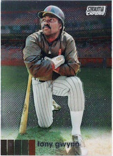
Card Number 1010: Topps Stadium Club Chrome, 2021; #24


In real life this is a bit shinier than the regular version of the card. And it has the Stadium Club Chrome logo on the front. Otherwise there is not much to add to what I've said previously. 

And here's the back...


Card Number 1011: Topps Stadium Club Chrome (refractor), 2021; #24


This card went all shimmering crazy on the scanner. In real life it doesn't look hugely different to the first Chrome card I've posted. 

It says 'refractor' on the back as a handy help for collectors.


My thanks go out to Graham for the base card and to Sam for the refractor. 

Total: 1011 cards


Monday, April 4, 2022

Modern Monday - Allen & Ginter shiny bubble

This could be a 'twin' card. It's a "hotbox parallel" card courtesy of Gawain.

Card Number 992: Topps Allen & Ginter [hotbox parallel], 2021; #53

The flatbed scan is remarkably dull.


The overhead scan is a bit brighter. The 'bubble' has an odd pearlescent finish that just doesn't scan very nicely.


I missed this detail when I blogged about the regular base version of this card, but this card is #53 in the set - which is a meaningful number because it was the number Tony wore in Spring Training in 1982 and thus became the number on his shirt in the photo on his Topps rookie card in 1983. 

I would like to think that is a deliberate numbering choice by Topps that would only be spotted by number-obsessed weirdo bloggers, like a little in-joke between us. But it could equally just be a random coincidence. 

The card numbering is the only interesting thing on the back of the as-dull-as-usual cardback. 


Total: 992 cards

Monday, February 28, 2022

Modern Monday - recent retro with Topps Archives

I have some cards from the new 2022 Topps release on their way to me in the mail! In the meantime, here is a card from last year that looks a bit older.

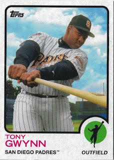
Card Number 975: Topps Archives, 2021; #140

Topps used seven different former card templates in their 2021 release of Topps Archives. Tony appears on a card laid out in the 1973 template. 


I have zero complaints about that card front. It's a great photo that works well with the design. Tony's face is visible and so is the team name on his chest. Neither of those things are a guarantee with photos that Topps put on cards!

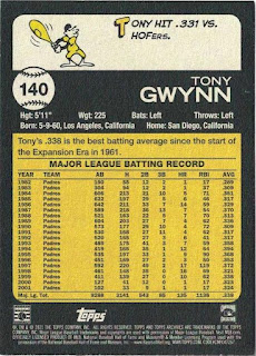
On the back we have a little cartoon guy wielding a bat that looks like a bowling pin, and a succinct factoid. I'm going to award this card a bonus point for that. There's a second concise factoid just above the stats box.


I like cardbacks with clean and complete stats boxes and relevant factoids that don't go overboard with flowery language.

I am sometimes critical of Topps, but this is probably as close as it gets to the perfect baseball card. 

A big thank you goes out to Gawain for sending me this card!

Total: 975 cards

Monday, February 21, 2022

Modern Monday - smudgy Gold Labels

A couple more cards from last year, which arrived via Michael who is a member of the UK collectors group on Facebook.

Card Number 961: Topps Gold Label Class 1 (black parallel), 2021; #12

Topps separate their Gold Label sets into three classes of increasing scarcity. Each class has a variety of different colour parallels going on. Basically, this is one of those sets with multiple similar cards of any given player. This is class 1, so the most common, but the black parallel, so less common.


The juxtaposition of Tony as a young player rocking the old brown and orange Padres look from the early 80s, with older Tony in the pinstripes and blue makes for a nice effect on the card. It's also shiny, hence the slight dappling effect around the logo in the scan. The lettering on the silver foil is in black and there are black solid patches in the various corners. That's how to tell it's a black parallel. 

On the back there are some smudges as if the card has hit some printer ink. I don't think this happened in transit becase they arrived in a penny sleeve and in a toploader. I think the ink is from the printing process. 


The term "live-ball era" was a new one to me. A quick Google revealed it is referring to baseball after 1920 when a load of rule changes were introduced to make baseball more "lively". I've frequently said that comparing Tony to pre-war playes is a bit futile, because of how much the game has changed, but I like this stat that says you have to go back to 1931 to find another player who was as consistently good at hitting the ball and not striking out as Tony. It's yet another way to cut the statistical cake to show that Tony was the greatest hitter of his lifetime. 

Card Number 962: Topps Gold Label Class 3, 2021; #12


Topps change one of the photos on the front in each of the different classes of cards. Topps has also been considerate for once, and included the class number in the foil print on the front of the card so it's easy to tell which version of the card this is.

The cardback is pretty much the same. 


Just a word on that stats box because there is an unusual line in there for 'average season'. That's not a common stat on cardbacks, and makes for some impressive reading. I would not have guessed that Tony averaged over 200 hits a season. The asterisks denote it's based on a 162-game season, so I presume it doesn't count 1982 or 1983 when he spent some time in the minor leagues, or 1994 when the season was cut short by a strike. Removing 1994 from their calculations would also explain why Topps printed his career best average as .372 instead of .394.

Or, knowing Topps, they just got it wrong!

Total: 962 cards

Monday, January 31, 2022

Modern Monday - a framed relic from A&G

This was an eBay purchase that arrived in the first few days of 2022.

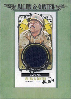
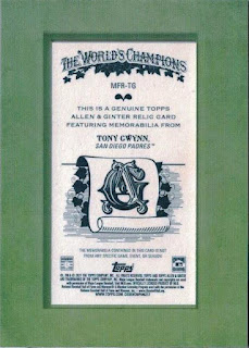
Card Number 911: Allen & Ginter framed mini-relic, 2021; #MFR-TG


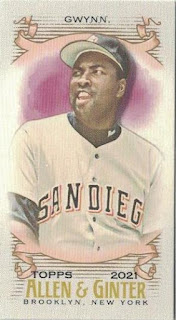
The mini card could be popped out of the frame if one so wished to do that. The swatch is a dark blue that could be a Padres uniform from the latter end of Tony's career. The photo is an interesting choice because it isn't the photo used on the Allen & Ginter base card or mini in 2021. Here's a reminder of what that card looked like.


The relic card looks like it has been rendered off the photo used by Topps for the Stadium Club Chrome card in 2020.


I haven't got an explanation why Topps switched out the photos for the mini-relic card. The eBay win included a 2021 Allen & Ginter relic card of Trent Grisham as well, and that used the same photo as his base card. That was a full-sized relic card, though.

The back looks nicer than the average Allen & Ginter card. The card acts as a guarantee of the genuineness of the cloth swatch, except...


... below the logo, it says the memorabilia isn't from "any specific game, event or season". So, what exactly is it from? 

Topps have produced relic cards for Tony for the last few years and I'm beginning to wonder how they are doing this. Surely at some point, they will run out of articles of clothing that Tony touched. This is beginning to feel like the trade in religious relics in Europe in the Middle Ages, when there were enough venerated bits of wood, all supposedly from the cross that Jesus was crucified on, to build a large structure. All those holy relics, ranging from bits of bone from long-dead saints to items touched or blessed by Jesus himself or his mother, often had very vague provenance. Topps seem to be following a similar path in terms of guaranteeing the genuineness of a relic while issuing a subtle disclaimer.

Total: 911 cards


Monday, December 20, 2021

Modern Monday - Fire (but no chestnuts roasting!)

There are a surprising number of references to fires in Christmas songs. And the background of this card makes it look a bit Christmassy to me, because it reminds me of a stained glass window. This card was an early Christmas present from Mark Benn - thanks Mark!

Card Number 898: Topps Fire, 2021; #162


Topps Fire doesn't seem to have fans like their other sets. Mark, who sent this to me, is the only person I know in the UK collectors group who opened any packs of Topps Fire.

I like this design. It's colourful. It looks a bit different to other sets put out this year. True, Topps are doing their usual thing of not showing the player's face clearly and, apart from the San Diego logo on Tony's helmet, this may as well be an unlicensed card considering the pose they have chosen. But it's still a nice card. And yet the set doesn't seem to be appealing to many collectors. 


I have no complaints about the cardback either - for a retired player, one factoid is all that's necessary. I am obviously interested in the 1994 season and postulates about what Tony might have achieved if the season had not been cut short. In He Left His Heart in San Diego, a mathematicican called Michael Schell calculated that if Tony had continued on the streak he was on when the season was prematurely halted, he would have broken .400, and might even have beaten Ted Williams's .406 batting average. This choice of stat on the cardback supports that theory.

Total: 898 cards

Monday, November 29, 2021

Modern Monday - at school with Snoop Dogg

Card Number 842: Topps Project70, 2021; #504

I'm still not a huge fan of Project70 as a concept. But I like this card, drawn by rapper Snoop Dogg, for a number of reasons.


Firstly, it's artistically very good. Secondly, it draws on part of Tony's life that is often overlooked in these Topps projects and establishes a personal connection with the artist. Snoop Dogg attended the same high school as Tony, Long Beach Polytechnic in Los Angeles. There are several photos of Snoop posing with a car in front of the school in the way Tony is depicted here. Snoop has drawn himself alongside his high school's famous alumnus, almost genuflecting towards him.

Would Tony and Snoop have been friends in high school? Maybe not, actually. Another celebrity who attended Long Beach Poly, Cameron Diaz, claimed that she bought weed off Snoop, who was a year above her when she was at the school. I doubt Tony would have hung out with anyone who was selling drugs. However, Tony did have a musical side. He sung some backing vocals on one of his daughter's records. So, who knows, maybe he and Snoop would have collaborated if they had been classmates.

The back of the card contains none of this, and the bio for the artist is rather sanitised.


I had decided not to buy any more Project70 cards. My resolve was weak when it came to this. It's also the 21st card released in 2021 that I have added to the collection, which has a nice synchronicity to it.

Total: 842 cards

Monday, October 25, 2021

Modern Monday - platinum player

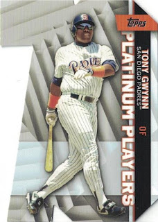
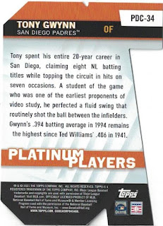
Card Number 802: Topps, 2021; #PDC-34

This die-cut insert card was a cheap purchase off eBay. The cut out shape is a big 70, marking Topps' platinum anniversary. Annoyingly there are only 50 cards in the insert series. They should have done 70.


The cardback contains a nice little summary of what makes Tony a Platinum Player.


I need one more card issued this year to reach 21 cards issued in 2021!

Total: 802 cards


Tuesday, October 5, 2021

Tuesday Twins - photo edition

When I looked through the cards that Richard sent me recently, two cards matched so much I instantly thought, 'That's a twins post!'

Card Number 760: Topps All-Star Collector's Edition, 1985; #29

This was the first time Tony was included in these sets of glossy cards that were mailed to collectors who sent in tokens. I have previously blogged some of his cards from these sets that were issued in later years.


That yellow shirt was history in 1985. After reaching the World Series in 1984, the Padres revealed an all new look for the following season - white pinstripes at home and grey pinstripes for the road uniforms. The background of this photo makes me wonder if is was taken at a Spring Training game in 1984. Topps used photos taken at Spring Training on some cards.

The back of this card is very dull. The glossy photo on the front is supposed to make up for having nothing to look at on the back.


The other card this matches also has a dull cardback.

Card Number 761: Topps Allen & Ginter, 2012; #205

Topps had been releasing Allen & Ginter sets since 2006 but I think this is the first time Tony appeared in one of the sets. He is also on an insert card from this set.

And, there it is, 27 years after Topps produced that glossy All-Star card, the same picture appears with a small filter applied to make it look more like it has been drawn.


And here is the back. This must have felt fun and quirky once, but I feel the novelty has worn off. 


This isn't the only time Topps re-used the photo. In 2013 they mocked up what an All-Star card from 1984 could have looked like. (At least the uniform would have been right on that card!)


Topps go through phases of using the same photos in several sets released around about the same time, so seeing this picture in sets released in successive years isn't that surprising. It's a nice photo, so I'm not complaining. It was just a bit odd getting two cards in the same parcel that were released so far apart and yet look so similar.

Total: 761 cards

Monday, September 20, 2021

Modern Monday - slightly anachronistic All Star

This is a card freshly pulled from a Topps 2021 Series 2 pack, and sent to me by Gawain. He has sent me a brand new card two weeks running now!

Card Number 737: Topps 35th Anniversary All-Star, 2021; #86AS2


This is a really nice looking card, using the template of the All Star cards in the set that Topps released in 1986. There are a few things that trip the Anachronism Klaxon, though!

The obvious thing that sets off the klaxon is that Tony didn't have an All Star card in the 1986 set. He had one at bat in the 1985 game but wasn't deemed worthy of a card. 

That uniform is wrong for a card in 1986 as well. The Padres ditched the classic brown, yellow and orange after the 1984 World Series and went to white pinstripes. 

And then there's the back...


Topps have put Tony's stats from 1994 on the back of this card that replicates the 1986 card design. It's odd, even by Topps's standards for doing odd things. Yes, that was an amazing year in terms of Tony's achievements - this blog is called "point 394" because of that season - but why highlight that season on this card? Who knows? Like the Almighty, Topps moves in mysterious ways far beyond the understanding of mere collectors. 

However, this is a really nice looking card and I can tune out the klaxon. It is also particularly noteworthy because it is the 19th card from 2021 to make it into my collection. 19 is a very special number around here. Thank you Gawain for sending me this card!

Total: 737 cards 


Monday, September 13, 2021

Modern Monday - Carolina Blue and a hallowed number of parallels

Breaking up the goodies that were in the parcel from France, Gawain messaged me the other day with a photo of a card he had picked up in a joblot and asked me if I had one of them yet. The answer was no, so he sent it to me. (Thank you, Gawain!)

Card Number 726: Panini Carolina Blue Prizm, 2021; #225

This card is insanely shiny and scans like an insanely shiny card does.


The base version of this card is a normal shiny silver colour. But Prizm cards are all about the parallels. I thought this was a Blue Prizm, but those are just one shade of blue. Then I found the Carolina Blue Prizms and there was the match!

Not only are there multiple different versions of blue Prizm cards, there are multiple different versions of lots of other colours too. There are a grand total of 42 parallels listed for this card, which is simply ridiculous, even though 42 is a pretty special number in baseball. And, of course, it's also the meaning to life, the universe and everything!

On the back there is a little write-up comparing Tony to other luminaries of the game and describes his "contact numbers" as "intriguing".


Panini's future in the card industry looks a bit shaky because they produce these cards on a license with the Player's Association, which has now signed an exclusive deal with another company starting in a couple of seasons. In the meantime, I'm sure Panini will be producing a plethora of parallels with every set.

Total: 726 cards


Monday, August 23, 2021

Gawain got me some Ginter

A little padded envelope arrived on the weekend from Gawain. It was a set of this year's Padres cards in the Allen & Ginter retro range. Tony had a base card in the set and Gawain dropped in a bonus as well.

Card Number 713: Topps Allen & Ginter, 2021; #53


I doubt it's deliberate but the pink outline around the picture make it look a bit like Tony is trapped in a giant bubblegum bubble, particularly the wispy bits on the top and bottom. 

I like the look of this card, even though the designer has clearly used the art filter to re-render the photo that Topps used on last year's Topps short print card. 


It was also on the back of this year's card in the Stadium Club range.


They obviously like this photo.

The back is, well, it's what Topps do with Allen & Ginter cards. It's tedious but they've been doing it for so long they aren't going to change.


The bonus card that Gawain generously added in was the mini parallel!

Card Number 714: Topps Allen & Ginter Mini, 2021; #53


Smaller card. Smaller bubblegum bubble effect.


The cardback is just a scaled down version of what appears on the regular card. There are lots of different parallel versions of this card with different cardbacks that sort of replicate cigarette cardbacks of yore (except without any references to cigarettes).

The big news in the baseball card world this week is that Topps are likely to lose their exclusive monopoly to produce cards, with both the Player's Association and MLB signing deals with another company. While I have said for a while that I don't think the monopoly position was particularly helpful to the hobby as it meant Topps weren't being pushed to keep things fresh, I don't think the solution is to have a different company enjoying a monopoly position. 

And the big news in my blogging world this week is that a large selection of cards might be incoming which will keep me posting well past the end of the baseball season and probably into next year! Until then, stay safe everyone and thank you for reading.

Total: 714 cards


Thursday, August 12, 2021

Back in black (foil)

Here's my third version of this year's Stadium Club card. Gawain sent it to me and we agreed that Topps are just getting really lazy with their parallels.

Card Number 712: Topps Stadium Club black foil parallel, 2021; #24


The logo and Tony's name are in black foil instead of silver or red.

Even though the back is exactly the same as the two other versions of this card, I scanned it so I could upload it to this blog. I think this means I have made as much effort, possibly more effort, than the set designers employed by Topps. 


It's a nice card, and I am grateful to Gawain for sending me this version of it. But, come on Topps, this is easily the most boring way to produce parallel versions of cards. Maybe spend less time trying to sell glorified jpegs or more unending series of samey cards designed by 'artists' and put a bit of work in on the bread and butter stuff, eh?

SIDENOTE


So, my blogging of cards is slowing up. This is mainly because I don't have a stock of cards waiting to be blogged. Last year I literally had hundreds of scans and could batch write posts and then publish them on a daily schedule. I'm waiting on people getting in touch now or I have to actively go out and find cards. 

And going out and finding cards isn't high on my priorities at the moment if I'm totally honest. In the last few weeks attending live soccer matches has been permitted for the first time since March 2020 and I have jumped on that train. I went to three matches in July, before the season had properly started, and I have already been to four games in August. That's my primary focus at the moment.

I even got offered a card last week that I turned down because, well, it was more than I wanted to pay for a brand new release and I've watched how prices of cards bubble up when a new product line is released, and then a few months later the bubble pops and a £5 card becomes a £1 card, or just gets chucked in a joblot. I literally thought to myself "Will I get £5 worth of joy from this card?" and decided that no, I wouldn't.

I'm not saying I'm bored of baseball cards or blogging. This has been, and continues to be, a really fun project and I still love my collection of Tony Gwynn cards. I'm not over Tony! Not by a long shot. But I recognise that my blogging has been very intermittent over the past couple of months and I just wanted to flag up that it may get worse at least until my need to watch soccer is sated slightly. 

As ever, I just want to say a big thank you to the regular commenters. I do read all the comments and find them very encouraging. Take care of yourselves as the world opens up again!

Monday, July 19, 2021

Modern Monday - still a Diamond King

I recently bought a small lot of Padres cards on eBay. It was an assortment of parallels from a number of sets and it included some base cards from the Panini Diamond Kings set released this year. I already had a 2021 Diamond Kings insert featuring Tony, but I didn't have his base card. I do now.

Card Number 708: Panini Diamond Kings, 2021; #30


It's a fairly normal Diamond Kings card front. Nothing too complicated. It has a nice finish on the card front; a sort of matt canvassy effect.

The cardback is a bit plain, with some purple prose in the write up. I grew up in a religious family and am used to the phrase "The Lord giveth; the Lord taketh away". It's amusing to see the same thing said about Tony.


We established last time I reviewed a Diamond Kings card that the characters next to the copyright notice are Chinese. I'm waiting for the day when Tony appears on a card written in one of the Asian languages. Topps have done some Japanese cards before but Tony wasn't included. I'd love to be able to add that to the French and Spanish language cards I've got already.

Total: 708 cards


Sunday, July 18, 2021

One card only - parallel persistence

Last week when I blogged about this year's Stadium Club card of Tony, I mentioned how Marc had also offered me a copy of the card, which I declined. However, a couple of days later Marc messaged me asking if I had the 'red foil parallel' version. And I didn't. 

So, a big thank you to Marc for his persistence in offering me cards!

Card Number 707: Topps Stadium Club red foil parallel, 2021; #24


The only difference between this card and the base card is the red foil Stadium Club logo and Tony's name in red foil too. 

This is one of 17 parallel sets that are available in this year's Stadium Club release. I have a theory that somewhere in the multiverse is a parallel universe where Topps only release one version of their cards.

The back is the same as the base card. I have already discussed the factoids.


This time around I noticed the one line stats box. I really approve of that on a card of a retired player. It's all the information that's needed.

Thanks again, Marc!

Total: 707 cards


Tuesday, July 13, 2021

Reusing photos raises questions...

No new cards today, but something that's stood out to me. As I've acquired more cards I have started noticing the same photos being reused. Recently I was hunting for a blog post to check something, and I found the post with the Fleer Tony Gwynn Commemorative cards from 1991. I noticed something I hadn't picked up on before.

This is one of the cards - #5 in the insert set.


It wasn't the front that caught my eye. It was the back.


I had just been flicking through my Topps binder looking at cards from 2021, which I why I noticed this connection.


That is the Topps Archives insert from 2021 Series One. And that is the exact same photo that was used on the back of the Fleer card in 1991 - except it's not close-cropped.

So, what does this mean? Have Topps acquired the photos that Fleer used in the past? This may explain why so many cards that give me a feeling of deja vu give me a feeling of deja vu! Except, I've only ever been looking at Topps cards to find where the photos are originally used. I will need to be looking in my Fleer binder from now on.

I doubt this is a ground-breaking revelation, but I felt a bit stunned when I discovered it. Maybe other bloggers would be able to shed some more light on the situation?

Sunday, July 11, 2021

One card only - metal manufactured relic

Brian sent me today's card. It's a "manufactured relic", which is basically a chunk of metal embedded in some 2mm thick foamboard.

Card Number 706: Topps 70th Anniversary Logo Patch, 2021; #T70P-TG


The metal logo rather dominates the card. These were included in blaster boxes of Topps Series 2, as a bonus item along with the packs. 

The back is fairly plain, manly explaining the nature of the card. This is quite helpful information as it has the year, card type and the set name on. I'm actually surprised Topps have been this helpful. Usually they bury the details or leave it up to the collector to hunt the card down on Trading Card Database.


Manufactured relics like this aren't everyone's cup of tea, but, hey, it's a new Tony Gwynn card for the collection and I am never going to say no to one of those. 

Brian is better known among UK collectors for busting lots of junk wax. He also sent me another card that's 30 years older than this one. I'll be posting about it tomorrow.

Total: 706 cards