Thursday, March 31, 2022

Celebrating the Upper Dec(k)ade

To celebrate their tenth anniversary, Upper Deck released some special baseball cards that have one of my favourite things on the back - pictures of other baseball cards!

Card Number 990: Upper Deck 10th Anniversary Preview, 1998; #55

These shiny inserts appeared in the 1998 Upper Deck flagship set. Design-wise, they ape the design of Upper Deck's first set released in 1989.


On the back is a write-up about what a great batter Tony is, linked to a card that Upper Deck released in 1992, which was notable for being the first Upper Deck insert card with a full-bleed photo design. 

The card was in an insert series supposedly curated by Ted Williams - I blogged about it here.

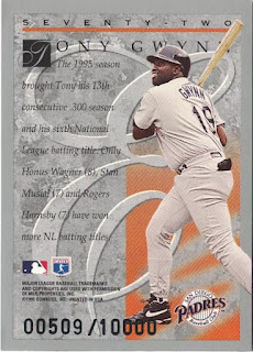
Card Number 991: Upper Deck 10th Anniversary Team (Double), 1999; #X8

I received this card back in January from Riley in Nashville - thanks Riley! The X in the card numbering is the Roman Numeral for 10!

This insert series featured players who were active during the Upper Deck era, and the team selection was made through a popular ballot.

Upper Deck produced four different versions of their 10th Anniversary Team insert cards - there was a regular version, this version that was called a 'double' and numbered to 4,000, a 'triple' version numbered to 100 and a 'home run' version that had a print run of 1! All the versions are numbered X8 and it's only the serial numbering that really differentiates this from the vanilla version. The triples have silver foil stamps on the front. There are no reference pictures on Trading Card Database, but I imagine the home run versions had gold stamps on the front.


On the back is one of my favourite Upper Deck cards, featuring Tony fishing!


I blogged about that card showing Tony fishing way back in August 2020! The serial number is big and bold. I can't think of a meaningful link between Tony and the number 497.

Upper Deck had a hobby-changing impact when the first cards landed in 1989. I've written a bit about how the "UD asteroid" wiped out the cardboard dinosaurs that had ruled the hobby in the 1980s. By the end of the 1990s, the other card companies were no longer playing catch up. Almost all of Upper Deck's innovations became standard across the industry - from foil stamps, to parallels, to relic cards, to autographed cards inserted in packs. Even now, a couple of decades later, it feels really fitting to celebrate the decade of innovation that Upper Deck brought to the world of baseball cards. 

Total: 991 cards


Wednesday, March 30, 2022

The Dawn of the Chrome Age

1993 - the year Topps started making "chrome" cards. Except they weren't called Chrome, they were called Finest...

Card 989: Topps Baseball's Finest, 1993; #77

There were 199 cards in this groundbreaking set from Topps as they aimed for the "super-premium market" (in the words of BaseballCardPedia). Topps announced a limited print run of 4,000 for the entire 'Finest' set - apparently the first time a card publisher had annonced production figures. [EDIT - I got this wrong, thanks to Fuji for pointing it out in the comments!]

The cards are super shiny and glow under my overhead scanner.  


The back is less remarkable. Topps clearly couldn't be bothered about making the backs looks like a premium product. It does have a photo, although Tony has a "Sure, Jan" expression on his face as he strokes his chin.

Sometimes, looking at these evolutionary stages of baseball card design makes me think how things could have turned out differently. If this product had bombed, instead of being jumped on by eager collectors with magpie instincts, Topps might have written off the chroming process as an expensive mistake. That would have curbed their urge to produce 'chrome' versions of everything in sight in later years.

But Finest was a massive hit when it was released and from then on up to the present day hordes of collectors swoop on shiny cards every time they are released!

Total: 989 cards

Tuesday, March 29, 2022

Tuesday Twins - some cards we've seen before

As is customary for Tuesdays, here are some "twins" - cards that look a lot like other cards in the collection.

Let's start off with a card where Topps made the kind of mistakes the market-leading brand shouldn't be making.

Card Number 986: Topps Update, 2016; #3000H-12

Previously seen as the shiny Chrome version.


When I blogged about the Chrome version of this card I noted there were two mistakes on this cardback. See if you can spot them (or remember them!) - check your answers here.


Card Number 987: Topps Chrome, 1999; #LD12

I have no idea why Topps would bother reproducing shiny inserts in their Chrome sets, but back in the late 90s they did.

I scanned the front on a black background, which really shows up the pointy die-cut at the top of this card.


But I scanned the back on a white background because I used the flatbed for the back.


As noted when I blogged the vanilla flagship version of this card, the copyright year says 1998, but this was released in 1999.

There is another version of this card as well - Topps put refractors in their Chrome sets so maybe one day this twin will turn into a triplet. 

Card number 988: Topps, 1997; #SB-1

Another shiny insert card previously seen as an unnecessary Chrome version.


Compared to the front, the back is under-stated. The photo is another example of Topps excelling at logoless cards despite being fully licensed. 

There isn't much more to add about this selection of twins, except to point out how chroming some cards is pointless when they are already super-shiny foil. 

Total: 988 cards

Wednesday, March 23, 2022

Brand new for 2022

40 seasons after Tony made his debut for the Padres, he is still featuring on cards printed by Topps. And 40 seasons on, Topps are celebrating him making it to the big leagues. This is the first card printed in 2022 to land in my collection and it came via Michael in the UK collectors group on Facebook - cheers Michael!

Card Number 985: Topps Welcome to the Show insert, 2022; #WTTS-41


If that card looks familiar, it's because Topps used it last year on their 1986 tribute inserts (which I blogged about amost exactly a year ago).


Topps cleaned up the photo a bit. The white line around Tony makes it much more visually impactful and they haven't cropped it as closely this year. While this is the early 80s uniform, looking at it, Tony looks a bit older than I would expect him to look like in a photo from that era.

The back is a reasonable summary of what Tony got up to before playing in the Major Leagues. I haven't double-checked the stats that Topps are using but they look right.

I know I haven't blogged for a couple of weeks. I was away on holiday - which you can read about on my personal blog if you want - and then have been busy with work. I hope to get back into blogging regularly next week!

Total: 985 cards

Friday, March 4, 2022

Back to Bowman Base

I think this is the final card in the run of Tony's base cards from Bowman to feature on this blog.

Card number 984: Bowman, 1997; #274

Black borders make this a sharp looking card, 25 years after it was printed. Stylistically, the way Tony's head breaks the border is nicely done.


Throughout Tony's career, Bowman was a subsidiary brand of Topps. However, Bowman cards tended to do their stats boxes differently to cards found in Topps sets. On this card, there is a "Team Breakdown" to show how Tony fared against different opponents in 1996. The statistical anomalies are against two teams he faced a handful of times each, the Rockies and the Marlins, racking up ridiculously high batting averages against both teams. 


The team with the best pitching record against Tony in 1996 was the Dodgers. Their pitching staff managed to keep Tony's average more than .100 lower than his season average. Considering Tony won the batting title that season, that was excellent work by the Dodgers.

Total: 984 cards

I am taking a break for a week and will be back blogging the week after next. See you then!

Thursday, March 3, 2022

Thor's Day Thunder Boss

It seems fitting to celebrate Thor's Day with a card called Thunder Boss!

Card Number 983: Fleer Circa Thunder Boss, 1998; #8

There were 300 cards in the Circa Thunder set and 20 cards in this insert series of Thunder bosses. The multiple words in this set name should have given regular readers a good visual idea of what kind of ludicrous card this is going to be. It does not disappoint.

While this could be a contender for ugliest card ever produced by Fleer, it's also a really good illustration of how trying to be futuristic will date a design faster than almost anything else. 

The back has a write-up that is very restrained by the standards of Fleer / Skybox in the late 90s. The photo is far too posed to look natural. "Tony, stare into the middle distance as if you're watching a home run land in the bleachers, that's great Tony, just like that Tony, tilt your head back slightly, great, great...[click click click]."


Bright purple is an unusual colour on baseball cards generally, so I'm going to award a bonus point for that. I'm sure Thor would approve.

Total: 983 cards


Wednesday, March 2, 2022

Going Elite!

Shiny cards that don't scan as good as they look in hand! Welcome to the world of Elite cards by DonRuss...

Card Number 980: DonRuss Elite, 1996; #72

There were 12 of these inserts in the DonRuss flagship set numbered from 60 to 72. These numbers followed on from previous 12-card sets since the first set of Elite cards in the 1991 set. Elite were reasonably rare, with 1 card in every 75 packs in series 1 and 1 in every 40 packs in series 2 of DonRuss cards. But card #72 only appeared in series 2. 

It's not very visible on the scan, but this card has a shiny border all around the card. Tony is jogging the bases in the photo with an apocalyptic mid-90s sky behind him.


A couple of things of note on the card back. Firstly, the card number is written out in full, 15 years before Topps started doing that sort of nonsense on Allen & Ginter cards. (But even Topps don't write out the card number in full!)

Secondly, these cards were numbered out of 10,000. There's always something a bit special about a numbered card, even when it's a five digit limited run. This particular one is #509 - I can't think of anything particularly special about that number. 


Card Number 981: DonRuss Elite, 1998; #9
by 1998, DonRuss was issuing 'Elite' as a standalone high end set of 150 shiny cards. This card is so shiny it was a real rascal to scan. 


Despite the shininess, and the price tag on packs to match, this is quite a boring card. The back isn't much better. I ding points for partial stats boxes. Ding!


Card Number 982: DonRuss Elite, 2001; #24
Another shiny card that doesn't scan to it's full potential.


The font for Tony's name and the title on the stats box has to be one of the schmanciest serif fonts ever used on a baseball card. It's pure font luxury.


This was from Tony's final season where he was probably an onlooker from the bench more often than he would have liked - so that's a fitting photo on the cardback there. 

Total: 982 cards

Tuesday, March 1, 2022

Some little things for St David's Day

It's St David's Day, celebrating the patron saint of Wales. David was a monk, preacher and reputed miracle-worker who lived in the 6th century. His earliest biography dates from the 11th Century. Much of that is apocryphal, but I really like one of the, perhaps legendary, tales about him. 

Towards the end of his life, David gave some final instructions to his followers and friends and told them to "Do ye the little things in life" as a way of demonstrating they remained faithful to their religious beliefs. It's a phrase I find inspiring because it's often doing the little things that show how much we respect and care for people.

So in honour of St David, here are some "little things", that came in the big parcel of items that Richard (YoRicha) sent me several months back. They are stickers not cards, but they count here as cards! (Although they are about a quarter of the size of a regular baseball card.)

Red Foley stickers were included in the Red Foley Best Baseball Book Ever that was published for several years in the late 80s and early 90s. The books had spaces to stick the stickers in. These stickers don't seem to never got stuck into a book.

Card Number 976: Red Foley, 1992; #44

There's no sticker back to show. Not even a number on the little bit of paper.

There were only 130 stickers included with the book so it's pretty cool that Tony was on two of them.

Card Number 977: Red Foley, 1992; #116


That photo might look really familiar. I am reasonably certain that's a photo from the All Star game in 1991. Mainly because of this Upper Deck card.


The guy in the yellow backwards baseball cap is in the background of both cards. I hope whoever he is he knows he was on a baseball card and a baseball sticker!

Tony got two stickers the next year as well!

Card Number 978: Red Foley, 1993; #38

Tony is adjusting his gloves in the photo that also looks quite familiar, although I can't quite place it. Dug-out pictures are fairly common, after all. 

And just to make it fun and confusing, Tony had the #116 sticker for the second successive year.

Card Number 979: Red Foley, 1993; #116


This is the same uniform and virtually the same pose as sticker #44 the previous year. It's a different background though, and Tony has sleeves on.

As a bonus Richard also included a little cameo picture cut from the cover of one of the Red Foley books.


I could have probably dated that photo by the colour of the batting helmet and the Van Dyck moustache and beard, but instead I used Google image search to locate it in the top right corner of the cover of the 1988 sticker book. Ironically, Tony wasn't on any of the stickers inside the book in 1988!

I really appreciate these little things from Richard - and thanks also for faithfully commenting on the blog along with other regular commenters. Your encouragement keeps me going!

Total: 979 cards (and stickers!)