Friday, April 15, 2022

1990 randomness

Today's post features three cards from 1990 that are completely unrelated to each other. Just for fun, like. 

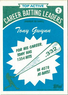
Card Number 1003: Topps Batting Leaders, 1990; #2

These cards were inserted into blister packs of 100 cards from Topps flagship set that were exclusive to K-Mart. 


The cartooney drawn baseball bat makes this look quaint, even considering it's from way back in 1990.

The politest way to describe the cardback is that it doesn't look like the designer made too much of an effort but did just enough to earn their paycheck.


Tony's final career batting average went up from this point. In terms of hitting baseballs, he was an absolute monster in the decade after this card was released.

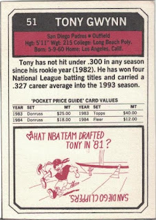
Card Number 1004: Sport's Collector Digest, 1990; #37

This isn't a baseball card, it's a pocket price guide! (Oh, okay, sure thing, Sport's Collector Digest.)


This is the second 'pocket price guide' to feature on this blog (here's the other one). It's fair to say that if more price guides looked as good as the front of this card, more people would collect price guides!


These guides provide an insight into the expansion of the collecting bubble in the early 1990s. Comparing these prices to the valuations SCD put on cards in 1993, shows how much a collector could have made by investing in rookie cards in 1990.


SCD reckoned that mint Topps rookie cards had doubled in price from $20 in 1990 to $40 in 1993, while the five hundred per cent growth in value for a mint 1984 Fleer card (from $2 to $12) was a huge jump for a second year card.

All this is a casual reminder that card values are always inflated by the companies doing the valuations. The real value of a card is not what a company claims it to be - the real value is the price it actually sells for. This is true regardless of whether the price is listed on a magazine or on a nice baseball-card sized 'pocket price guide'. 

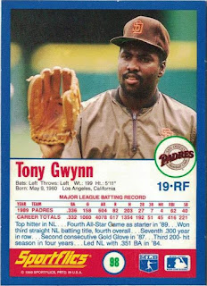
Card Number 1005: Sportflics, 1990; #98
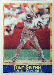
Sportflics are lenticular cards that show player in three different poses. I am not keen on them for a number of reasons. They don't scan well. They are thick plastic and the plastic yellows with age. And they warp because of the plastic coating. 

But apart from that, they're OK.


Sporflics are reasonably important in the history of baseball cards because they were the entry product for the Pinnacle company who then produced Score cards before releasing sets under the Pinnacle brand name. The back of this card shares a lot of design aesthetics with contemporary Score cards, particularly the use of a colour photo, the lettering and presentation.


On top of all the other issues with Sportflics cards, I'm going to ding this a point for having Tony's squad number more obvious than the card set number, and ding it another point for having a set number that looks like a different number. It's not #88, it's #98! However, I will give it a point back for the quirky photo showing Tony with his glove half-on, half-off. 

Total: 1005 cards

Wednesday, April 13, 2022

Into a new millennium of cards...

How do you follow the 1000th card on the blog? Well, blogging my first millennium of cards reminds me of celebrating the Millennium 22 years ago.  Here are some cards from two early-noughties sets that just about everybody has forgotten about.

Card Number 1001: DonRuss Champions, 2003; #221

Tony tips his hat on the front of a card celebrating a batting title eight years previously. 


This was an odd set with a lot of parallels and large insert sets. However, DonRuss were struggling for photos because they reused the photo on the back. The one line stats box is from Tony's last active season, for some reason. He was retired by 2003 and it could have just had his career totals.  


Card Number 1002: Fleer Mystique, 2000; #105

Fleer included the set name in the logo on the front and right across the background of this shiny card.


Fleer opted for the full stats box on the back. Tony has a faint white aura around him in the photo. 


Someone is probably working on a history of the Fleer company because what little I know is, frankly, incredible. There was a slew of these strange sets released when the company was in private ownership during the last ten years of its existence. Three sets of Mystique were released, in 1999, 2000 and 2003. That gap in release years is intriguing, as is the return for just one year.

Total: 1002 cards


Tuesday, April 12, 2022

SMILE, IT'S CARD #1000

A double milestone today - the 1000th card on the blog in my 500th blog post.

Why did I pick this card to be the 1000th card on the blog? Well I just love it. I loved the original version. And this is the super-shiny parallel.

Card Number 1000: Pinnacle Summit (foil board parallel), 1996; #134


Although the overhead scan captures the almost impossible shininess of this card, the much duller flatbed scan below shows the set logo a bit more clearly. 


The back includes the nicely laid out representation of Tony' performance on a month by month basis. He was very hot at the end of the 1995 season.

Pinnacle and it's various sub-brands are being kept on life support by Panini now. But this card represents everything that was right with baseball cards in the 1990s. I love it and it feels like an exciting and special card to celebrate getting into triple figures on this blog.

As ever, a massive thank you to everyone who has helped me along the way. I am very grateful to you all!

Total: 1000 cards!

Monday, April 11, 2022

Scoring a triple in 1995

Three cards from the same manufacturer released in the same year today! 1995 was right in the middle of Tony's mid-90s peak. 

Card Number 997: Score, 1995; #28

Let's start with the base card from the Score set that year.


Tony is wearing a batting practice top but has a dirt stain on his knee so has obviously been taking practice seriously. The 'ragged' edges of the photo and the blue box with Tony's name on are the kind of framing that I associate with the nineties, especially combined with the 'drop shadow' at the bottom. The green colouring on the borders adds a dash of colour without being overpowering. 


There is a full height portrait on the back. Tony looks relaxed in the outfield. Notice the batting gloves stuffed into his back pocket. I'm glad the designer found space for that factoid next to the giant stats box. I didn't know that Tony had never finished lower than sixth in the batting table up to this point. Even his less productive seasons were top ten material. 

Card Number 998: Score Hall of Gold, 1995; #HG14

This insert series was really just an excuse for Score to produce really shiny cards! The photo is a almost Toppsian masterclass in showing a player without showing any of their identifying features!


27 years after this card was released, it annoys me that Score didn't choose to use a photo where Tony's face was visible. If they were going to bother including him in the insert set it seems sensible to actually use such a photo. We know they had those photos available - because they used one on the back of the card!


As insert cards go, I don't mind shiny. But there are several design mistakes here on the back. Firstly they dropped his name onto the photo with an odd placement. Tony's name isn't placed centrally, making the whole thing slightly off-kilter.  Then they put white text on over Tony's white uniform, making it unreadable. Even the drop shadows on the font (so nineties!) can't make the letters legible. The borders are unequal too, and the black line chops off Tony's body on either side. Overall it's a poorly executed mess.

Card Number 999: Score Dream Team Gold, 1995; #DG8

And just to round off the post, an almost-unscannable hologram card. 


Holograms aren't particularly interesting to me. And they are impossible to reproduce in blog-friendly form. Although this scan does show some of the detail hidden in the hologram.

The back has a pure nineties colour scheme with it's gradated hot pink, teal and orange. This card is so nineties, I feel like staring at it for any length of time might give me time travelling powers so I can go back 30 years!


It's not really possible to understand nineties baseball card design without understanding how computers revolutionised the way baseball cards were laid out. Why else would you have one green letter in Tony's name? Or different kerning for his first name and his surname? Even the stars have a 3D effect drop shadow going on.

Although it seems like I am mocking the way cards were designed in the nineties, these are actually beautiful mementos of a long-gone decade. It was a time of hope and optimism - a new century was only a few years away, and who knew what wonders lay just over that millennial horizon? It maybe hasn't turned out as planned, which makes me feel wistful for the short window of history encapsulated in cards released in the 1990s.

Total: 999 cards


Sunday, April 10, 2022

One card only - Swing-o like Van Gogh

Card Number 996: Pinnacle Museum Collection, 1995; #291

This is a parallel version of the base card from the 'Swingmen' subset. It has a 'dufex' finish. Because of the subset design this card takes on a really trippy painted effect with the finish.


I took another scan of this using the overhead scanner. The swirliness really comes alive with more intensity.


The blue and purple swirling really reminds me of some of Vincent Van Gogh's paintings. The 'bumpiness' (technical term) of the dufex finish adds to the feeling that it's painted on. 

On the back, the 'Museum Collection' logo has been added, in case someone didn't realise this card was different to the Pinnacle base cards! The kerning of "1995" above the word Museum is too stretched for my liking. The photo of Tony has him looking right down the camera lens. He doesn't look like he will take any messing about from the photographer.


Back in 1995, the Museum Collection would have been a reasonably tricky parallel set to complete. These cards were inserted 1 in every 4 packs. However, I acquired mine from Jason in Rhode Island - thanks Jason!

Total: 996 cards

Tuesday, April 5, 2022

Leading the league in the middle of the 90s

I like cards that show 'league leaders'. They are usually relatively easy to find, and they provide a bonus card of certain players if those players happened to trouble the leader boards. Tony often did, so that often meant he had an extra card in sets issued in the 1990s.

Card Number 993: Fleer (league leaders insert), 1995; #6

The base cards in the set issued by Fleer in 1995 are all kinds of mid-90s crazy- when I blogged about Tony's card in the set I called it "the most 1995 card ever". Fleer toned their hyperactive designers down a lot for these inserts.


The write up on the back is how Tony had to "settle" for winning the batting title in 1994 with .394. The writer notes that Tony's average was rising at the point the season was curtailed. 

A couple of years later and Tony was picking up another National League title...

Card Number 994: Upper Deck Collector's Choice, 1997; #56

Of the eight batting titles that Tony won, his title in 1996 was the only one when he wasn't the outright winner across both major leagues. In 1996 he missed out to a young buck who was in his third season in the majors, Alex Rodriguez. Whatever happened to him, eh?


The way Upper Deck positioned the two photos makes it look like A-Rod is about to swing at Tony who is distracted by something else. 

There are a few names on the back that instantly jump out. And several that I'd never heard of before. Bernard Gilkey? Kevin Seitzer? 


Tony's team-mate, Ken Caminiti was sixth on the list. Ken was integral to the Padres National League West pennant win in 1996 and was also an All Star that year. 

But it's not just batting average that produces leader boards. In baseball, every statistic has leaders and sometimes the card companies decided to highlight some of those.

Card Number 995: Fleer Ultra [On Base Leaders insert], 1996; #3

This seems to be a weird stat for an insert set to focus on because it's very similar to batting average. The designer maybe felt the same way and it doesn't look like much care has been taken on the photo placement on the front. 

The back is much better. 

I had a Twitter conversation with Tim from Pennsylvania recently about the decision by Major League Baseball to ban the defensive shift, and we agreed that it just showed the reduced quality of hitting in the modern game. Would Tony have been curtailed by the shift? Unlikely, and this Fleer card from 26 years ago agrees.

I never think of Tony being the kind of player to draw a lot of walks, but his on base percentage of .404 suggests he got a few in the preceding season. A few blog posts back, I noted a stat on a Topps Gold Label card about walks, so pitchers sometimes opted to intentionally put him on base rather than risk a hit. And I don't blame them!

Total: 995 cards
 

Monday, April 4, 2022

Modern Monday - Allen & Ginter shiny bubble

This could be a 'twin' card. It's a "hotbox parallel" card courtesy of Gawain.

Card Number 992: Topps Allen & Ginter [hotbox parallel], 2021; #53

The flatbed scan is remarkably dull.


The overhead scan is a bit brighter. The 'bubble' has an odd pearlescent finish that just doesn't scan very nicely.


I missed this detail when I blogged about the regular base version of this card, but this card is #53 in the set - which is a meaningful number because it was the number Tony wore in Spring Training in 1982 and thus became the number on his shirt in the photo on his Topps rookie card in 1983

I would like to think that is a deliberate numbering choice by Topps that would only be spotted by number-obsessed weirdo bloggers, like a little in-joke between us. But it could equally just be a random coincidence. 

The card numbering is the only interesting thing on the back of the as-dull-as-usual cardback. 


Total: 992 cards