Showing posts with label insert card. Show all posts

Friday, August 26, 2022

Another royal title

DonRuss repeatedly honoured Tony as a Diamond King during the 80s and 90s but Fleer crowned him as a different kind of king in 1999.

Card Number 1033: Fleer Ultra, 1999; #13RK


The spectacular design on the front of this insert card masks the complete lack of logos or identifying features on the picture. Like the Leaf Legacy card I blogged yesterday, this could be a card from the era of unlicensed cards if it wasn't for the full team name included at the bottom. 

The photo of Tony on the back was taken in that brief window when he experimented with a beard in the late 90s. 


The shadow that has been added to the photo is weird and unnecessary - nobody would think Tony is actually standing in front of a big swirly mandala thing.

As noted in the write up, Tony had taken the lead in the Padres all-time franchise stats for RBI by the end of the 1998 season. He is still the Padres all time RBI leader with a career total of 1,138. (He is also the all-time Padres leader in walks with 790, which I didn't know until I looked up the RBI stat!)

Additional bonus point for this card doing what Fleer always did on their late 20th / early 21st century cards and include the year of issue under the logo. 

Total: 1033 cards

Tuesday, August 23, 2022

A star from California

This post was made possible by Casey who contacted me saying he wanted to send me a card. In fact, he sent a few, all the way from California. (Casey is a church pastor as well as a baseball card collector, and here is his blog.)

The card in this post isn't the card Casey originally got in touch with me about - I'm still researching that one. However, I wanted to say thank you to Casey for being such a star and what better way than with a card he sent me featuring Tony as a Star Attraction?

Card Number 1028: Upper Deck, 1997; #SA5

These insert cards are die-cut along the top and bottom edges. 


I like cards that use a cameo portrait on the back - especially if Tony is smiling. The silver grey stripes are reminiscent of Fleer in the late 80s, but the use of space makes the design look classy. 


The cardback references the 1997 season, which is unusual on a card released in 1997. 

These cards were only available in retail packs labelled 'Memorabilia Madness' - the Upper Deck set in 1997 was the first baseball product to include memorabilia cards, including the very first memorabilia cards for Tony! 

The Star Attractions cards were included at a rate of one per memorabilia madness pack as an extra perk for collectors trying to get their hands on cards with little swatches of cloth in them. I presume the cards were printed late in the year, which is why they reference the 1997 season. (I've cribbed these details from Baseballcardpedia.)

Many thanks again to Casey for being such a star and sending me this Star Attraction card!

Total: 1028 cards

Sunday, July 31, 2022

One card only - game-worn Gold Label

I'm not sure how it has been two and a half months since I last blogged. Anyway, I'm hoping to restart this soon. I have about 50 cards sitting to be blogged, some of them for several months. But today's card only arrived at the start of July from my friend Gawain.

Card Number 1025: Topps Gold Label, 2002; #GMR-TG

This 'Major League Moments' insert card has been printed in a dark purple tone, rather than this just being a dark scan.


Unlike modern cards with their little cloth swatches of unknown origin, this card specifies the date it was worn - 30 September, 1999.

On the back it explains why that date is meaningful. Tony got 7 hits from 8 at bats over two games in a double-header at the end of the season.


This card was released in 2002 and Tony had retired at the end of the 2001 season. However, news seemed to take a while to get through to Topps HQ. Tony had a card in the Topps flagship set in 2002, and this card may well have been lined up before they knew he had retired. 

Also, you may have spotted this is a "class 2 platinum" card. Gold Label cards are divided into all kinds of classes and subdivisions. I think the platinum ones were meant to be rarer.

Total: 1025 cards


Sunday, May 15, 2022

One card only - a grandstand great

Card Number 1024: Fleer Platinum Grandstand Greats, 2001: #7GG

These insert cards had rounded corners as befitting an 'old timey' retro set. Fleer Platinum was marking Fleer's 20th year producing baseball cards - the base cards recalled the 1981 template. On this insert the picture of Tony has been laid over a vintage photo of a baseball stadium. I never visited Jack Murphy Stadium, but I know that isn't a picture of it. The same picture appears on all the cards in this insert set.


The cardback write up is remarkably restrained considering it's a Fleer card. 


Fleer Platinum was successful enough to continue in subsequent seasons. I can see its appeal. The cards are neatly understated, printed on retro card stock, with good photos and not too big a set list. Fleer managed to get the retro feel right, and make it timeless.

Total: 1024 cards

Friday, May 13, 2022

Sportflics gets an X

Sportflics got updated in the mid-90s to Sportflix. The cards continued using the same lenticular finish though, making them difficult to capture properly for blogging purposes. I've had a go...

Card Number 1016: Sportflics 2000, 1994; #25

(They added '2000' to the set name because back in 1994, "2000" was really futuristic. The Millennium was coming!)


The way Tony's name moves when this card is tilted is quite nifty.

I hope that silhouette on the back is actually Tony's silhouette, but I suspect it isn't. The photo looks familiar, but I've gone through my Pinnacle Brands binder and I can't see this particular photo used on any other cards. Pinnacle used a lot of photos that look like this in their various sets - they often used head and shoulders candid non-game shots on their cardbacks. So it's more the type of photo that's triggering my deja vu rather than the actual photo. 


It's a mid-90s colour scheme as well. Double gradated colour like that was novel at the time. It looks well dated now. 

Card Number 1017: Sportflix, 1995: #HT10

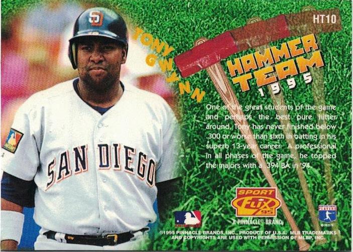
This card was in the Hammer Team insert set for successful batters. (The base card is blogged here!) Tony is dodging a rain of sledgehammers on the front.


It is all a bit reminiscent of those brothers with hammers in a certain cartridge-based video game manufactured by a Japanese company starring an Italian plumber.

A hammer is falling towards Tony on the back as well!


Even though he 'topped the majors' (what a quaint phrase), Tony only had the tenth card in this insert series. He should have been #1, surely. 

1995 was the peak year for Sportflix as, in addition to the lenticular set, there was also a 3D set called UC3. (Yesterday I was blogging about UD3. Today it's UC3! Tomorrow it's... no, I don't have a set called UB3.)

Card Number 1018: Sportflix UC3, 1995; #133

This is the second 'base' card in the set with Tony on. I blogged the other one previously here. 


3D cards don't scan well, but they're better than lenticular cards. On the back we go "In-Depth" which is hyphenated for some strange reason. That's a very short summary considering. It doesn't feel like it is in any depth. 


And do you see my point about head and shoulders candid non-game photos on the cardback? Because here's another one. 

Tony had a third UC3 card. It's another quirky insert.

Card Number 1019: Sportflix UC£, 1995; #CS13

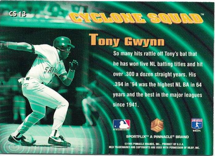
Tony is a member of the Cyclone Squad! It sounds pretty cool even if it doesn't really mean anything.


The effect on the back is meant to be cyclone-related but it just reminds me of the Rebel Alliance tactics room at the end of Star Wars: A New Hope, as Princess Leia waits to hear if Luke Skywalker has blown up the Death Star.


Does anyone else see that, or is it just me?

Card Number 1020: Sportflics, 1996; #9

And back to the lenticular cards. As this card is tilted it flicks (or flix) between Tony's name...

... and his batting average

The back is probably the best-designed Sportflix cardback, listing the previous season's stats and Tony's career stats. Tony has an odd expression in the photo, though, even if it is the tried and tested candid non-game style photo!


That's it for my collection of Sportflix cards. 1996 was the final year they were produced, and I think overall I have now blogged the complete run. 

I hope so, because I really don't like scanning lenticular cards!

Total: 1020 cards

Thursday, May 12, 2022

Among the rookies with Upper Deck

Today's post features three cards released by Upper Deck in 1998.

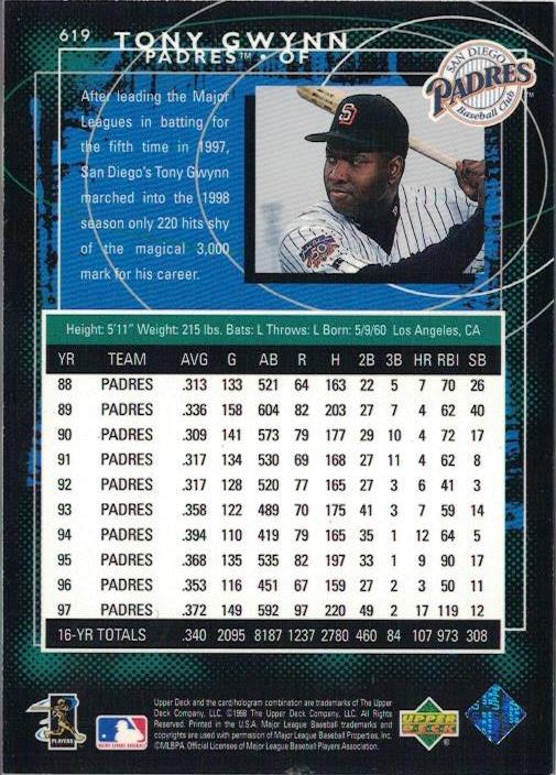
Card Number 1013: Upper Deck, 1998; #619

The Upper Deck set in '98 was released in three tranches - Series 1, Series 2, and the third series was known as the 'rookie series'. Although it had some players who were well past being rookies. Some of those players got put in a subset called 'Eminent Prestige' (which was apparently "unintentionally shortprinted"!). 


It's very shiny so I used the overhead scanner on the front. The way the subset name goes across Tony's legs make it look like he's kneeling down instead of just starting his run towards first base. 

The back has a truncated stats box, that includes the previous ten years and doesn't give full career totals. That's a tad unusual. The photo on the back looks like a posed photo - considering this was a subset about eminent players, it might have been a better choice to include it on the front. 


The ragged-edged blue background and swirling circles firmly root this card in the late 90s.

The Rookie series started numbering at 540, so I think Upper Deck made a deliberate choice to have Tony Gwynn at number 619 in the series. They get a bonus point for their attention to detail!


Card Number 1014: Upper Deck, 1998; #AS19

This card was also from the rookie (third) series of the Upper Deck flagship set - this time an insert card. It's another shiny card, so it got the overhead scan. I'm not overjoyed by these scans but at least you can see all the details of the card including the jade green colour of the foil. (The flatbed captures none of it.)


The design is reminiscent of a fancy security pass giving Tony access to the field for the All Star Game. Tony was a perennial selection for All-Star teams throughout the 90s, and he featured in his last All-Star Game after the season this set was released - although he was unable to play. Instead he helped his hero Ted Williams throw the ceremonial first pitch. 


With some characteristic attention to detail. Upper Deck gave Tony card number 19 in the 30-strong insert series. That's nineteen bonus points for this card!

Card Number 1015: Upper Deck UD3, 1998; #180

This card range has one of the most horrible numbering systems ever. Basically the same cards appear three times with different finishes and all have different numbers. I'm not sure what the design is meant to be on the front. It looks like a steampunk TV. (Was steampunk a thing in 1998?) There were numbered die-cuts produced as inserts in the set, so the card has been desinged with the die-cutting process in mind.


On the back is the numbering. This card set could be compiled in three different ways. I am going off the set number because that's the one that makes sent. None of the numbers have a 19 in them. (Boo!)


This was the second year that Upper Deck produced UD3. It shouldn't surprise anyone to hear it was also the last year that Upper Deck produced UD3. Sometimes card companies just get a bit too clever for their own good. 

Total: 1015 cards

Monday, May 9, 2022

Happy birthday Mr Padre (redux)

Two years ago I started this blog on what would have been Tony Gwynn's 60th birthday. My plan then was to collect and blog about 394 different Tony Gwynn baseball cards. Now, two years and over 500 blog posts later, there are over 1,000 different Tony Gwynn cards chronicled on this blog. 

The first card I posted was from the Topps set in 1987. I chose that card because the first baseball cards I ever bought, while on a childhood holiday to America in 1987, were from that set. The card has a terrible photo of Tony on it where he has no visible distinguishing features.

Two years later, and I have a chance to revisit those cards from 1987 with the most recent card to arrive in my collection. Marc sent me the card (thanks, Marc!) and it arrived towards the end of April. The card is from the most recent Topps flagship set where the company are marking the 35th anniversary of the release of the set in 1987. That makes me feel a bit old, thinking that me buying those cards in Florida was 35 years ago!

Card Number 1009: Topps 1987 Throwback, 2022; #T87-57

Unlike the card from the 1987 set, at least Tony's face is visible in this photo. It would have looked better with the 1987 style logo. The photo is also from the 90s rather than from 1987. It's all setting off the anachronism klaxon!

Topps really bodged the back as well. It looks like the back of a card from 1987, but the designer only included a selection of years on the back. Given that Tony was active in 1987, they only needed to include the years from 1982 to 1986. They would have had space for a factoid then!


Even though the card has limitations, it felt like a nice way of marking the anniversary of my blog, and, of course, celebrating what would have been Tony's 62nd birthday!

Total: 1009 cards

Monday, April 11, 2022

Scoring a triple in 1995

Three cards from the same manufacturer released in the same year today! 1995 was right in the middle of Tony's mid-90s peak. 

Card Number 997: Score, 1995; #28

Let's start with the base card from the Score set that year.


Tony is wearing a batting practice top but has a dirt stain on his knee so has obviously been taking practice seriously. The 'ragged' edges of the photo and the blue box with Tony's name on are the kind of framing that I associate with the nineties, especially combined with the 'drop shadow' at the bottom. The green colouring on the borders adds a dash of colour without being overpowering. 


There is a full height portrait on the back. Tony looks relaxed in the outfield. Notice the batting gloves stuffed into his back pocket. I'm glad the designer found space for that factoid next to the giant stats box. I didn't know that Tony had never finished lower than sixth in the batting table up to this point. Even his less productive seasons were top ten material. 

Card Number 998: Score Hall of Gold, 1995; #HG14

This insert series was really just an excuse for Score to produce really shiny cards! The photo is a almost Toppsian masterclass in showing a player without showing any of their identifying features!


27 years after this card was released, it annoys me that Score didn't choose to use a photo where Tony's face was visible. If they were going to bother including him in the insert set it seems sensible to actually use such a photo. We know they had those photos available - because they used one on the back of the card!


As insert cards go, I don't mind shiny. But there are several design mistakes here on the back. Firstly they dropped his name onto the photo with an odd placement. Tony's name isn't placed centrally, making the whole thing slightly off-kilter.  Then they put white text on over Tony's white uniform, making it unreadable. Even the drop shadows on the font (so nineties!) can't make the letters legible. The borders are unequal too, and the black line chops off Tony's body on either side. Overall it's a poorly executed mess.

Card Number 999: Score Dream Team Gold, 1995; #DG8

And just to round off the post, an almost-unscannable hologram card. 


Holograms aren't particularly interesting to me. And they are impossible to reproduce in blog-friendly form. Although this scan does show some of the detail hidden in the hologram.

The back has a pure nineties colour scheme with it's gradated hot pink, teal and orange. This card is so nineties, I feel like staring at it for any length of time might give me time travelling powers so I can go back 30 years!


It's not really possible to understand nineties baseball card design without understanding how computers revolutionised the way baseball cards were laid out. Why else would you have one green letter in Tony's name? Or different kerning for his first name and his surname? Even the stars have a 3D effect drop shadow going on.

Although it seems like I am mocking the way cards were designed in the nineties, these are actually beautiful mementos of a long-gone decade. It was a time of hope and optimism - a new century was only a few years away, and who knew what wonders lay just over that millennial horizon? It maybe hasn't turned out as planned, which makes me feel wistful for the short window of history encapsulated in cards released in the 1990s.

Total: 999 cards


Thursday, March 31, 2022

Celebrating the Upper Dec(k)ade

To celebrate their tenth anniversary, Upper Deck released some special baseball cards that have one of my favourite things on the back - pictures of other baseball cards!

Card Number 990: Upper Deck 10th Anniversary Preview, 1998; #55

These shiny inserts appeared in the 1998 Upper Deck flagship set. Design-wise, they ape the design of Upper Deck's first set released in 1989.


On the back is a write-up about what a great batter Tony is, linked to a card that Upper Deck released in 1992, which was notable for being the first Upper Deck insert card with a full-bleed photo design. 

The card was in an insert series supposedly curated by Ted Williams - I blogged about it here.

Card Number 991: Upper Deck 10th Anniversary Team (Double), 1999; #X8

I received this card back in January from Riley in Nashville - thanks Riley! The X in the card numbering is the Roman Numeral for 10!

This insert series featured players who were active during the Upper Deck era, and the team selection was made through a popular ballot.

Upper Deck produced four different versions of their 10th Anniversary Team insert cards - there was a regular version, this version that was called a 'double' and numbered to 4,000, a 'triple' version numbered to 100 and a 'home run' version that had a print run of 1! All the versions are numbered X8 and it's only the serial numbering that really differentiates this from the vanilla version. The triples have silver foil stamps on the front. There are no reference pictures on Trading Card Database, but I imagine the home run versions had gold stamps on the front.


On the back is one of my favourite Upper Deck cards, featuring Tony fishing!


I blogged about that card showing Tony fishing way back in August 2020! The serial number is big and bold. I can't think of a meaningful link between Tony and the number 497.

Upper Deck had a hobby-changing impact when the first cards landed in 1989. I've written a bit about how the "UD asteroid" wiped out the cardboard dinosaurs that had ruled the hobby in the 1980s. By the end of the 1990s, the other card companies were no longer playing catch up. Almost all of Upper Deck's innovations became standard across the industry - from foil stamps, to parallels, to relic cards, to autographed cards inserted in packs. Even now, a couple of decades later, it feels really fitting to celebrate the decade of innovation that Upper Deck brought to the world of baseball cards. 

Total: 991 cards


Tuesday, March 29, 2022

Tuesday Twins - some cards we've seen before

As is customary for Tuesdays, here are some "twins" - cards that look a lot like other cards in the collection.

Let's start off with a card where Topps made the kind of mistakes the market-leading brand shouldn't be making.

Card Number 986: Topps Update, 2016; #3000H-12

Previously seen as the shiny Chrome version.


When I blogged about the Chrome version of this card I noted there were two mistakes on this cardback. See if you can spot them (or remember them!) - check your answers here.


Card Number 987: Topps Chrome, 1999; #LD12

I have no idea why Topps would bother reproducing shiny inserts in their Chrome sets, but back in the late 90s they did.

I scanned the front on a black background, which really shows up the pointy die-cut at the top of this card.


But I scanned the back on a white background because I used the flatbed for the back.


As noted when I blogged the vanilla flagship version of this card, the copyright year says 1998, but this was released in 1999.

There is another version of this card as well - Topps put refractors in their Chrome sets so maybe one day this twin will turn into a triplet. 

Card number 988: Topps, 1997; #SB-1

Another shiny insert card previously seen as an unnecessary Chrome version.


Compared to the front, the back is under-stated. The photo is another example of Topps excelling at logoless cards despite being fully licensed. 

There isn't much more to add about this selection of twins, except to point out how chroming some cards is pointless when they are already super-shiny foil. 

Total: 988 cards

Wednesday, March 23, 2022

Brand new for 2022

40 seasons after Tony made his debut for the Padres, he is still featuring on cards printed by Topps. And 40 seasons on, Topps are celebrating him making it to the big leagues. This is the first card printed in 2022 to land in my collection and it came via Michael in the UK collectors group on Facebook - cheers Michael!

Card Number 985: Topps Welcome to the Show insert, 2022; #WTTS-41


If that card looks familiar, it's because Topps used it last year on their 1986 tribute inserts (which I blogged about amost exactly a year ago).


Topps cleaned up the photo a bit. The white line around Tony makes it much more visually impactful and they haven't cropped it as closely this year. While this is the early 80s uniform, looking at it, Tony looks a bit older than I would expect him to look like in a photo from that era.

The back is a reasonable summary of what Tony got up to before playing in the Major Leagues. I haven't double-checked the stats that Topps are using but they look right.

I know I haven't blogged for a couple of weeks. I was away on holiday - which you can read about on my personal blog if you want - and then have been busy with work. I hope to get back into blogging regularly next week!

Total: 985 cards

Wednesday, March 2, 2022

Going Elite!

Shiny cards that don't scan as good as they look in hand! Welcome to the world of Elite cards by DonRuss...

Card Number 980: DonRuss Elite, 1996; #72

There were 12 of these inserts in the DonRuss flagship set numbered from 60 to 72. These numbers followed on from previous 12-card sets since the first set of Elite cards in the 1991 set. Elite were reasonably rare, with 1 card in every 75 packs in series 1 and 1 in every 40 packs in series 2 of DonRuss cards. But card #72 only appeared in series 2. 

It's not very visible on the scan, but this card has a shiny border all around the card. Tony is jogging the bases in the photo with an apocalyptic mid-90s sky behind him.


A couple of things of note on the card back. Firstly, the card number is written out in full, 15 years before Topps started doing that sort of nonsense on Allen & Ginter cards. (But even Topps don't write out the card number in full!)

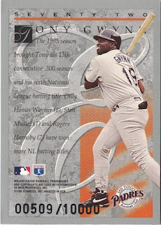
Secondly, these cards were numbered out of 10,000. There's always something a bit special about a numbered card, even when it's a five digit limited run. This particular one is #509 - I can't think of anything particularly special about that number. 


Card Number 981: DonRuss Elite, 1998; #9
by 1998, DonRuss was issuing 'Elite' as a standalone high end set of 150 shiny cards. This card is so shiny it was a real rascal to scan. 


Despite the shininess, and the price tag on packs to match, this is quite a boring card. The back isn't much better. I ding points for partial stats boxes. Ding!


Card Number 982: DonRuss Elite, 2001; #24
Another shiny card that doesn't scan to it's full potential.


The font for Tony's name and the title on the stats box has to be one of the schmanciest serif fonts ever used on a baseball card. It's pure font luxury.


This was from Tony's final season where he was probably an onlooker from the bench more often than he would have liked - so that's a fitting photo on the cardback there. 

Total: 982 cards