Showing posts with label die-cut. Show all posts

Tuesday, August 23, 2022

A star from California

This post was made possible by Casey who contacted me saying he wanted to send me a card. In fact, he sent a few, all the way from California. (Casey is a church pastor as well as a baseball card collector, and here is his blog.)

The card in this post isn't the card Casey originally got in touch with me about - I'm still researching that one. However, I wanted to say thank you to Casey for being such a star and what better way than with a card he sent me featuring Tony as a Star Attraction?

Card Number 1028: Upper Deck, 1997; #SA5

These insert cards are die-cut along the top and bottom edges. 


I like cards that use a cameo portrait on the back - especially if Tony is smiling. The silver grey stripes are reminiscent of Fleer in the late 80s, but the use of space makes the design look classy. 


The cardback references the 1997 season, which is unusual on a card released in 1997. 

These cards were only available in retail packs labelled 'Memorabilia Madness' - the Upper Deck set in 1997 was the first baseball product to include memorabilia cards, including the very first memorabilia cards for Tony! 

The Star Attractions cards were included at a rate of one per memorabilia madness pack as an extra perk for collectors trying to get their hands on cards with little swatches of cloth in them. I presume the cards were printed late in the year, which is why they reference the 1997 season. (I've cribbed these details from Baseballcardpedia.)

Many thanks again to Casey for being such a star and sending me this Star Attraction card!

Total: 1028 cards

Tuesday, March 29, 2022

Tuesday Twins - some cards we've seen before

As is customary for Tuesdays, here are some "twins" - cards that look a lot like other cards in the collection.

Let's start off with a card where Topps made the kind of mistakes the market-leading brand shouldn't be making.

Card Number 986: Topps Update, 2016; #3000H-12

Previously seen as the shiny Chrome version.


When I blogged about the Chrome version of this card I noted there were two mistakes on this cardback. See if you can spot them (or remember them!) - check your answers here.


Card Number 987: Topps Chrome, 1999; #LD12

I have no idea why Topps would bother reproducing shiny inserts in their Chrome sets, but back in the late 90s they did.

I scanned the front on a black background, which really shows up the pointy die-cut at the top of this card.


But I scanned the back on a white background because I used the flatbed for the back.


As noted when I blogged the vanilla flagship version of this card, the copyright year says 1998, but this was released in 1999.

There is another version of this card as well - Topps put refractors in their Chrome sets so maybe one day this twin will turn into a triplet. 

Card number 988: Topps, 1997; #SB-1

Another shiny insert card previously seen as an unnecessary Chrome version.


Compared to the front, the back is under-stated. The photo is another example of Topps excelling at logoless cards despite being fully licensed. 

There isn't much more to add about this selection of twins, except to point out how chroming some cards is pointless when they are already super-shiny foil. 

Total: 988 cards

Tuesday, November 2, 2021

Tuesday Twins - seen in previous guises

The recent influx of cards into my collection has included quite a few parallel versions of cards that have featured already on the blog. Here are a few more from the various Upper Deck ranges. I've included links to where the other version was blogged.

Card Number 818: Upper Deck Collector's Choice Special Edition Silver Signature, 1995; #160

Base version was #354 on the blog.

Special Edition was Upper Deck's third release in its Collector's Choice Range, after Series 1 and Series 2. Like the rest of the cards in the range, parallel versions with silver foil and gold foil signatures were released. The gold foil signatures were a lot rarer. The 'Special Edition' logo (top right) was recolourised for this silver signature release. Ironically, the silver signature scans black!

The back has a photo that is definitely in the top ten photos of Tony on a cardback. You can almost hear him saying "Heeeyyyyy, you guys!"

If every parallel had a photo that good on it, I would have a lot more appreciation for parallels.

Card Number 819: Upper Deck UD Choice Starquest (Green), 1999; #SQ8

Base version was #129 here

Green shiny card! Lovely. 


UD Choice was Upper Deck's late 90s rebrand for Collector's Choice. It lasted for one year and was replaced the following year by the MVP range.

Every pack of UD Choice cards had one Starquest card in it. The base cards were blue. The green versions were inserted at a rate of 1 in 8 packets. There were also red versions inserted 1 in 23 packets and gold versions sequentially numbered to 100. 

The dull cardback is made up for by the shininess of the front. The sleeve logo of the Swinging Friar is quite prominent in the cropped version of the photo on the cardback. 


Card Number 820: Upper Deck Special F/X, 1998; #9

According to Baseballcardpedia, this set "partially-parallels 150 cards from the 1998 Upper Deck set". I blogged the regular version back in September (#745).


Aside from being shiny holofoil, this card doesn't have the little logo denoting 'Ken Griffey's Hot List' that is on the regular card. The presentation marks the first time the Padres played at Edison field in Anaheim. The Angels player presenting the award is Eddie Murray.

Apart from the set number, the back is exactly the same as the regular release.


Card Number 821: Upper Deck SP (die-cut), 1994; #130


In addition to all 200 cards in the inaugural SP set being holofoil, there were die-cut parallels inserted at a rate of 1 in every pack. It's not the most imagintaive die-cut, with just a chunk taken out of the top of the card. This is an overhead scan. If you want to see how dark this would look on a flatbed scan, then that's what I used when I blogged the normal version of this card. 

SP went for the minimalist approach on the card back. The photo has been cropped so tightly the base path Tony is running on isn't visible. 


And that's the Tuesday Twins for today! 

Total: 821 cards

Sunday, October 31, 2021

One Card Only - Silver Spx

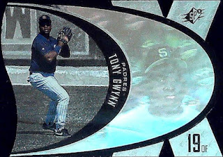
Today's card kicks off an entire week of Upper Deck cards with a die-cut shiny card from one of Upper Deck's spin-off ranges. SPx was a follow-on from Upper Deck's SP range. When I opened the big box of cards that Richard sent me, I saw this card and mentally filed it as a dupe. But then I realised, it looked a bit different to the one I had already.

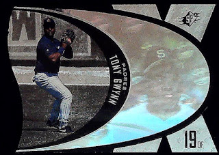
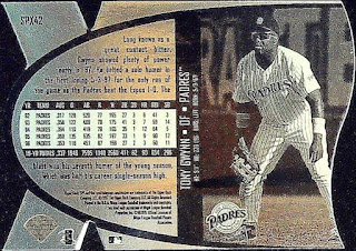
Card Number 814: Upper Deck SPx Silver, 1997; #SPX42

These cards are a nightmare to scan, even with the overhead scanner.


I had a few goes at different exposures!


What marks this as a silver parallel is the use of silver foil on the X. The card I blogged previously was blue.

The back is also a shiny scanning nightmare. The back is all silver, even the photo has been colourised to match.


You may have noticed a slight ripple across the bottom of the hologram on the front of the card. This is actually a minor blip on the card. However, when I looked it up on Trading Card Database, I noticed the picture on there also has a ripple in the same place. The person who sent me this card - Richard - also submitted the scan to TCDb! So I think this could be the very same card, or this weird effect happened on more than one card. 

Richard's scans are better than mine. I need to get some scanning tips off him!

Total: 814 cards


Monday, October 25, 2021

Modern Monday - platinum player

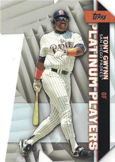
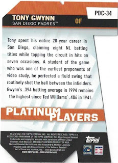
Card Number 802: Topps, 2021; #PDC-34

This die-cut insert card was a cheap purchase off eBay. The cut out shape is a big 70, marking Topps' platinum anniversary. Annoyingly there are only 50 cards in the insert series. They should have done 70.


The cardback contains a nice little summary of what makes Tony a Platinum Player.


I need one more card issued this year to reach 21 cards issued in 2021!

Total: 802 cards


Sunday, June 7, 2020

One card only: Heavy is the head that wears the Crown Royale

Sundays are days when I profile one card. This one has a bit of a story to it as it's one of the few where I really remember the circumstances of buying it.

In the shop at the National Baseball Museum and Hall of Fame in Cooperstown, they sell packs of assorted baseball cards from every baseball team. They are repacks, and there's no way of knowing what you're getting, except you can see the card on the top. Today's card was on the top and I knew as soon as I saw it that I would have to buy the pack of cards.

Card Number 84: Pacific Crown Royale, 2000; #120


It's a die-cut card in the shape of a crown. The amount of gold foil on this card is huge, but it's not just whanged on there for it's own sake. It's arranged nicely to ensure the crown design is golden. You can see why this stood out on the card racks.

I've said before that I think the baseball card hobby is poorer without Pacific. This kind of thing is what I'm talking about. On a holiday when I bought loads of baseball cards, this is the one I remember buying!


This card was issued in Tony's penultimate season. He had recorded over 3,000 hits by this point. The 2000 season was problematic for him as he had knee surgery. He managed to record over .300 in both 2000 and 2001, although he played very few games those seasons. His final tally of 19 seasons averaging over .300 meant he was still 4 seasons behind Ty Cobb, who is mentioned on the card here.

Another little personal story about this card is that when I went to scan it I found there were actually two cards in the sleeve. They had adhered together. I had always thought it was a double thickness card, but actually it was two regular thickness cards. That was a nice little bonus that livened up the tedious job of scanning my cards!

Total: 84/394