Showing posts with label bizarre numbering. Show all posts

Thursday, May 12, 2022

Among the rookies with Upper Deck

Today's post features three cards released by Upper Deck in 1998.

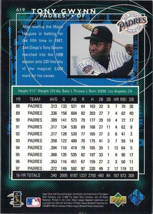
Card Number 1013: Upper Deck, 1998; #619

The Upper Deck set in '98 was released in three tranches - Series 1, Series 2, and the third series was known as the 'rookie series'. Although it had some players who were well past being rookies. Some of those players got put in a subset called 'Eminent Prestige' (which was apparently "unintentionally shortprinted"!). 


It's very shiny so I used the overhead scanner on the front. The way the subset name goes across Tony's legs make it look like he's kneeling down instead of just starting his run towards first base. 

The back has a truncated stats box, that includes the previous ten years and doesn't give full career totals. That's a tad unusual. The photo on the back looks like a posed photo - considering this was a subset about eminent players, it might have been a better choice to include it on the front. 


The ragged-edged blue background and swirling circles firmly root this card in the late 90s.

The Rookie series started numbering at 540, so I think Upper Deck made a deliberate choice to have Tony Gwynn at number 619 in the series. They get a bonus point for their attention to detail!


Card Number 1014: Upper Deck, 1998; #AS19

This card was also from the rookie (third) series of the Upper Deck flagship set - this time an insert card. It's another shiny card, so it got the overhead scan. I'm not overjoyed by these scans but at least you can see all the details of the card including the jade green colour of the foil. (The flatbed captures none of it.)


The design is reminiscent of a fancy security pass giving Tony access to the field for the All Star Game. Tony was a perennial selection for All-Star teams throughout the 90s, and he featured in his last All-Star Game after the season this set was released - although he was unable to play. Instead he helped his hero Ted Williams throw the ceremonial first pitch. 


With some characteristic attention to detail. Upper Deck gave Tony card number 19 in the 30-strong insert series. That's nineteen bonus points for this card!

Card Number 1015: Upper Deck UD3, 1998; #180

This card range has one of the most horrible numbering systems ever. Basically the same cards appear three times with different finishes and all have different numbers. I'm not sure what the design is meant to be on the front. It looks like a steampunk TV. (Was steampunk a thing in 1998?) There were numbered die-cuts produced as inserts in the set, so the card has been desinged with the die-cutting process in mind.


On the back is the numbering. This card set could be compiled in three different ways. I am going off the set number because that's the one that makes sent. None of the numbers have a 19 in them. (Boo!)


This was the second year that Upper Deck produced UD3. It shouldn't surprise anyone to hear it was also the last year that Upper Deck produced UD3. Sometimes card companies just get a bit too clever for their own good. 

Total: 1015 cards

Friday, February 11, 2022

Friday Flair in Fleer Fortnight

Flair was Fleer's high brow range of cards for much of the 90s. I've accumulated a few in the collection and here are some that haven't appeared on the blog previously.

When I previously blogged about Flair cards, I posted the card from 1993 and the card from 1995, but didn't have the card from 1994. So, let's set that right.

Card Number 938: Fleer Flair, 1994; #436

This card is everything you might expect from a premium card in the mid-90s. Full bleed picture, gold foil tints, elaborate swirly fonts. It's also everything you would expect from a Fleer card in the mid-90s. Confusing juxtaposition of photos, cropped off feet...


There is a full photo background on the back, with a Topps-esque shot half showing Tony's face and with his butt pointing towards the camera! However, it is unusual to have an action shot with Tony wearing his trademark wraparound shades.

For the first few years that Fleer produced Flair, they were relatively uncomplicated sets. Then towards the end of the 90s they started getting more complex, with parallels, rebrands and strange numbering systems.

Card Number 939 Fleer Flair Gold version, 1996; #174

In 1996, every Flair base card came in either a silver version or a gold version. The silver versions had gold lettering, and the gold versions has silver lettering. The cards were all shiny, using the Fleer 'etched foil' approach that gave the cards a gritty sort of surface feel. 

As with other Flair sets, this card has a composited image of pictures of Tony on the front.


Despite the abundant use of photoshop on the card, the designers left the grass stain on Tony's knee. 

There are two photos on the back as well, and a huge stats box.


After 1996, Flair was rebranded as Flair Showcase. That was when things started to get weird with the brand. In 1998 Flair Showcase was released as a 'tiered product' with four different versions of each card released, numbered from Row 3 to Row 0, with 3 being the most common and 0 the most scarce. Furthermore, each row was divided into 30-card sections, which were also of unequal scarcity. It's all very complicated. Even Baseballcardpedia has difficulty explaining it.

Card Number 940: Fleer Flair Showcase (Flair), 1998; #Section 2 Row 3, Seat 19

I'm going to count this as a #19 card! Row 3 means it was the most common version of Tony's cards in the set.

This was a really difficult card to scan. This was captured using my overhead scanner and is slightly over-exposed.The line on it is in the etched foil coating.


At least when they made an unnecessarily complicated set, Fleer had the decency to add the word 'Flair' under the set name so collectors could instantly tell which bit of the set the card was from. Although, they could have been more original and used a different word than Flair, which was the brand!

The cardback looks a bit, well, creepy, to be honest. It's the combination of the colours and Tony's hyper-focussed facial expression.


The word 'showtime' on the back indicates which subsection this card is from. "Flair Showtime Flair Showtime" are the most commonly occuring cards in the set. You were more likely to get more than one of these cards in a packet than none at all (if I've worked out the ratios on Baseballcardpedia correctly).

Card Number 941: Fleer Flair Showcase (Style), 1998; #Section 2, Row 2, Seat 19

Another #19 card. Or the same one? These 'Row 2' cards were the second most common cards in the set.


This card looks better. There is a big 'e' on the red advertising hoarding behind Tony. It looks really familiar but I don't think it's the e in Budweiser. It might be the e from the word Coke. 

It's the same photo on the back. The entire background has been wiped but because the whole picture hasn't been tinted blue, it's less freaky looking. 


This card is in the Showstopper division of row 2 cards. Again, that makes it one of the most common of the Row 2 cards, with these cards appearing at a rate of 1 every 2 packs.

I don't have the rarer Flair Showcase cards from 1998. But Flair continued their weird numbering system the following year, although there were only 3 rows. (They dispensed with row 0.) They also dropped the number of subdivisions across each row down to 3. The reduction in complexity may be an indicator the range was having problems so it's no surprise that Flair went on hiatus after the 1999 set before being brought back in 2002 for a new run.

Card Number 942: Fleer Flair Showcase (Power), 1999; #Row 3, Seat 9

The 'power' cards are the most common version of the card - this is in the 'Showtime' subdivision, which was the most common subdivision, making it one of the most common cards in the set overall. 


Fleer seemed to like having a picture of Tony running towards the camera on the cardback as they used a picture of him like that for the second year running. 


The green bar for the factoid is very prominent. It's a good factoid too, retelling the story of Tony's draft day when he was also offered a place with the Clippers in the NBA.

That's all the flair I have available to blog at the moment. At some point I will have to go a-hunting for rare flair to share.

Total: 942 cards

Wednesday, November 4, 2020

Accessing the Archives

Topps Archives first appeared between 2001 and 2005. It was branded Archives for the first couple of years of release then rejigged as 'All Time Fan Favourites' for the next three years. The 'ATFF' cards used Topps templates with different photos in them, a habit that Topps has continued to this day. I've already blogged about Tony's ATFF card from 2005, which reused the Topps 2000 template and kept the year 2000 on the front.

Archives then went on hiatus and returned in 2012 featuring players in classic card designs. That's the range that has continued up to this year, and will probably carry on. Tony's Archives card from 2020 was featured in a Modern Monday post at the end of September.

Card Number 456: Topps Archives, 2003; #106

Bizarrely, Topps decided to use their template from 2001 for this card released in 2003. That's an even shorter gap between a set release and a template being reused in an Archives set than the one in 2005 that used the template from 2000. Annoyingly, I don't have the original 2001 base card it's based on - I have two parallels and this, so that's three cards in this template without owning the actual base card.

Batting donut bonus point! Given that Tony is in a game uniform, I think this must be a closely cropped photo of him 'on deck' waiting for his turn at the plate. 

I feel there must be some kind of story behind the image on his wrist. Perhaps someone can shed some light on it.

(Is that meant to be a drawing of him?)

The back is laid out like the back of a card from 2001, including the Topps 50th celebration logo. The green strip up the side explains that it's an Archives card.


Card Number 457: Topps Archives, 2012; #660 (original cardback version)

This is a straight up reprint of Tony's card from 1985.  


The back is a slightly different colour, because it's printed on a much better card stock. There's also a little bit of blurb underneath.


Here's the back of the original card from 1985 for comparison. 


There weren't 660 cards in the 2012 Archives set. There were 241 cards in the base set and then the reprint inserts were just given the same card number as the original cards. There were two #160 and two #164 as a result, for example, besides the base card with that number as well. 

Card Number 458: Topps Archives 2013; #190
Tony got a card in the 1990 template with a different picture on the front. He's dropping his bat having hit the ball.


For reference, here's Tony's card from 1990.


The 2012 card is a better print. The photos look at first glance like they could be from the same game. But if so, then  it's an early photo for a 1990 card, anyway. The black letters RAK on the sleeve were worn in honour of the late Padres owner Ray Kroc, and appeared on uniforms from 1984 to 1986. 

That begs the question, was the photo on Tony's card in 1990 actually from 4 years previously? Knowing how slapdash Topps were with their photography, it wouldn't surprise me. It looks like a different bat handle though, in the original card, so maybe they're not from the same time period.

This is the cardback from the Archives set. It has the same fonts as the card from 1990.


Topps could have given Tony the number 19 card. But number 190 is reasonably close.

Card Number 459: Topps Archives 2014; #105
Topps didn't worry about trying to get a photo from anywhere near the right era for Tony's Archives card in 2014. This is a picture from towards the end of his career, set into the 1986 template.
 

There's a lot of love out there for the 1986 template with it's bold lettering for the team names. Personally, it doesn't do much for me. I have a sentimental fondness for the 1987 design, and the 1984 and 1985 card designs are both lovely, so this is one I don't really look at too much.


In the stats box Topps only included Tony's stats up to 1998 - an arbitrary cut off point. Maybe they went for how it looked, not expecting anyone to read the back. But it annoys me and I'm going to ding a point off this card for it. (Because I can be arbitrary too!)

I hope you enjoyed this visit to the Archives.

Total: 459 cards


Monday, October 26, 2020

Modern Monday - Panini (yes, Panini) Diamond Kings

Since 2009, Panini have owned all the DonRuss-associated brands. I've seen these referenced as "Zombie brands" because they are issued as DonRuss or Leaf or Pinnacle, with a small Panini logo on the back. Panini have issued their own cards as well and this year I noticed they have taken one of the most well-known DonRuss spin-off sub-brands - the Diamond Kings - and branded them as a Panini range. 

So, after almost 40 years of DonRuss Diamond Kings, today's cards are ultra-modern. I present to you two Panini Diamond Kings cards. I'd like to thank Andrew S and Drew O from the UK Facebook collectors group, for sending me these cards.

Card Number 438: Panini Diamond Kings In the Zone Insert, 2020; #INT-1

A #1 card, albeit in an insert series.


Panini don't have a Major League Baseball license, but having illustrated cards rather gets round the logo issue. They just don't draw them in! The guy sitting on the bench in the background has a suggestive smudge that looks like a Padres shirt-front, though!


The write-up on the back explains why Tony was "In the Zone", in his case, the strike zone, and talks about his career batting average and his .394 season.

This card is as colourful on the back as it is on the front. My one criticism would be that they don't name the artist, although I suspect this artistic look has been created by the Panini design team putting photographs through a computer program.

Card Number 439: Panini Diamond Kings The 3000 Insert, 2020; #3000-14
If I ever built a "frankenset" (cards arranged in numerical order taken from numerous other sets) I don't know how I would count this number. 3000 is probably the highest numbered Tony Gwynn card that I've got. But really it's number 14.

The 3000 insert series honours 15 players who have reached 3000 hits.


It's another colourful card-front.

The same image of Tony is replicated on the back, combined with an amusing account of Tony scoring his 3000th hit.


That's a new metaphor to me - "golfed a single". I've never heard a hit in baseball being described as "golfed" before. The choice to paint him in a brown uniform is slightly odd, considering he was wearing the grey road uniform when he golfed that single, but it doesn't really detract from the impact of the card. And at least they got the date right! (Unlike Topps!)

Total: 439 cards


Saturday, August 15, 2020

Sporting some Flair

Flair was a premium range that Fleer released throughout most of the Nineties. I always associate flair with Jennifer Aniston's put-upon waitress character in Office Space, a film which apparently caused a change in the restaurant industry because of the way it mocked "flair".

However, no intention of mockery here, just some Flair cards for your enjoyment. 

Card Number 269: Fleer Flair, 1993; #133


The way they have montaged this photo makes it look like Tony is a Jedi ghost watching offering guidance to the batter at the plate. Meanwhile, at the plate, Tony looks like he is preparing to bunt.

On the back we have a quote from "An NL pitching coach". Imagine saying something so pithy and profound that a baseball card company decide to put your one line summary onto the back of a baseball card. And then they decide not to add your name. Maybe the coach only gave a quote on the strict condition of having his anonymity preserved! 

And although there wasn't a single way to pitch to catch Tony out, one team did almost try something a bit different. Apparently, Tony did not like knowing what pitch was coming and one team considered telling him as a way of putting him off

Card Number 270: Fleer Flair, 1995; #201


This shiny card has a glitter coating. The big picture of Tony is less ghostly.  

That's not a flattering photo on the back. The odd positioning of the team logo right in the centre of the card doesn't improve the photo either. 

Card Number 271: Fleer Flair Showcase, 1997; Row 2, Seat 37

And the winner for weirdest card numbering system goes to....


This time the juxtaposition of close up photo and inset full length photo really works well. Then they decide to give the main photo a green tint. 

I don't have the foggiest idea what's going on with the card numbers. They've also decided to cover most of the photo on the back up with a stats box.

The cardback factoid mentions a hitting streak in Tony's rookie season, fifteen years previously. There's a classic Eighties feel to that. 

Reading this back, I know I said I wasn't going to mock the Flair, but the cards have been consistently offbeat throughout so it was almost unavoidable. 

Total: 271/394