Showing posts with label shiny. Show all posts

Thursday, May 12, 2022

Among the rookies with Upper Deck

Today's post features three cards released by Upper Deck in 1998.

Card Number 1013: Upper Deck, 1998; #619

The Upper Deck set in '98 was released in three tranches - Series 1, Series 2, and the third series was known as the 'rookie series'. Although it had some players who were well past being rookies. Some of those players got put in a subset called 'Eminent Prestige' (which was apparently "unintentionally shortprinted"!). 


It's very shiny so I used the overhead scanner on the front. The way the subset name goes across Tony's legs make it look like he's kneeling down instead of just starting his run towards first base. 

The back has a truncated stats box, that includes the previous ten years and doesn't give full career totals. That's a tad unusual. The photo on the back looks like a posed photo - considering this was a subset about eminent players, it might have been a better choice to include it on the front. 


The ragged-edged blue background and swirling circles firmly root this card in the late 90s.

The Rookie series started numbering at 540, so I think Upper Deck made a deliberate choice to have Tony Gwynn at number 619 in the series. They get a bonus point for their attention to detail!


Card Number 1014: Upper Deck, 1998; #AS19

This card was also from the rookie (third) series of the Upper Deck flagship set - this time an insert card. It's another shiny card, so it got the overhead scan. I'm not overjoyed by these scans but at least you can see all the details of the card including the jade green colour of the foil. (The flatbed captures none of it.)


The design is reminiscent of a fancy security pass giving Tony access to the field for the All Star Game. Tony was a perennial selection for All-Star teams throughout the 90s, and he featured in his last All-Star Game after the season this set was released - although he was unable to play. Instead he helped his hero Ted Williams throw the ceremonial first pitch. 


With some characteristic attention to detail. Upper Deck gave Tony card number 19 in the 30-strong insert series. That's nineteen bonus points for this card!

Card Number 1015: Upper Deck UD3, 1998; #180

This card range has one of the most horrible numbering systems ever. Basically the same cards appear three times with different finishes and all have different numbers. I'm not sure what the design is meant to be on the front. It looks like a steampunk TV. (Was steampunk a thing in 1998?) There were numbered die-cuts produced as inserts in the set, so the card has been desinged with the die-cutting process in mind.


On the back is the numbering. This card set could be compiled in three different ways. I am going off the set number because that's the one that makes sent. None of the numbers have a 19 in them. (Boo!)


This was the second year that Upper Deck produced UD3. It shouldn't surprise anyone to hear it was also the last year that Upper Deck produced UD3. Sometimes card companies just get a bit too clever for their own good. 

Total: 1015 cards

Wednesday, April 13, 2022

Into a new millennium of cards...

How do you follow the 1000th card on the blog? Well, blogging my first millennium of cards reminds me of celebrating the Millennium 22 years ago.  Here are some cards from two early-noughties sets that just about everybody has forgotten about.

Card Number 1001: DonRuss Champions, 2003; #221

Tony tips his hat on the front of a card celebrating a batting title eight years previously. 


This was an odd set with a lot of parallels and large insert sets. However, DonRuss were struggling for photos because they reused the photo on the back. The one line stats box is from Tony's last active season, for some reason. He was retired by 2003 and it could have just had his career totals.  


Card Number 1002: Fleer Mystique, 2000; #105

Fleer included the set name in the logo on the front and right across the background of this shiny card.


Fleer opted for the full stats box on the back. Tony has a faint white aura around him in the photo. 


Someone is probably working on a history of the Fleer company because what little I know is, frankly, incredible. There was a slew of these strange sets released when the company was in private ownership during the last ten years of its existence. Three sets of Mystique were released, in 1999, 2000 and 2003. That gap in release years is intriguing, as is the return for just one year.

Total: 1002 cards


Tuesday, April 12, 2022

SMILE, IT'S CARD #1000

A double milestone today - the 1000th card on the blog in my 500th blog post.

Why did I pick this card to be the 1000th card on the blog? Well I just love it. I loved the original version. And this is the super-shiny parallel.

Card Number 1000: Pinnacle Summit (foil board parallel), 1996; #134


Although the overhead scan captures the almost impossible shininess of this card, the much duller flatbed scan below shows the set logo a bit more clearly. 


The back includes the nicely laid out representation of Tony' performance on a month by month basis. He was very hot at the end of the 1995 season.

Pinnacle and it's various sub-brands are being kept on life support by Panini now. But this card represents everything that was right with baseball cards in the 1990s. I love it and it feels like an exciting and special card to celebrate getting into triple figures on this blog.

As ever, a massive thank you to everyone who has helped me along the way. I am very grateful to you all!

Total: 1000 cards!

Monday, April 11, 2022

Scoring a triple in 1995

Three cards from the same manufacturer released in the same year today! 1995 was right in the middle of Tony's mid-90s peak. 

Card Number 997: Score, 1995; #28

Let's start with the base card from the Score set that year.


Tony is wearing a batting practice top but has a dirt stain on his knee so has obviously been taking practice seriously. The 'ragged' edges of the photo and the blue box with Tony's name on are the kind of framing that I associate with the nineties, especially combined with the 'drop shadow' at the bottom. The green colouring on the borders adds a dash of colour without being overpowering. 


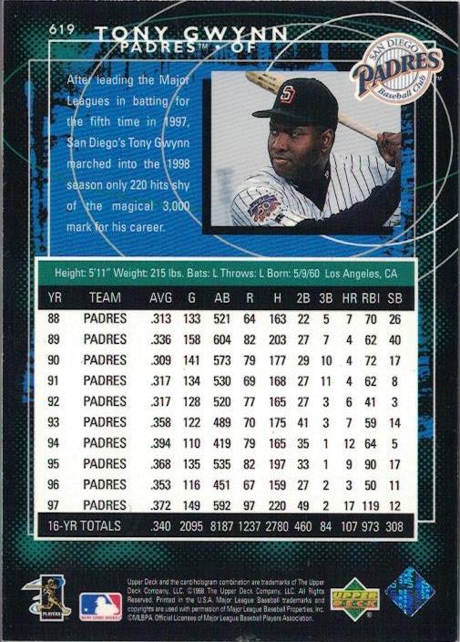
There is a full height portrait on the back. Tony looks relaxed in the outfield. Notice the batting gloves stuffed into his back pocket. I'm glad the designer found space for that factoid next to the giant stats box. I didn't know that Tony had never finished lower than sixth in the batting table up to this point. Even his less productive seasons were top ten material. 

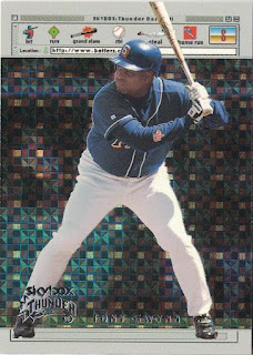
Card Number 998: Score Hall of Gold, 1995; #HG14

This insert series was really just an excuse for Score to produce really shiny cards! The photo is a almost Toppsian masterclass in showing a player without showing any of their identifying features!


27 years after this card was released, it annoys me that Score didn't choose to use a photo where Tony's face was visible. If they were going to bother including him in the insert set it seems sensible to actually use such a photo. We know they had those photos available - because they used one on the back of the card!


As insert cards go, I don't mind shiny. But there are several design mistakes here on the back. Firstly they dropped his name onto the photo with an odd placement. Tony's name isn't placed centrally, making the whole thing slightly off-kilter.  Then they put white text on over Tony's white uniform, making it unreadable. Even the drop shadows on the font (so nineties!) can't make the letters legible. The borders are unequal too, and the black line chops off Tony's body on either side. Overall it's a poorly executed mess.

Card Number 999: Score Dream Team Gold, 1995; #DG8

And just to round off the post, an almost-unscannable hologram card. 


Holograms aren't particularly interesting to me. And they are impossible to reproduce in blog-friendly form. Although this scan does show some of the detail hidden in the hologram.

The back has a pure nineties colour scheme with it's gradated hot pink, teal and orange. This card is so nineties, I feel like staring at it for any length of time might give me time travelling powers so I can go back 30 years!


It's not really possible to understand nineties baseball card design without understanding how computers revolutionised the way baseball cards were laid out. Why else would you have one green letter in Tony's name? Or different kerning for his first name and his surname? Even the stars have a 3D effect drop shadow going on.

Although it seems like I am mocking the way cards were designed in the nineties, these are actually beautiful mementos of a long-gone decade. It was a time of hope and optimism - a new century was only a few years away, and who knew what wonders lay just over that millennial horizon? It maybe hasn't turned out as planned, which makes me feel wistful for the short window of history encapsulated in cards released in the 1990s.

Total: 999 cards


Wednesday, March 30, 2022

The Dawn of the Chrome Age

1993 - the year Topps started making "chrome" cards. Except they weren't called Chrome, they were called Finest...

Card 989: Topps Baseball's Finest, 1993; #77

There were 199 cards in this groundbreaking set from Topps as they aimed for the "super-premium market" (in the words of BaseballCardPedia). Topps announced a limited print run of 4,000 for the entire 'Finest' set - apparently the first time a card publisher had annonced production figures. [EDIT - I got this wrong, thanks to Fuji for pointing it out in the comments!]

The cards are super shiny and glow under my overhead scanner.  


The back is less remarkable. Topps clearly couldn't be bothered about making the backs looks like a premium product. It does have a photo, although Tony has a "Sure, Jan" expression on his face as he strokes his chin.

Sometimes, looking at these evolutionary stages of baseball card design makes me think how things could have turned out differently. If this product had bombed, instead of being jumped on by eager collectors with magpie instincts, Topps might have written off the chroming process as an expensive mistake. That would have curbed their urge to produce 'chrome' versions of everything in sight in later years.

But Finest was a massive hit when it was released and from then on up to the present day hordes of collectors swoop on shiny cards every time they are released!

Total: 989 cards

Wednesday, March 2, 2022

Going Elite!

Shiny cards that don't scan as good as they look in hand! Welcome to the world of Elite cards by DonRuss...

Card Number 980: DonRuss Elite, 1996; #72

There were 12 of these inserts in the DonRuss flagship set numbered from 60 to 72. These numbers followed on from previous 12-card sets since the first set of Elite cards in the 1991 set. Elite were reasonably rare, with 1 card in every 75 packs in series 1 and 1 in every 40 packs in series 2 of DonRuss cards. But card #72 only appeared in series 2. 

It's not very visible on the scan, but this card has a shiny border all around the card. Tony is jogging the bases in the photo with an apocalyptic mid-90s sky behind him.


A couple of things of note on the card back. Firstly, the card number is written out in full, 15 years before Topps started doing that sort of nonsense on Allen & Ginter cards. (But even Topps don't write out the card number in full!)

Secondly, these cards were numbered out of 10,000. There's always something a bit special about a numbered card, even when it's a five digit limited run. This particular one is #509 - I can't think of anything particularly special about that number. 


Card Number 981: DonRuss Elite, 1998; #9
by 1998, DonRuss was issuing 'Elite' as a standalone high end set of 150 shiny cards. This card is so shiny it was a real rascal to scan. 


Despite the shininess, and the price tag on packs to match, this is quite a boring card. The back isn't much better. I ding points for partial stats boxes. Ding!


Card Number 982: DonRuss Elite, 2001; #24
Another shiny card that doesn't scan to it's full potential.


The font for Tony's name and the title on the stats box has to be one of the schmanciest serif fonts ever used on a baseball card. It's pure font luxury.


This was from Tony's final season where he was probably an onlooker from the bench more often than he would have liked - so that's a fitting photo on the cardback there. 

Total: 982 cards

Tuesday, February 22, 2022

Tuesday Twins - more Gold Label parallels

Following on from yesterday's Gold Label cards from 2021, here are some more from the Topps range that perpetuates the class system.

Card Number 963: Topps Gold Label Class 1, 2019; #92

As with the more recent cards that I blogged yesterday, this card juxtaposes an older photo of Tony with a more recent one. In this case it's a photo from either 1985 or 1986 and a photo that's probably from 2001.


Like the cards from 2021, the cardback has Tony's 'average season' stats and states that Tony's season best batting average was .372. I still can't decide if this is an error by Topps or just someone behind the scenes being a pedantic dork and discounting the stats from 1994 because it wasn't a 162 game season. Whatever the reason, Topps has been printing this stat for a while. 


The factoid is a useful illustration of how well Tony hit in the clutch. He didn't often get to two strikes as he liked to swing at the first pitch if he could. But when he got to two strikes, it was very rare that he would get to three.

Card Number 963: Topps Gold Label Class 1 (black parallel), 2019; #92

Like yesterday, here is a black parallel to compare with the regular class 1 card.


The black parallel looks much more striking as a card, and also makes the 'class 1' lettering much more obvious in the scan.

I have a confession - the cardback I showed you previously could have been from either the regular or the parallel. I scanned them together and can't tell them apart. Here's a scan of both of them to show what I mean.


And, as a bonus, another card from the same set and same year...

Card Number 965: Topps Gold Label Class 2, 2019; #92


I really like the white Padres uniform with the yellow, orange and brown accents. That uniform is the one worn by the team in the 1984 World Series, and replaced almost immediately with the switch to pinstripes for the 1985 season. (Maybe it's because I'm a child of the seventies, but it feels to me that the move to pinstripes in the 1980s was a boring choice!)

The cardback is the same again, complete with the description of Tony's batting after two strikes as "preposterous", and a mention of Wade Boggs.

With baseball itself very much in the balance for 2022, I don't know if Gold Label is scheduled to appear again. I'm waiting to see if Topps persist with claiming Tony's best batting average is .372. If Topps do, then I might get in touch with them and ask what their reasoning is. 

Total: 965 cards

Sunday, February 20, 2022

One Card Only - shredded foil on a Pacific Prism

Card Number 960: Pacific Prisms, 1996; #P-61
Unusually for Pacific, this set doesn't have the set name on it, just the Crown Collection logo. These cards were sold in packs of 2 - one Prism and a bonus card.


The foil effect looks like the card has been clawed by a big cat. It's an eye-catching design that looks very different to Prism cards released in other years.

The cardback is bilingual because Pacific specifically targeted the Spanish-speaking market.


There's no real reason for the card number to have a P in front of it. All the other cards shipped with Prism cards had different letter codes in front of the numbers depending what small set they were from. Having a P in front of the numbers on the main cards in the set makes is feel like a whole set made up of inserts!

Total: 960 cards


Thursday, February 17, 2022

Flying high with Skybox

Skybox and Fleer were merged together when Marvel acquired both companies and then stayed together after Marvel went bankrupt and sold off their trading card companies as a going concern. (That sentence is proof, if any were needed, that the 90s was a different time. Imagine Marvel going bankrupt now!) 

Anyway, as part of the Fleer family, it's fitting that some Skybox cards are squeezed into Fabulous Fleer Fortnight.

Card Number 951: Skybox Supernatural, 1999; #141

This has a metal sheen to it similar to the Skybox Metal Universe cards. It makes it a rascal to scan.


The awkward poise in the photo, combined with the finish and the colouration of this card, make me feel slightly uncomfortable. Tony is running, but it looks like he is jumping. His bat is flying off the card. It's all angular and weird, mainly because of the graphic design choices. 

The back is remarkably restrained for a Skybox card. An unfussy picture and a big stats box. The curves on the stats box are unusual.


Card Number 952: Skybox Thunder www.Batterz.com, 1999; #4

That web address is part of the name of this 10-card insert series insert series from Skybox Thunder. It's all fancy and cyberspacey because it was 1999 and the Internet was going to change the world! In case you think I'm joking, look there is a vintage web page header on the card front!


On the back we get a pure trademark Skybox weird cardback write-up that kicks off with plagiarising 'Ghetto Superstar' by Pras. 


There is also another reference to 'Death, taxes and Tony Gwynn batting over .300' being the only certainties in life! This one predates the Fleer Focus card from 2000 that I blogged about a couple of days ago. Not content with plagiarising popular songs, Fleer also reused their own weird descriptions!

One day, when I run out of new cards to blog I am going to do a 'Best of Skybox Weird Write-ups' post. I promise. (Remind me of this and hold me to my promise!

That batterz.com web address is long dead by the way. But continuing on the Internet theme...

Card Number 953: Skybox E-ticket, 2000; #9

Back in 2000 just about every word had an "e" attached to make it internetty. Also, check out the hand cursor icon. 


On the back is a slightly more restrained write up. There is also another long-dead website that a keen fan could surf to and look at more photos. How many more photos? It feels to me that if Fleer had lots of photos they wouldn't have used the same photo on the front as they did on the back. That pixellation effect doesn't fool me!


I love these late 90s nostalgic reminders of the innocent days of the Internet when it was all shiny and exciting and the thought of seeing more photos would persuade people to type a web address into their computer. Who would have predicted it would have ended up where we are now?

Total: 953 cards

Sunday, February 13, 2022

One Card Only - FFF Focal point

Fleer Focus was a short lived Fleer range in the early noughties. It had some nice cards in it though.

Card Number 945: Fleer Focus Focal Points insert, 2000 #2F

A shiny front. Fleer did a lot of shiny cards.


On the back we have a trademark Fleer oddly written blurb that starts with "Death, taxes and Tony Gwynn batting .300."


As it's a card from 2000, it mentions Tony topping the 3,000 hit mark in the previous season.

Total: 945 cards


Thursday, February 3, 2022

Limited Leafs

A couple of mid-90s shiny cards to brighten up your Thursday!

Card Number 916: Leaf Limited, 1994; #152

You can tell this is a high end card because Tony's name is written in fancy cursive script!


This is so shiny is scans a different colour depending how much light is getting into the room. (I'm using the overhead scanner for this and, seriously, the cards change colour if the sun goes behind a cloud while I'm scanning!) So, sometimes the card looks like this. 


On the back we get a quote from Ozzie Smith, which is superb hyperbole. (Superbole?


"Tonys mechanicals are so good they enable him to get hits when he's not hitting. There's no stopping him, you just try to slow him down."

No, I don't know what 'getting hits when he's not hitting' means either. The cameo portrait has a classy surround with that feathered pattern. I'll award a bonus point for including the set name, although it is prominent on the front as well. The one year stats line includes the years he had been active up to this point. That feels like an unusual inclusion in a one-line stats box.

Card Number 917: Leaf Limited Gold, 1995; #20

There were 192 cards in this high end set, and 24 further cards in the 'Gold' insert series, which looked a lot like the regular cards (as can be seen here). They used different photos and the card had a gold back instead of the usual silver. The Gold cards were included at a rate of 1 per pack. 

This time it's the team name in the fancy cursive script.


For some reason they decided to crop off Tony's feet. The converging shiny lines combined with the Leaf Limited logo make it look like he is stading in front of a giant badminton shuttlecock. 

Here's the gold back - with the cursive script used for Tony's name. There's no quote this time, meaning there is space for a breakdown of Tony's monthly stats across his entire career. I was surprised to see July was the month Tony recorded his lowest batting averages. (At least, up to the end of the 1994 season!)


All the cards in Leaf Limited - base and inserts - were limited to a print run of 37,500 cards, apart from the 'Lumberjacks' insert series that were numbered in a print run of 5,000. Tony didn't have a Lumberjack card, but he did have a 'Bat Patrol' insert card (previously blogged here), giving him three cards in quite a small set.

Total: 917 cards 

Sunday, December 12, 2021

One Card Only - Dynagon!

Today's one card only is for Richard (YoRicha) because I know how much he loves Pacific cards.

Card Number 880: Pacific Dynagon Diamond, 1999; #19

This was one of 20 cards in an insert series in Pacific's flagship set in 1999.


It's bright shiny green foil with a whirly swirly background. 

This card gets 19 bonus points for being the 19th card in the set. Pacific were one of the card companies that paid close attention to card numbering. Another reason why the card hobby was poorer when they ceased trading.


The background of this card does make it feel like a baseball is flying straight at your face! Best read it quick!

Total: 880 cards