
Sportflics got updated in the mid-90s to Sportflix. The cards continued using the same lenticular finish though, making them difficult to capture properly for blogging purposes. I've had a go...
Card Number 1016: Sportflics 2000, 1994; #25
(They added '2000' to the set name because back in 1994, "2000" was really futuristic. The Millennium was coming!)


The way Tony's name moves when this card is tilted is quite nifty.
I hope that silhouette on the back is actually Tony's silhouette, but I suspect it isn't. The photo looks familiar, but I've gone through my Pinnacle Brands binder and I can't see this particular photo used on any other cards. Pinnacle used a lot of photos that look like this in their various sets - they often used head and shoulders candid non-game shots on their cardbacks. So it's more the type of photo that's triggering my deja vu rather than the actual photo.

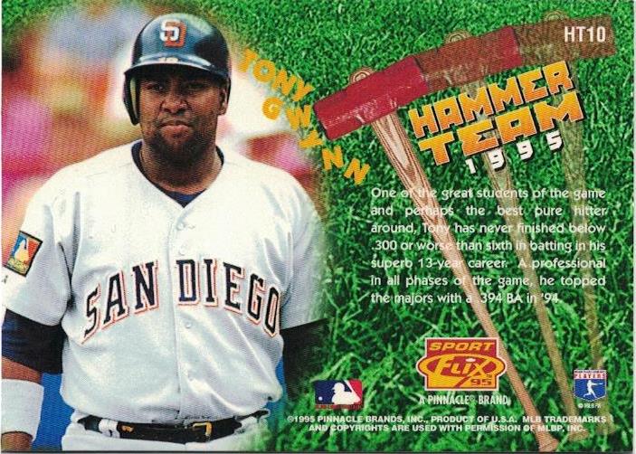
Card Number 1017: Sportflix, 1995: #HT10
This card was in the Hammer Team insert set for successful batters. (The base card is blogged here!) Tony is dodging a rain of sledgehammers on the front.

It is all a bit reminiscent of those brothers with hammers in a certain cartridge-based video game manufactured by a Japanese company starring an Italian plumber.
A hammer is falling towards Tony on the back as well!
1995 was the peak year for Sportflix as, in addition to the lenticular set, there was also a 3D set called UC3. (Yesterday I was blogging about UD3. Today it's UC3! Tomorrow it's... no, I don't have a set called UB3.)
Card Number 1018: Sportflix UC3, 1995; #133
This is the second 'base' card in the set with Tony on. I blogged the other one previously here.

3D cards don't scan well, but they're better than lenticular cards. On the back we go "In-Depth" which is hyphenated for some strange reason. That's a very short summary considering. It doesn't feel like it is in any depth.

And do you see my point about head and shoulders candid non-game photos on the cardback? Because here's another one.
Tony had a third UC3 card. It's another quirky insert.
Card Number 1019: Sportflix UC£, 1995; #CS13
Tony is a member of the Cyclone Squad! It sounds pretty cool even if it doesn't really mean anything.

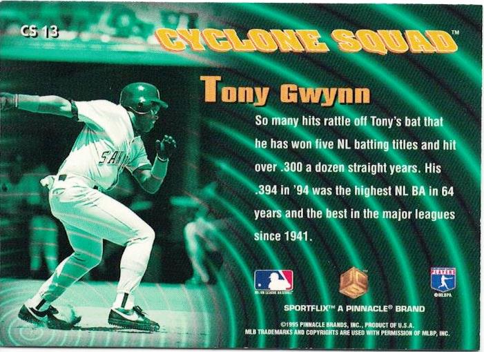
The effect on the back is meant to be cyclone-related but it just reminds me of the Rebel Alliance tactics room at the end of Star Wars: A New Hope, as Princess Leia waits to hear if Luke Skywalker has blown up the Death Star.

Card Number 1020: Sportflics, 1996; #9
And back to the lenticular cards. As this card is tilted it flicks (or flix) between Tony's name...


The back is probably the best-designed Sportflix cardback, listing the previous season's stats and Tony's career stats. Tony has an odd expression in the photo, though, even if it is the tried and tested candid non-game style photo!

That's it for my collection of Sportflix cards. 1996 was the final year they were produced, and I think overall I have now blogged the complete run.
I hope so, because I really don't like scanning lenticular cards!
Total: 1020 cards
Lenticular cards are always better in person. Sportflics were my jam back in the 80's. It sort of lost its luster in the 90's for me, but I enjoy them now. As for the the Rebel base on the back of the card... I can see it. Although I doubt that would have popped into my head without you mentioning it.
ReplyDeleteYes, my only gripe is that they are so annoying to scan!
Delete