Showing posts with label Allen & Ginter. Show all posts

Monday, April 4, 2022

Modern Monday - Allen & Ginter shiny bubble

This could be a 'twin' card. It's a "hotbox parallel" card courtesy of Gawain.

Card Number 992: Topps Allen & Ginter [hotbox parallel], 2021; #53

The flatbed scan is remarkably dull.


The overhead scan is a bit brighter. The 'bubble' has an odd pearlescent finish that just doesn't scan very nicely.


I missed this detail when I blogged about the regular base version of this card, but this card is #53 in the set - which is a meaningful number because it was the number Tony wore in Spring Training in 1982 and thus became the number on his shirt in the photo on his Topps rookie card in 1983

I would like to think that is a deliberate numbering choice by Topps that would only be spotted by number-obsessed weirdo bloggers, like a little in-joke between us. But it could equally just be a random coincidence. 

The card numbering is the only interesting thing on the back of the as-dull-as-usual cardback. 


Total: 992 cards

Monday, January 31, 2022

Modern Monday - a framed relic from A&G

This was an eBay purchase that arrived in the first few days of 2022.

Card Number 911: Allen & Ginter framed mini-relic, 2021; #MFR-TG


The mini card could be popped out of the frame if one so wished to do that. The swatch is a dark blue that could be a Padres uniform from the latter end of Tony's career. The photo is an interesting choice because it isn't the photo used on the Allen & Ginter base card or mini in 2021. Here's a reminder of what that card looked like.


The relic card looks like it has been rendered off the photo used by Topps for the Stadium Club Chrome card in 2020.


I haven't got an explanation why Topps switched out the photos for the mini-relic card. The eBay win included a 2021 Allen & Ginter relic card of Trent Grisham as well, and that used the same photo as his base card. That was a full-sized relic card, though.

The back looks nicer than the average Allen & Ginter card. The card acts as a guarantee of the genuineness of the cloth swatch, except...


... below the logo, it says the memorabilia isn't from "any specific game, event or season". So, what exactly is it from? 

Topps have produced relic cards for Tony for the last few years and I'm beginning to wonder how they are doing this. Surely at some point, they will run out of articles of clothing that Tony touched. This is beginning to feel like the trade in religious relics in Europe in the Middle Ages, when there were enough venerated bits of wood, all supposedly from the cross that Jesus was crucified on, to build a large structure. All those holy relics, ranging from bits of bone from long-dead saints to items touched or blessed by Jesus himself or his mother, often had very vague provenance. Topps seem to be following a similar path in terms of guaranteeing the genuineness of a relic while issuing a subtle disclaimer.

Total: 911 cards


Tuesday, October 5, 2021

Tuesday Twins - photo edition

When I looked through the cards that Richard sent me recently, two cards matched so much I instantly thought, 'That's a twins post!'

Card Number 760: Topps All-Star Collector's Edition, 1985; #29

This was the first time Tony was included in these sets of glossy cards that were mailed to collectors who sent in tokens. I have previously blogged some of his cards from these sets that were issued in later years.


That yellow shirt was history in 1985. After reaching the World Series in 1984, the Padres revealed an all new look for the following season - white pinstripes at home and grey pinstripes for the road uniforms. The background of this photo makes me wonder if is was taken at a Spring Training game in 1984. Topps used photos taken at Spring Training on some cards.

The back of this card is very dull. The glossy photo on the front is supposed to make up for having nothing to look at on the back.


The other card this matches also has a dull cardback.

Card Number 761: Topps Allen & Ginter, 2012; #205

Topps had been releasing Allen & Ginter sets since 2006 but I think this is the first time Tony appeared in one of the sets. He is also on an insert card from this set.

And, there it is, 27 years after Topps produced that glossy All-Star card, the same picture appears with a small filter applied to make it look more like it has been drawn.


And here is the back. This must have felt fun and quirky once, but I feel the novelty has worn off. 


This isn't the only time Topps re-used the photo. In 2013 they mocked up what an All-Star card from 1984 could have looked like. (At least the uniform would have been right on that card!)


Topps go through phases of using the same photos in several sets released around about the same time, so seeing this picture in sets released in successive years isn't that surprising. It's a nice photo, so I'm not complaining. It was just a bit odd getting two cards in the same parcel that were released so far apart and yet look so similar.

Total: 761 cards

Monday, August 23, 2021

Gawain got me some Ginter

A little padded envelope arrived on the weekend from Gawain. It was a set of this year's Padres cards in the Allen & Ginter retro range. Tony had a base card in the set and Gawain dropped in a bonus as well.

Card Number 713: Topps Allen & Ginter, 2021; #53


I doubt it's deliberate but the pink outline around the picture make it look a bit like Tony is trapped in a giant bubblegum bubble, particularly the wispy bits on the top and bottom. 

I like the look of this card, even though the designer has clearly used the art filter to re-render the photo that Topps used on last year's Topps short print card


It was also on the back of this year's card in the Stadium Club range.


They obviously like this photo.

The back is, well, it's what Topps do with Allen & Ginter cards. It's tedious but they've been doing it for so long they aren't going to change.


The bonus card that Gawain generously added in was the mini parallel!

Card Number 714: Topps Allen & Ginter Mini, 2021; #53


Smaller card. Smaller bubblegum bubble effect.


The cardback is just a scaled down version of what appears on the regular card. There are lots of different parallel versions of this card with different cardbacks that sort of replicate cigarette cardbacks of yore (except without any references to cigarettes).

The big news in the baseball card world this week is that Topps are likely to lose their exclusive monopoly to produce cards, with both the Player's Association and MLB signing deals with another company. While I have said for a while that I don't think the monopoly position was particularly helpful to the hobby as it meant Topps weren't being pushed to keep things fresh, I don't think the solution is to have a different company enjoying a monopoly position. 

And the big news in my blogging world this week is that a large selection of cards might be incoming which will keep me posting well past the end of the baseball season and probably into next year! Until then, stay safe everyone and thank you for reading.

Total: 714 cards


Wednesday, April 7, 2021

Great Ginter cards

I have been critical of the Allen & Ginter range from Topps previously on this blog. Like the other retro ranges that Topps produce, the cards can feel a bit tired. However, one of their inserts is up there as one of my favourite card designs ever - the Star Signs insert from 2019. Topps had a good year in 2019, insert-wise because here's another nice insert from the same year.

Card Number 635: Topps Allen & Ginter 'Ginter's Greats' insert, 2019; #GG13

Greatest ever to hold a bat and ball, says the tagline. No arguments with that.


There were 50 cards in this set of all-time greats. There's a lot to like in this picture, from the background with the heraldic crossed bats and baseball, through to the choice of image - Tony with his arms folded, concentrating on something. 

It has a great write up on the cardback too, recounting Tony's success against Hall of Fame pitcher Greg Maddux. Does anyone want to suggest what word is replaced in the quote by [blanking]?


Topps were definitely playing a strong game with the cards featuring Tony in 2019. The base card is pretty nice too. But I really like this parallel version.

Card Number 636: Topps Allen & Ginter Gold Hot Box parallel, 2019; #77

I can't find a statistic for the frequency of 'hot boxes' but from looking at rip videos, all the base cards in a hot box had this gold foil filigree border. 


The border really enhances this product and I can imagine ripping a box and finding these cards as the ordinary 'base' cards would be pretty special.

The back is the same as the regular base card, with its pretentious writing out of the numbers using words. I can forgive the pretentiousness this time because the front is so nice.


I am slowly starting to appreciate Allen & Ginter a bit more. 2019 is fast becoming my favourite set because of this nice parallel and the high quality insert cards.

Total: 636 cards

Tuesday, January 19, 2021

Tuesday Twins - X exclusive

I hadn't heard of Allen & Ginter X until Paul from the Facebook group sent me a picture of this card. Apparently it was an online exclusive version of Allen & Ginter. I have expressed reservations about the Allen & Ginter shebang a few times now. And yet, this is the fifth version of this card in my collection.

Card Number 576: Topps Allen & Ginter X, 2020; #128

The card is black. Classy.


Actually, to be fair, the three in a row look really nice sitting next to each other.


The main thing about the X card is that 'Gwynn' is much more prominent than on the regular base card or the chrome version. I thought the chrome was a definite improvement on the regular base. I'm almost of the opinion that the X is an improvement on the chrome. Almost.

The back looks like every other regular Allen & Ginter card.


I don't like the way Topps write out the numbers. I get that it's retro and trying to be quirky, but the charm has worn off for me. 

And just like that, I'm back on blogging break.

(Thanks again, Paul.)

Total: 576 cards


Tuesday, January 12, 2021

Tuesday Twins - shiny Allen & Ginter

Like they did with Stadium Club, Topps gave their Allen & Ginter range the Chrome treatment at the extreme end of 2020. And like he did with Stadium Club, my friend Gawain opened a few boxes and along the way found me some Tony Gwynn cards!

These work as 'twins' in two different ways. They are the same as each other and the same designs as the regular Allen & Ginter non-chrome release.

Card Number 571: Topps Allen & Ginter Chrome, 2020; #128


Although this is the same card as the base range, the Chrome effect makes it look a lot more impressive. (Judge for yourself by comparing with the original version I blogged about two months ago.)

The cardback is exactly the same as the regular Allen & Ginter release. As ever, I feel it's a bit pretentious writing out the numbers as words.


As in the regular release, all the base cards were produced as 'mini' versions as well. And one tipped up in Gawain's ripping adventure.

Card Number 572: Topps Allen & Ginter Chrome (Mini), 2020; #128

This also looks a lot more impressive as a Chrome card than the regular release. The picture has been cropped but is exactly the same image as the normal-sized card.

The back is the regular cardback shrunk to fit. However, the version of this I own from the regular release has a parallel "A&G" cardback, so this cardback is different to the one I had previously.


Even though there is nothing particularly new about this release, these are very nice cards, and are an improvement on the normal set. I'm very grateful to Gawain for putting these to one side for me as he was opening the cards. I already owe him several beers and one day, when we are allowed to meet up on the other side of this pandemic, I think I owe him yet another one!

Total: 572 cards


Monday, November 9, 2020

Modern Monday: back to Allen & Ginter (and an A&G back)

One of the first posts on this blog was about two Allen & Ginter inserts, and last month I blogged about a couple of base cards from earlier in the decade. In the last couple of weeks some more up-to-date base have come through the post, so here are the base cards from the last couple of years, and a bonus.

Card Number 468: Topps Allen & Ginter, 2019; #77

The front is a nice portrait rendered like a painting, as is the Allen & Ginter style. This is obviously adapted from a photo taken in 1999 - it's easy to tell because of the prominent 30th anniversary sleeve patch.


The back is the same quirky / tiresome list of statistics with the numbers written out in full.


Card Number 469, Topps Allen & Ginter, 2020; #128
It's harder to date the source photo for this card to a particular season, but I'd guess it's around about 1988, based on the brown jacket and Tony's moustache.


The cardback design is slightly less fussy.


Card Number 470: Topps Allen & Ginter Mini, 2020; #128 (A&G back parallel)

And the bonus card! All Allen & Ginter base cards have a 'mini' parallel that's cigarette card sized. Every pack of Allen & Ginter 2020 had one of these parallels in it. And this is a parallel of a parallel because it has a different cardback - these versions were only available at a rate of one in five packs. 

The front picture is cropped slightly to fit the new card dimensions.


And this is the back with a big A&G logo on. It looks a lot better than the typical list of statistics.


I've commented before about the links with tobacco companies of yore on modern day cards. I don't need to say anything more about that. But this cardback is so much better than the standard ones, I'm not going to criticise Topps again for it. I have noticed that Topps say they are commemorating the picture cards that came out in 1887, rather than saying the tobacco or cigarette cards. If you didn't know Allen & Ginter were once one of the biggest cigarette companies in the world, then you wouldn't have a problem with it.

(And on that historical note, Allen & Ginter was a comparatively progressive company in its own way. They were the first cigarette rolling company to employ women - although that might have been because they could pay women less than men. They were also innovative, the first American company to try and develop mechanised cigarette rolling. If that had been totally successful, they wouldn't have need so many employees, so maybe that's less laudable.)

I'd like to thank Gawain and Andy M for sourcing and sending me these cards - cheers, chaps!

Total: 470 cards


Thursday, October 1, 2020

Back to Base: Allen & Ginter

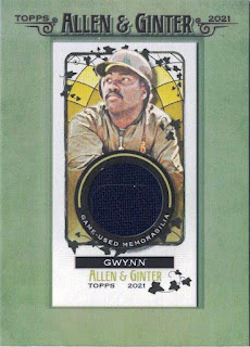
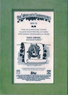
Allen & Ginter World's Champions baseball cards have been issued by Topps for several years now. In addition to baseball players there are usually a number of random quirky cards included in the sets as well, along with "Rip" cards that contain another image under the photo and ask the holder if they will 'keep it or rip it?' and a variety of other inserts, mini cards, relics, autographs and so on.

The original Allen & Ginter was a tobacco company in the 19th Century. The link between baseball cards and tobacco companies predates the link with bubblegum, and a surprising number of very old tobacco brands have been resurrected by the card companies in this century. Upper Deck have their Goodwin's Champions, and Topps release their very high end "206" product and the Gypsy Queen range. 

I am ambivalent about the use of long-gone tobacco company names by card companies. While they aren't recognisable brands and the association with packets of cigarettes or tobacco are purely historical, there is an anachronism that tobacco advertising has disappeared from sports grounds within the last 30 years or so, and yet card companies are still preserving the link between tobacco and the sport, albeit in a very obscure way. (Cigarette advertising has sometimes inadvertently appeared on cards. There's a Marlboro ad in the background of a card from 1994, which was shortly before advertising was banned altogether.)

However, as a fan and chronicler of Tony Gwynn's career, I can't escape the fact his life was cut incredibly short because of chewing tobacco and I am supportive of efforts to ban tobacco entirely from the sport. So, that's another reason why I have mixed feelings about these particular card sets.

And, being honest, the cards themselves aren't particularly interesting to warrant the fuss that is made over them by some collectors. The insert series can sometimes be quite nice -  I really liked the Star Signs card featured on this blog in one of my first posts - but the sets tend to blend into each other and the cards all feel very samey. I have similar feelings towards Gypsy Queen and Panini Prizm cards. Still, at least they put the set years on the front so it's easy to tell them apart.

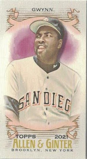
Card Number 385: Topps Allen & Ginter, 2013; #97


The enforced quirkiness of the Allen & Ginter brand is shown on the front where they just have the player's surname and don't mention the team. In the photo, Tony is wearing a batting practice jersey - Mitchell & Ness have produced a replica of this top complete with the number 19 on the back.

If the front is quirky, the back is similarly trying to be eccentric in its disdain for numerals, instead writing the key numbers out in full words. (Except for the card number.)


At least it's a different way of summarising and displaying career stats. For a known contact hitter, Tony was afforded very few walks in his career. That's probably because he wasn't a home run slugger like the all-time record holder Barry Bonds. But even Ted Williams, Tony's hitting hero, received over 2,000 walks in his career.

As I noted when I reviewed this year's Topps Archives card on Monday, they have decided to print Tony's weight at the end of his career, which seems rather mean-spirited. He didn't weigh 225lbs when he stole most of those 319 Stolen Bases!

Card Number 386: Topps Allen & Ginter, 2014; #223
This year the team name was on the front of the card. It's a photo of Tony in his batting stance - a classic pose for a hitting champion.


The back was very similar to the previous year's card, except it was printed in blue ink rather than black.


As the cardback is to all intents and purposes the same as the previous year, there is very little else to say about it.

Total: 386/394


Wednesday, May 20, 2020

Astrology and onomastics in Allen & Ginter

I've been dwelling in the 90s for my last few posts, so here are some more recent cards that have come my way.

Allen & Ginter (A&G) is a Topps brand of retro looking cards, which I quite like. They are a more expensive product and include a lot of retired stars in their sets every year, usually in their insert series based around a gimmick.

Card Number 35: Topps Allen & Ginter 2012; #WIN48
In 2012, the A&G gimmick was names. "What's in a Name?" they asked.


The field of studying names is called onomastics. "Anthony" derives from the Latin and could mean "Priceless". "Keith" is a Scottish name originally. There are places called Keith, one of which has a soccer team called Keith FC, and players playing for that team also called Keith. (Their current captain is Cameron Keith!) It's probably from Gaelic and could mean "wind" or "wood". "Gwynn" has a Welsh origin (Yay!) - the word 'gwyn' in Welsh means "White". (Gwin gwyn means white wine!)

A&G ignored all these possible names and focussed on his epithet, "senior". When he was playing, Tony was never known as Tony Gwynn Sr. A&G used it so they could write about his son, Anthony Keith Gwynn Jr, who has also had a respectable major league baseball career.


I admit I feel silly quibbling with what's written on the backs of baseball cards, but there is a lot that could be made out of a "priceless" wielder of "wood" when talking about a baseball player known for his batting! It's almost as if Topps had their stock of factoids pre-written and then had to somehow shoehorn them into the A&G theme.

Card Number 36: Topps Allen & Ginter 2019, #BSS42
In 2018, the gimmick was starsigns for the baseball stars. I can see the logic to that. I was sent this card recently by Allan who is part of the UK baseball collecting community on Facebook. Thanks, Allan!


This is an absolutely gorgeous card design.


The back is a lot more relevant than the 'What's in a Name?' card from 2012, although there are several attributes for Taurus that could be applied to Tony. 'Generous' - he was given the Branch Rickey Award in 1995, the Lou Gehrig Award in 1998 and the Roberto Clemente Award in 1999, all for his philanthropic work. 'Extremely focused' - his focus on hitting caused tensions with some of his team-mates. 'Prefers simplicity' - this is a common theme in the memories people share about him in He Left His Heart in San Diego. I guess you can't include everything on the back of a baseball card and loyalty was a great part of what made Tony Gwynn special.

Total: 36/394