I have some cards from the new 2022 Topps release on their way to me in the mail! In the meantime, here is a card from last year that looks a bit older.
Card Number 975: Topps Archives, 2021; #140
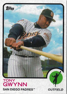
Topps used seven different former card templates in their 2021 release of Topps Archives. Tony appears on a card laid out in the 1973 template.
I have zero complaints about that card front. It's a great photo that works well with the design. Tony's face is visible and so is the team name on his chest. Neither of those things are a guarantee with photos that Topps put on cards!
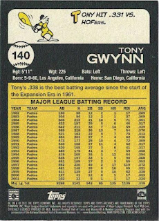
On the back we have a little cartoon guy wielding a bat that looks like a bowling pin, and a succinct factoid. I'm going to award this card a bonus point for that. There's a second concise factoid just above the stats box.
I am sometimes critical of Topps, but this is probably as close as it gets to the perfect baseball card.
A big thank you goes out to Gawain for sending me this card!
Total: 975 cards


Topps Archives is such a nice and nostalgic product. I hardly ever have a complaint about them. The only thing that I think would make any Topps Archives set a little better in my opinion is if the card stock was the same as the years design.
ReplyDeleteGreat card. 1973 Topps is a solid design. And that tidbit on Gwynn vs. HOFers is a neat piece of trivia. My only complain is that they zoomed in a tad bit much. I'm not a fan when they cut off things like the tip of the bat.
ReplyDelete@YoRicha - yes and they have gum stains for that genuine vintage thrill
ReplyDelete@Fuji - I almost included a comment that you would find the cropping annoying!
I mean they SHOULD have gum stains. (Missed out a crucial word there!)
DeleteGum stain variation would be so much better then Red, Orange, Silver, Refractor, and so on that is for sure!
Delete