Showing posts with label 2000. Show all posts

Wednesday, April 13, 2022

Into a new millennium of cards...

How do you follow the 1000th card on the blog? Well, blogging my first millennium of cards reminds me of celebrating the Millennium 22 years ago.  Here are some cards from two early-noughties sets that just about everybody has forgotten about.

Card Number 1001: DonRuss Champions, 2003; #221

Tony tips his hat on the front of a card celebrating a batting title eight years previously. 


This was an odd set with a lot of parallels and large insert sets. However, DonRuss were struggling for photos because they reused the photo on the back. The one line stats box is from Tony's last active season, for some reason. He was retired by 2003 and it could have just had his career totals.  


Card Number 1002: Fleer Mystique, 2000; #105

Fleer included the set name in the logo on the front and right across the background of this shiny card.


Fleer opted for the full stats box on the back. Tony has a faint white aura around him in the photo. 


Someone is probably working on a history of the Fleer company because what little I know is, frankly, incredible. There was a slew of these strange sets released when the company was in private ownership during the last ten years of its existence. Three sets of Mystique were released, in 1999, 2000 and 2003. That gap in release years is intriguing, as is the return for just one year.

Total: 1002 cards


Thursday, February 24, 2022

Some older Gold Label cards

I selected today's cards with Fuji and YoRicha in  mind, because they said they liked the Gold Label cards that I posted at the beginning of the week. All these cards are slightly pearlescent so I used the overhead scanner on them. The results are a bit flakey, but at least the design is visible. 

Card Number 968: Topps Gold label, 1998; #14

Awkward photo juxtaposition ahoy!


Seriously, that photo arrangement makes it look like Tony is kneecapping his larger self.

These 'cards' are printed on quite thick plasticky card - much thicker than usual card stock. The material they are printed on contributes to the sheen on the card. It also warps slightly. 

The candid photo on the back should have a thought bubble saying "Huh!?" next to it. 


Right, okay, back on Tuesday I questioned what Topps was doing by discounting the 1994 season and the .394 batting average that everyone associates with Tony on their modern Gold Label cards. Back in 1998, Topps didn't have an issue with Tony hitting .394 in a season that was shortened by strike action. Here they have it as his career best batting average. They also explain how they calculated the 'average season' using 'at bats' rather than the number of games. That makes more sense and just adds to my suspicion that the company's employees knew what they were doing back in the late 90s compared to the people working there now. 

I have one of the books mentioned in the factoid - Tony Gwynn's Total Baseball Player. One day I hope to get hold of The Art of Hitting as well. 

Card Number 969: Topps Gold Label Class 1, 1999; #6
Topps introduced the class system to the range in 1999 and the shine on the cards was even more iridescent.


That fielding photo looks really familiar, but I don't think it was on a Topps card.

On the back there is another cameo portrait of Tony with a quizzical expression. 


The factoid about Tony's loyalty doesn't mention that apparently other top players were annoyed with him for staying with the Padres because it was dragging down the market value of all the other players. (Did that really happen? Now it's all part of the mythos.)

For those taking notes, the career best batting average on this card is .394. Also, a bonus point for this card having the class number on the back (by the team logo) - which makes it a lot easier for people like me trying to work out which cardback is which!

Card Number 970: Topps Gold Label Class 2, 1999; #6
One of the photos has been changed on the front, along with the team logo behind Tony.


The cardback is virtually identical apart from the class number.


Card Number 971: Topps Gold Label Class 2, 2000; #11
In this year's set the class is printed on the front of the card, etched into the foil.


That photo on the back is from the photoshoot that Topps used on some of their tribute cards in the 2000 flagship set, except this time, Tony isn't looking straight down the camera lens.


So a couple of things about this cardback. Firstly, the important career batting average high point stat is correct! Secondly, a factoid about walks! This is a really rare topic for factoids, because although Tony drew a fair few walks (as is obvious by the factoid!), generally he made contact at the plate. Except when opponents opted not to pitch at all! 

I always love learning something new from a card - so kudos to Topps for this!

Total: 971 cards


Friday, February 18, 2022

Finishing Fleer Fortnight in a Traditional way

Fleer Tradition was the company's retro range at the tail end of the 90s and across the cusp of the millennium. It sometimes combined a mix of fairly ordinary looking cards with vintage style parallels and sometimes just went for a full set of full-on retro designs. Some sets also had some well-designed subsets and insert sets. One of my favourite Tony Gwynn cards ever is a Fleer Tradition insert that I blogged about in my first month of blogging.

Card Number 954: Fleer Tradition, 1998; #250

An unusual - and fantastic! - photo on the front of this base card. Tony has a pen in his hand so he was presumably turning that shirt into an autographed shirt!

The use of the shirt for the backdrop on the cardback is very effective. I've not seen it done on many (if any) cards. It seems like the sort of design technique that should appear frequently because it's such a simple yet impactful idea. 

There is lots more colour in the stats box than is usually applied on a card, whihc makes it easier to read than the usual rows of tiny numbers. Plenty of thought went into the design of this card.

Card Number 955: Fleer Tradition, 1998; #315

There were 10 "Golden Memories" cards in the middle of the 600 card Fleer Tradition set in 1998. It's a shiny card that looks really special but is actually 'just' a base card. Trading Card Database has a note that these cards were inserted at a ratio of 1 in 6 packs, which probably makes them more common than regular base cards.

The back has a flamboyant cameo frame and a factoid about how Tony scored 4 hits in 5 at bats against Greg Maddux in a game in 1997. 

Greg famously reckoned Tony was the only player it was impossible to strike out. It's always worth a re-quote.

“Sometimes hitters can pick up differences in spin. They can identify pitches if there are different release points or if a curveball starts with an upward hump as it leaves the pitcher’s hand. 
But if a pitcher can change speeds, every hitter is helpless, limited by human vision. 
Except for that f---ing Tony Gwynn.”

Card Number 956: Fleer Tradition Update, 1999; #U-145

Fleer Tradition was so popular in the late 90s is merited an update series, which included some season highlights from that year.


I doubt any regular readers don't know that the 6th August 1999 was the date of Tony's 3000th hit. This is one of the first cards released commemorating it. 


What is really strange is that Tony was the first player in 20 years to reach the 3,000 hit mark. The next player to reach 3,000 hits was Wade Boggs on the 7th August 1999. The day after Tony reached that milestone!

Card Number 957: Fleer Tradition Dividends insert, 2000; #9

Sometimes when an insert series has an odd name like 'Dividends', I just assume it's because baseball companies were running out of words...


Red borders always make a card look good. However, the offset nature of the black and white photo is a little jarring.

The same photo appears on the back, except it's rendered in sepia.

Although the write up implies hits were inevitable when Tony made a plate appearance, they were relatively rare in the 2000 season because Tony made comparatively few plate appearances - just 140 compared to 446 in 1999.

Total: 957 cards


Thursday, February 17, 2022

Flying high with Skybox

Skybox and Fleer were merged together when Marvel acquired both companies and then stayed together after Marvel went bankrupt and sold off their trading card companies as a going concern. (That sentence is proof, if any were needed, that the 90s was a different time. Imagine Marvel going bankrupt now!) 
Anyway, as part of the Fleer family, it's fitting that some Skybox cards are squeezed into Fabulous Fleer Fortnight.

Card Number 951: Skybox Supernatural, 1999; #141

This has a metal sheen to it similar to the Skybox Metal Universe cards. It makes it a rascal to scan.


The awkward poise in the photo, combined with the finish and the colouration of this card, make me feel slightly uncomfortable. Tony is running, but it looks like he is jumping. His bat is flying off the card. It's all angular and weird, mainly because of the graphic design choices. 

The back is remarkably restrained for a Skybox card. An unfussy picture and a big stats box. The curves on the stats box are unusual.


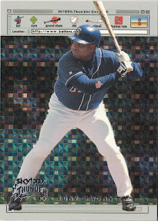
Card Number 952: Skybox Thunder www.Batterz.com, 1999; #4

That web address is part of the name of this 10-card insert series insert series from Skybox Thunder. It's all fancy and cyberspacey because it was 1999 and the Internet was going to change the world! In case you think I'm joking, look there is a vintage web page header on the card front!


On the back we get a pure trademark Skybox weird cardback write-up that kicks off with plagiarising 'Ghetto Superstar' by Pras. 


There is also another reference to 'Death, taxes and Tony Gwynn batting over .300' being the only certainties in life! This one predates the Fleer Focus card from 2000 that I blogged about a couple of days ago. Not content with plagiarising popular songs, Fleer also reused their own weird descriptions!

One day, when I run out of new cards to blog I am going to do a 'Best of Skybox Weird Write-ups' post. I promise. (Remind me of this and hold me to my promise!) 

That batterz.com web address is long dead by the way. But continuing on the Internet theme...

Card Number 953: Skybox E-ticket, 2000; #9

Back in 2000 just about every word had an "e" attached to make it internetty. Also, check out the hand cursor icon. 


On the back is a slightly more restrained write up. There is also another long-dead website that a keen fan could surf to and look at more photos. How many more photos? It feels to me that if Fleer had lots of photos they wouldn't have used the same photo on the front as they did on the back. That pixellation effect doesn't fool me!


I love these late 90s nostalgic reminders of the innocent days of the Internet when it was all shiny and exciting and the thought of seeing more photos would persuade people to type a web address into their computer. Who would have predicted it would have ended up where we are now?

Total: 953 cards

Wednesday, February 16, 2022

Back to Base - Fleer Ultra

I found it hard to believe that I still had some Fleer Ultra base cards to blog. As it's Fabulous Fleer Fortnight, this feels like the right time to rectify that!

Card Number 949: Fleer Ultra, 1996; #284

Tony has a bit of an odd expresson on the front. He looks poised to spring.


The back is... well, a bit of a mess really, with multiple photos dropped on top of each other.


I'm not too critical of single line stats boxes, but yellow was a poor choice of colour for it.

Card Number 950: Fleer Ultra, 2000; #4

The thing I like most about this photo on the front is that Tony's foot has left the ground as he begins his dash to first base. He looks like he's hovering. 


The font that Fleer used on the card front is really nice. It gets used again on the back, although that's not what is most noticeable!


Bright orange? Give Tony a glowing halo? Completely 'shop a photo so it looks like he's emerging from an apocalyptic firestorm? Yeah, let's do it! 

But seriously, however garish this cardback, it's better than the one from 1996!

Total: 950 cards.


Sunday, February 13, 2022

One Card Only - FFF Focal point

Fleer Focus was a short lived Fleer range in the early noughties. It had some nice cards in it though.

Card Number 945: Fleer Focus Focal Points insert, 2000 #2F

A shiny front. Fleer did a lot of shiny cards.


On the back we have a trademark Fleer oddly written blurb that starts with "Death, taxes and Tony Gwynn batting .300."


As it's a card from 2000, it mentions Tony topping the 3,000 hit mark in the previous season.

Total: 945 cards


Friday, February 4, 2022

Millennium Bowmans

A couple of Bowman cards from the year 2000! (Ah, Y2K, a simpler time. When all that was going to kill us was the imminent technological meltdown.)

Card Number 918: Bowman, 2000; #80

I've never really got the point of Bowman. It's a mid-point range, maybe a little more upmarket than Topps flagship. Pitched at true fans. Worthy, but dull. And never more dull than on the cusp of the 21st century when the designers thought grey would be the perfect colour for the borders on their cards. (Had they learned nothing from 1989 Fleer?)

Then there's the thing about reproducing the player's signature on the side of the card. It's Tony's signature from back when he was a rookie. However, in his career Tony signed so much stuff we know that isn't what his signature looks like. At all. 

Grey shabby chic look aside, I like the Bowman Briefing that was on the back of Bowman cards.

I checked out that 'evolution' stat. Technically, it's true (although Baseball Reference lists his batting average for 1981 at .376), but it feels slightly misleading saying it was his "first pro season" without mentioning that it was low down in the minor leagues with Amarillo and Walla-Walla.

Card Number 919: Bowman (Retro/Future parallel), 2000; #80

One of these parallels was included in every pack. They are shiny homages to the famous 1955 Bowman design where all the player's pictures were on images of televisions. It was futuristic back then, and decidedly retro by 2000.

It's the same picture of Tony on the front, cropped to fit in the television screen.

The back has the same photo and the Bowman Briefing. However the layout is different. The grey borders are gone!

The Retro/Future parallels are much more interesting than the base cards and would be a nice set to collect, although their relative scarcity compared to the regular versions of the cards might make it a bit harder to build the set.

Total: 919 cards


Thursday, January 20, 2022

Feeling Invincible in 2022

I realise it has been several weeks since I last blogged some cards. I have had my evenings occupied with other things so have neglected this a little. However, here we are in 2022. I have added a few cards to the collection while the blog has been on hiatus, so the number of cards waiting to be blogged has increased. (And I feel the pressure!)

I hope to get back to blogging regularly before the month is out. Meanwhile, here are some "Invincible" cards because we want to feel positive about the new year and invincibility is just positivity set to maximum!

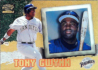
Card Number 901: Pacific Invincible, 1998; #139


I like these cards with their little acetate windows of clarity. This one is really shiny, so this is an overhead scan of the front. 

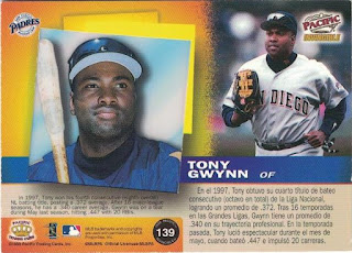
And a bilingual back! Because it's printed on acetate, the image of Tony is reversed out. 


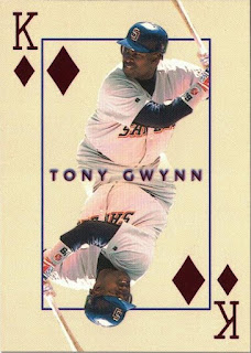
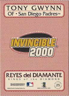
Card Number 902: Pacific Invincible Reyes del Diamante, 2000; #25

A variant on the phrase 'Diamond King'. I'm surprised DonRuss let Pacific get away with that!

There were 30 Kings of the Diamond in this insert series, and a further 20 Diamond Aces who were all pitchers. Although they look like playing cards, they all have the same value so would be rubbish for actually playing card games. 

The back is done to look like a playing card. Apart from the tell-tale player name!


And that's the first post of 2022 done. I will be back blogging regularly soon!

Total: 902 cards

Saturday, December 11, 2021

Topps in Y2K x 4

The sheer volume of cards being produced at the turn of the Millennium means there are loads of cards in my collection from the year 2000. Here are some from Topps.

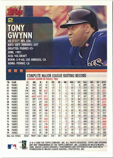
Card Number 876: Topps Opening Day, 2000; #2

I know I could have waited and put this in a 'Tuesday Twins' post, but hey, it's in this post instead. 


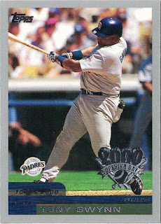
The Opening Day set had a silver border around it and the foil stamp saying opening day. I wish Topps would go back to foil stamps instead of photoshopping in Opening Day logos. 

This card has the same number as the regular flagship set, which doesn't always happen with Opening Day sets.


The back is uninspiring.

From a cheapie parallel set to something a bit odder.

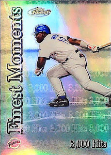
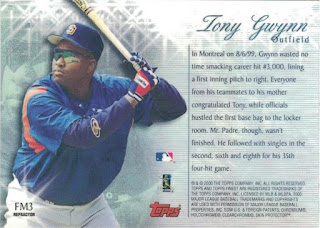
Card Number 877: Topps Finest Moments refractor, 2000; #FM3


There were only 4 "moments" commemorated in the Topps Finest set in 2000. Chipper Jones winning the 1999 National league MVP, Ivan Rodriguez winning the American League MVP, Wade Boggs recording his 3000th hit, and Tony recording his 3000th hit. In a freaky alignment of events, Tony hit his 3000th hit the day before Wade hit his. Two 3000th hits on consecutive days! 

The back talks about Tony's 3000th hit and notes that it was just one of four hits for him in that game. 


Also, a bonus point for Topps actually putting the word 'refractor' on the back under the set number. That's the handy information that often gets left off cards. 

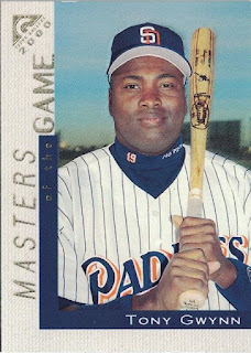
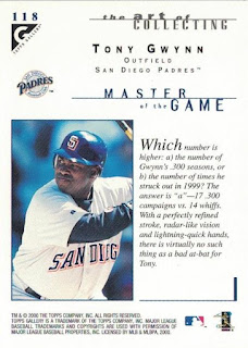
Card Number 878: Topps Gallery, 2000; #118

Tony had another card in the Gallery in 2000, as well as this card in the "Masters of the Game" subset. (The other card is blogged here.)


Topps used a similar photo on their Magic Moments cards in the flagship set from 2000.

The back has a confusing array of fonts and, frankly, looks a bit of a mess.

Reading the question on the back, it was kind of easy to guess the answer. Of course it would be A. Any kind of question where one of the options is a ridiculously low number of strike outs in a season, the number of strike outs is always lower than the other thing it's being compared with. Always.

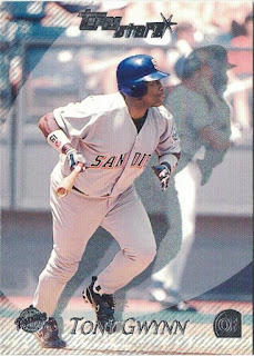
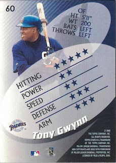
Card Number 879: Topps Stars, 2000; #60

I have worked with a number of graphic designers in my career and I feel I am able to interpret the intentions of designers fairly well, even when they don't work out. I think the idea here is that the player is illuminated by searchlights, like a film star would be, and that is casting the player's shadow. It doesn't quite work because Tony is running a base path and there is a person in the background in the photo, but Topps have never let the results interfere with their vision. If the card ends up looking like there is some kind of interdimensional rip in space-time going on, then, well, print it anyway.


Having said all that, I quite like Topps Stars. On the back we get a batting donut picture, again. That's been a recurring theme this week! Weirdly Fuji lists the other Tony Gwynn card from this set in his list of cards featuring batting donuts. So, again, that's two cards from the same set with a picture that includes a batting donut - as was the case a few days back!


I blogged the other card that Tony had in Topps Stars in 2000 back in September.

And that's it for Topps cards from 2000... for now!

Total: 879 cards


Saturday, December 4, 2021

Forgotten Topps Ranges

Back in the 90s Topps released a number of ranges to try and fend off the competition from every other card company who all seemed to be doing innovative things that collectors liked. Some of Topps's new ideas really worked. A lot did not. Here are some card ranges that disappeared without anyone really caring very much.

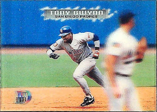
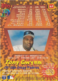
Card Number 858: Topps Dimension III, 1995; #42

Topps claimed these cards were "3-D so real, it's unreal". The cards were thick and plasticky and apparently afforded "infinite depth perception". They look OK.


Look! Tony is literally running behind that guy!

The back goes for a computery 3-D effect with the design. It looks very 90s. Very, very 90s.


Topps Dimension III was a one-shot attempt by Topps. It was obviously a commercial failure, because Topps rarely kill a range after just one year.

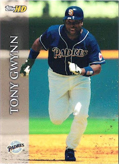
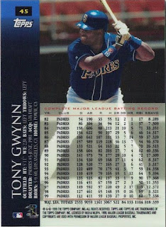
Card Number 859: Topps High Definition (aka HD), 2000; #45

The "HD" range got two years and this card is from the first year that Topps issued them. Like Dimension III, these cards are thick plastic 'cards'. They are seriously hefty. Baseballcardpedia notes the plastic stock is 50 point. It's slightly thicker than a credit card.


HD televisions were the cutting edge of television technology at the turn of the millennium. Topps were trying to get on the tech bandwagon for a change. Compared to the way other card companies embraced the emergence of the Internet and the growth in personal computing, Topps had been a bit slow.

The tagline on the card packets was "the game defined", as a riff on the idea of high definition. The cards had a high def pricetag too - 4 cards for $3.99.

Considering the concept of being at the cutting edge and the pricetag, the cards are a bit 'meh'. A grey stripe on the front and a boring stats box on the back. Was this card worth a whole dollar?


The range obviosuly sold well enough for Topps to try again the following year. But that was it and the range was quietly retired. 

Total: 859 cards