Showing posts with label gold. Show all posts

Friday, February 11, 2022

Friday Flair in Fleer Fortnight

Flair was Fleer's high brow range of cards for much of the 90s. I've accumulated a few in the collection and here are some that haven't appeared on the blog previously.

When I previously blogged about Flair cards, I posted the card from 1993 and the card from 1995, but didn't have the card from 1994. So, let's set that right.

Card Number 938: Fleer Flair, 1994; #436

This card is everything you might expect from a premium card in the mid-90s. Full bleed picture, gold foil tints, elaborate swirly fonts. It's also everything you would expect from a Fleer card in the mid-90s. Confusing juxtaposition of photos, cropped off feet...


There is a full photo background on the back, with a Topps-esque shot half showing Tony's face and with his butt pointing towards the camera! However, it is unusual to have an action shot with Tony wearing his trademark wraparound shades.

For the first few years that Fleer produced Flair, they were relatively uncomplicated sets. Then towards the end of the 90s they started getting more complex, with parallels, rebrands and strange numbering systems.

Card Number 939 Fleer Flair Gold version, 1996; #174

In 1996, every Flair base card came in either a silver version or a gold version. The silver versions had gold lettering, and the gold versions has silver lettering. The cards were all shiny, using the Fleer 'etched foil' approach that gave the cards a gritty sort of surface feel. 

As with other Flair sets, this card has a composited image of pictures of Tony on the front.


Despite the abundant use of photoshop on the card, the designers left the grass stain on Tony's knee. 

There are two photos on the back as well, and a huge stats box.


After 1996, Flair was rebranded as Flair Showcase. That was when things started to get weird with the brand. In 1998 Flair Showcase was released as a 'tiered product' with four different versions of each card released, numbered from Row 3 to Row 0, with 3 being the most common and 0 the most scarce. Furthermore, each row was divided into 30-card sections, which were also of unequal scarcity. It's all very complicated. Even Baseballcardpedia has difficulty explaining it.

Card Number 940: Fleer Flair Showcase (Flair), 1998; #Section 2 Row 3, Seat 19

I'm going to count this as a #19 card! Row 3 means it was the most common version of Tony's cards in the set.

This was a really difficult card to scan. This was captured using my overhead scanner and is slightly over-exposed.The line on it is in the etched foil coating.


At least when they made an unnecessarily complicated set, Fleer had the decency to add the word 'Flair' under the set name so collectors could instantly tell which bit of the set the card was from. Although, they could have been more original and used a different word than Flair, which was the brand!

The cardback looks a bit, well, creepy, to be honest. It's the combination of the colours and Tony's hyper-focussed facial expression.


The word 'showtime' on the back indicates which subsection this card is from. "Flair Showtime Flair Showtime" are the most commonly occuring cards in the set. You were more likely to get more than one of these cards in a packet than none at all (if I've worked out the ratios on Baseballcardpedia correctly).

Card Number 941: Fleer Flair Showcase (Style), 1998; #Section 2, Row 2, Seat 19

Another #19 card. Or the same one? These 'Row 2' cards were the second most common cards in the set.


This card looks better. There is a big 'e' on the red advertising hoarding behind Tony. It looks really familiar but I don't think it's the e in Budweiser. It might be the e from the word Coke. 

It's the same photo on the back. The entire background has been wiped but because the whole picture hasn't been tinted blue, it's less freaky looking. 


This card is in the Showstopper division of row 2 cards. Again, that makes it one of the most common of the Row 2 cards, with these cards appearing at a rate of 1 every 2 packs.

I don't have the rarer Flair Showcase cards from 1998. But Flair continued their weird numbering system the following year, although there were only 3 rows. (They dispensed with row 0.) They also dropped the number of subdivisions across each row down to 3. The reduction in complexity may be an indicator the range was having problems so it's no surprise that Flair went on hiatus after the 1999 set before being brought back in 2002 for a new run.

Card Number 942: Fleer Flair Showcase (Power), 1999; #Row 3, Seat 9

The 'power' cards are the most common version of the card - this is in the 'Showtime' subdivision, which was the most common subdivision, making it one of the most common cards in the set overall. 


Fleer seemed to like having a picture of Tony running towards the camera on the cardback as they used a picture of him like that for the second year running. 


The green bar for the factoid is very prominent. It's a good factoid too, retelling the story of Tony's draft day when he was also offered a place with the Clippers in the NBA.

That's all the flair I have available to blog at the moment. At some point I will have to go a-hunting for rare flair to share.

Total: 942 cards

Tuesday, February 8, 2022

Tuesday Twins - Familiar Fleer

For today's 'twins' post in Fabulous Fleer Fortnight, here are are some Fleer cards which may look familiar...

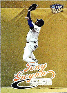
Card Number 930: Fleer Ultra Gold Medallion Edition, 1999; #596


The original version of this card (below) was very dark. This card is very shiny very gold!


On the back, Fleer have handily added a note that it's the gold medallion edition. There was one gold medallion parallel version in every pack.


Card Number 931: Fruit of the Loom / Fleer, 1993; #28

The only differences between this card and the normal base card was the small 'Fruit of the Loom' logo on the front, and a different number on the back.


These cards were available in packs of underwear produced by clothing company Fruit of the Loom. They were included in little packs of 6 cards in with briefs and boxer shorts. It's a quirky little parallel that is truly representative of the card collecting bubble in the late 80s and early 90s when just about any product imaginable could have baseball cards in it.


In the previous year, Fleer had produced cards for 7-Eleven (blogged with some heady nostalgia for my boyhood memories of 7-Eleven here) and in that promo set they changed the images on the front and back of the card. This time they didn't change the image on either side. Apart from the set number, this is exactly the same as the regular release. 

Card Number 932: Fleer Ultra Gold Medallion Edition checklist, 1996; #4

As I mentioned a couple of days ago, Junior Junkie has a good write up of Fleer's gold medallion parallels in 1996 and explains how Fleer did a gold medal version of everything. Including checklists.

The main difference is a teeny foil stamp on the front. It doesn't scan very well.


These cards were available at a rate of 1 per pack. There was also one insert per pack and every ten packs contained a gold medallion version of an insert. As per Junior Junkie's post, that means some rarer inserts have an exponentially higher scarcity value in the gold medallion version. However, this checklist would have been comparatively common.

Just in case a collector didn't see the large word 'CHECKLIST' on the front, Fleer wrote it repeatedly over the back as well.


Fleer often divided their sets up by numbering players from the same team consecutively. I've complained before that this was a missed opportunity not to align the player on the front with the team on the back. As ever with these checklists from the 90s, there are names that jump out as recognisable and a load of players who have disappeared into sporting obscurity now. (When I blogged the regular version of this checklist, I mentioned Wonderful Monds. I still wish he had made it in the bigs. What a name!)

Total: 932 cards


Thursday, February 3, 2022

Limited Leafs

A couple of mid-90s shiny cards to brighten up your Thursday!

Card Number 916: Leaf Limited, 1994; #152

You can tell this is a high end card because Tony's name is written in fancy cursive script!


This is so shiny is scans a different colour depending how much light is getting into the room. (I'm using the overhead scanner for this and, seriously, the cards change colour if the sun goes behind a cloud while I'm scanning!) So, sometimes the card looks like this. 


On the back we get a quote from Ozzie Smith, which is superb hyperbole. (Superbole?) 


"Tonys mechanicals are so good they enable him to get hits when he's not hitting. There's no stopping him, you just try to slow him down."

No, I don't know what 'getting hits when he's not hitting' means either. The cameo portrait has a classy surround with that feathered pattern. I'll award a bonus point for including the set name, although it is prominent on the front as well. The one year stats line includes the years he had been active up to this point. That feels like an unusual inclusion in a one-line stats box.

Card Number 917: Leaf Limited Gold, 1995; #20

There were 192 cards in this high end set, and 24 further cards in the 'Gold' insert series, which looked a lot like the regular cards (as can be seen here). They used different photos and the card had a gold back instead of the usual silver. The Gold cards were included at a rate of 1 per pack. 

This time it's the team name in the fancy cursive script.


For some reason they decided to crop off Tony's feet. The converging shiny lines combined with the Leaf Limited logo make it look like he is stading in front of a giant badminton shuttlecock. 

Here's the gold back - with the cursive script used for Tony's name. There's no quote this time, meaning there is space for a breakdown of Tony's monthly stats across his entire career. I was surprised to see July was the month Tony recorded his lowest batting averages. (At least, up to the end of the 1994 season!)


All the cards in Leaf Limited - base and inserts - were limited to a print run of 37,500 cards, apart from the 'Lumberjacks' insert series that were numbered in a print run of 5,000. Tony didn't have a Lumberjack card, but he did have a 'Bat Patrol' insert card (previously blogged here), giving him three cards in quite a small set.

Total: 917 cards 

Tuesday, February 1, 2022

Tuesday Twins - going gold with Score in 94

Card Number 912: Score, 1994; #12


Tony is swinging on this card. Even with a superspeedy camera shutter, the end of that bat is moving too fast to capture!

Tony is grinning on the back. I really like that photo.

This isn't a complicated cardback, but design-wise it is very well-balanced. Score always had a lot of text on their cardbacks. Here they squeeze in two paragraphs, a complete stats box, and that nice photo.

One thing this cardback chronicles is Tony's sticky patch in the early 90s, when his batting averages dipped to "just" .317. He had a couple of tough years with injuries and conflict in the team. Then, as the story goes, he had a chat with Ted Williams, started using a bigger bat, and went on to win 4 batting titles and post a higher batting average in the last 10 years of his career than in the first 10 years. 

Card Number 913: Score Gold Rush, 1994; #12

I think this is the first year that Score did shiny gold parallels. These cards were found at a rate of one per pack (or two in a "super-pack"). 


The entire front is foiled and the border is rendered in gold. It looks really impressive in real life.

On the back there is a 'Gold Rush' watermark.


The watermark earns the card a bonus point from me because it makes it easy to separate this from the regular version in my folder of scans! 

Total: 913 cards

Tuesday, December 7, 2021

Tuesday Twin - Parallel Paramount

I had an unexpected suprise in the post last week, a small box of cards from Gawain that had been in a job lot he bought, and that he sent on to me. While most of the cards were ones I had, there were some I didn't have, including one that I almost passed by as I looked through them. The moral is always keep one's eyes peeled for parallels!

Card Number 863: Pacific Paramount Gold, 1999; #203


The gold foil doesn't show up that well on the scan, but it looks great in my binder next to the regular version which has silver foil on (and that I blogged about over a year ago!)

I don't know what the frequency of gold parallels was, but I have discovered that Tony was on both the packets and the box the packets came in!


I like stats in columns instead of rows. I find them a lot easier to read, so this card gets a bonus point for that!

Total: 863 cards


Tuesday, October 19, 2021

Tuesday Twins - experiments in embossing

These 'twins' are from an experimental range created by Topps that has that rare distinction of being a 'one and done' set, as it only appeared for one year.

Card Number 788: Topps Embossed, 1995; #6


It's hard to tell from the scan, but Tony has a slight 3D effect because he has been pushed forward on the embossing machine. 

The cardback is also affected by the embossing, as the impression of Tony is reversed out.


The 'Did You Know' facts are about Tony still holding the record for assists in basketball in San Diego State University - which is still the case in 2021! - and being drafted by the Clippers as well. It also mentions that while Tony was a third round draftee, his brother Chris was drafted in the first round.

Then there is a comment about Tony having the smallest bat in baseball - which might not have been true any more in 1995 as he had switched up in size following a discussion with Ted Williams a few years previously. I suspect that once a 'fact' entered the big Topps reserve of factoids for cardbacks, it would never get updated. 

Gold parallels were a big thing for Topps in the 90s. Topps did it in this set too with one gold parallel card inserted into every pack.

Card Number 789: Topps Embossed Golden Idols. 1995; #6

This was basically the same card, just printed in gold. The flatbed scan actually shows up the embossing effect, if nothing else.


I had a go with the overhead scanner. This is probably the closest I could get to what this golden card looks like in real life.


By fiddling around with the exposure, I could get is a bit brighter 


I think the cardback is identical to the regular release. I scanned it because I'm thorough!


This unusual one and done style of set is a reminder of how innovations in the hobby didn't always pan out. Topps occasionally used embossing in their insert cards, and other companies sometimes gave it a go as well. But as a gimmick for an entire set it didn't really work.

Total:789 cards