
For today's 'twins' post in Fabulous Fleer Fortnight, here are are some Fleer cards which may look familiar...
Card Number 930: Fleer Ultra Gold Medallion Edition, 1999; #596
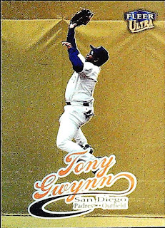
The original version of this card (below) was very dark. This card is very shiny very gold!

On the back, Fleer have handily added a note that it's the gold medallion edition. There was one gold medallion parallel version in every pack.

Card Number 931: Fruit of the Loom / Fleer, 1993; #28
The only differences between this card and the normal base card was the small 'Fruit of the Loom' logo on the front, and a different number on the back.

These cards were available in packs of underwear produced by clothing company Fruit of the Loom. They were included in little packs of 6 cards in with briefs and boxer shorts. It's a quirky little parallel that is truly representative of the card collecting bubble in the late 80s and early 90s when just about any product imaginable could have baseball cards in it.

Card Number 932: Fleer Ultra Gold Medallion Edition checklist, 1996; #4
As I mentioned a couple of days ago, Junior Junkie has a good write up of Fleer's gold medallion parallels in 1996 and explains how Fleer did a gold medal version of everything. Including checklists.
The main difference is a teeny foil stamp on the front. It doesn't scan very well.

These cards were available at a rate of 1 per pack. There was also one insert per pack and every ten packs contained a gold medallion version of an insert. As per Junior Junkie's post, that means some rarer inserts have an exponentially higher scarcity value in the gold medallion version. However, this checklist would have been comparatively common.
Just in case a collector didn't see the large word 'CHECKLIST' on the front, Fleer wrote it repeatedly over the back as well.

Total: 932 cards
I agree... it would have been nice to have the Padres checklist on the back of the Gwynn. That being said, I loved it when Fleer numbered their cards by teams. It made sorting so much easier.
ReplyDeleteP.S. That 1999 Ultra Gold Medallion is gorgeous!
I like the Ultra Gold Medallion too. Really, I like most Fleer Ultra cards from that time period.
ReplyDelete