Showing posts with label turquoise. Show all posts

Friday, January 28, 2022

Base Metals

Here's a 'back to base' post, as I have acquired a run of Tony's base cards from the Skybox range called 'Metal Universe'. These were once high end cards sold by the Fleer Skybox conglomerate. There are probably people who love these cards. I find Skybox cards are almost always off-kilter in some respect, usually odd word choices (like on this insert card!) and sometimes the overall concept is uncanny. 

Metal Universe cards are all super-shiny so I had to use my overhead scanner on them.

Card Number 903: Skybox Metal Universe, 1996; #235


How could you tell that this garish, shiny card with a weird image of Tony mashing milk out of a giant blue sponge ball was issued in the mid-90s? Apart from everything? This is compter-generated imagery from the 90s... on acid. 

The photo on the back is strangely old-fashioned. The unflattering comparison that came to my mind was Joey Tribbiani's explanation of "smell the fart acting". Tony looks mildly troubled by something. 


The interlocking gear teeth image at the bottom is part of the 'metal universe' theme. There are worse ways to waste space on the back of a baseball card. 

Card Number 904: Skybox Metal Universe, 1997; #219


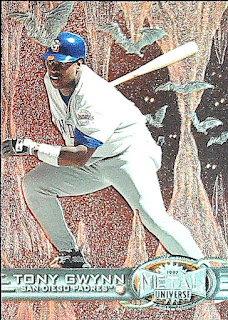
I've over-exposed this scan slightly. But otherwise it just scans incoherently. Instead of making a dash for first base, Tony is running though a fantasy cave complex pursued by bats. I'd like to think the bats are because Tony was an extraordinary wielder of the baseball bat. But there could be a more mundane reason, like using up leftover graphics from a computer game.

There's a more natural photo on the back. The cardback design has a steampunk look. Props to them for giving Tony a number containing the number 19. (No bonus points though!)


Card Number 905: Skybox Metal Universe, 1998; #178


This is probably the nicest of the cards I'm showing in this post. The shiny front has Tony batting... on a sand dune... with the ocean in the background... and it looks very nice. Completely bizarre, but I'm always up for something a bit different. And this is a happy trigger for a digression.

Back in 2004, when I went on a road trip around California with my wife Cathy, we drove down Highway 1 all the way from San Francisco to San Diego, so photos of that Pacific coast bring back good memories. We went to Cardiff-by-the-Sea and sent postcards back to all our friends living in Cardiff. Because we like irony. 

Anyway, back to the card, and the cardback. Ho, boy! This would have looked five or six years out of date in 1998. That kind of graded background was from the beginning of the decade! And turquoise! That was the colour of 1993!


The stats boxes designed to look like a scoring chart are nicely done though. 


Card Number 906: Skybox Metal Universe, 1999; #47

A bonus scan this time to explain the difference the overhead scanner makes. First, here is the flatbed scan.


And here is the overhead scan. 


The rivet marks make this card look like it should be embossed. It's not embossed. Given their usual commitment to gimmicky stuff, this feels like a real missed opportunity for Skybox.

The rivets continue on to the back. It's an odd photo, with Tony looking frustrated. He looks like he is walking back to the dug out after a flyball was caught. I'd also ding this card a point for having unreadable stats information perpendicular to the card. 


And that's it for the Metal Universe. The range only lasted 4 years. There were cards released in 2000 with the brand name 'Metal', and that was the last hurrah for these shiny cards. The Metal cards in 2000 were also the end of cards being sold under the Skybox brand.

Total: 906 cards


Saturday, February 6, 2021

Scraping the bottom of the box

This is the third card that was in the envelope from Jason. When I saw it in the photos of cards he sent me I knew I didn't have it, but I also had no idea how I hadn't seen it before. When it arrived it suddenly became clear!

Card Number 583: Topps Display Box Bottom, 1988; #F

(That's right, this card is number F!)

Just like I knew straightaway that the mini card I blogged about a couple of days ago was from 1989, I could tell this was a card from 1988 immediately. But I knew it was a different picture and the turquoise border threw me slightly. 

When it arrived and I saw the back, and the slightly squiffy edge, I realised what it was.


Topps, and other companies, used to print additional cards on the display boxes. It's actually something Topps revived a couple of years ago with their Big League range which had an extra card printed on the side of blaster boxes that could be cut out. In 1988 these 'box bottom' cards were printed in panels of 4, and there were 4 different panels to collect, with the cards 'numbered' A-P.

Tony was one of three Padres featured on the box bottoms, the other two being Marvell Wynne and John Kruk. The write up on the cardback explains why those three players featured. In a game against the San Francisco Giants on 13 April 1987, Marvell, Tony and John all hit a home run in consecutive at bats off pitcher Roger Mason - they were the first three at bats in the Padres first inning.

And you thought Slam Diego was a new thing for 2020!

Sadly, despite this feat, the Padres lost the game 13-6. Tony had 3 hits, picking up a couple more singles, and had a walk as well. It was one of the first of many defeats in a losing season for the Padres. They finished with 65 wins and 97 defeats, and in sixth place in the division. Tony's batting title was one of the few bright spots of the year.

Although this card is a little bit damaged, with a slight crease on the front and a mark on the back, I really like it. Of course it won't be pristine. It was cut from a counter-top display box after all the packs had been sold. But that makes it authentic, a genuine artifact from the 1980s baseball card hobby explosion.

Plus, there's a batting doughnut in the photo, so I know Fuji will appreciate this. In fact, if you look at his blogpost with a "dozen doughnuts", you'll see this card is the very first one. (And his card has an even more visible crease on it!)

I'd like to finish with a big thank you to Jason for sending me the cards I've blogged over the last couple of days. 

Total: 583 cards

Monday, November 2, 2020

Modern Monday: Topps Fire

My main supplier of modern Tony Gwynn cards, Gawain, busts a lot of product, which is one reason why he's my main supplier of modern Tony Gwynn cards. Recently he took delivery of a new release - Topps Fire!

Topps have released so many products this year, people might have missed this one. But if so, that's a shame because they are nice-looking cards and different to Topps's other, samey ranges.

Card Number 452: Topps Fire, 2020; #181


As "retro" cards go, this is a very 80s looking design. Although, I can't recall any 80s cards that actually looked like this. It's an 80s design aesthetic from 2020 rather than based off anything original. Even the set logo screams "80s metal band".

I feel conflicted by this. I feel like I should hate it because it's so jarring, but actually I really like it. It's so nice to see a card that doesn't look like every other attempt by Topps to do retro. And the colours work for me. Turquoise and pink, what's not to love? (Also, it's not a cigarette card!)

There's turquoise and pink on the back too. 


I looked up those dates mentioned on the back because it seemed like a long stretch of time to only make 16 starts. There were 51 regular season games in 1984 from August 5, and 5 May was the 23rd game in the 1985 season. He had five plate appearances in the game on 6 May but didn't record a hit (and also didn't strike out.) 

The dates seem somewhat arbitrary. Baseball Reference has the box score for 4 May 1985, and there's a strike out recorded against Tony. He also struck out on the 28 April 1985.

I went back and looked at the box scores from 1984. He struck out on 5 August against the Astros. Then he had a run of games where he hit safely and didn't strike out. However, on 10 August in the second match of a double-header in Atlanta, Tony got on base twice via walks but didn't actually get a hit. He was also hitless in 4 plate appearances on 12 August as well (also in Atlanta).

There might be a 16 game streak between those two dates, but I decided not to trawl through all the box scores for 74 games. He was obviously hitting well and rarely striking out between those dates, but I can't discern why Topps have picked them.

I mentioned this card came from Gawain, and because he was opening a lot of Topps Fire he also came across some parallels.

Card Number 453: Topps Fire Gold Parallel, 2020; #181

There are four of these parallels per blaster box. They are very shiny gold, which scans very green. This cards looks a lot nicer in real life.

The cardback is exactly the same. In fact, the cardback I showed you earlier may well have been the one off the parallel rather than the base card. There's no way to tell, as you can see from this side-by-side scan.


I need to get smarter about scanning and somehow indicate which one is the parallel. That's a new learning point for me!

Thank you Gawain for these cards!

Total: 453 cards

Friday, August 28, 2020

Back to Base - Fleer Ultra 91-94

Fleer Ultra was Fleer's other big card range for just over a decade, surviving the transition of ownership to Marvel, the merger with Skybox, Marvel's bankruptcy fire sale, and the restoration of the company in the late 90s. It was a range that competed in the Upper Deck / Stadium Club market, although all flagship products were soon featuring the fancy elements that set those ranges apart, like photos on the back and foil embellishments. 

Card Number 302: Fleer Ultra, 1991; #303

I was tempted to put this selection out of chronological order so that this card number matched up to my numbering system.


Fleer had quite a thing for grey at one time, and considering this was their exciting "Ultra" range, it's a dull framing colour.

The back makes up for it.

That colour scheme right there? That is 1991! I am getting flashbacks to Global Hypercolor t-shirts, alcopops and cassette singles just looking at it. 

I've mentioned awarding points to cards. This would get a bonus point for having the year in the set name on the front. I'd also give it four bonus points for having four photos, and for them all showing a different action - batting, base-running, throwing from the outfield, and posing all cool like. 

Card Number 303: Fleer Ultra, 1992; #277

Fleer upped their game in 1992 and Ultra aped Stadium Club's borderless look.


I often wonder about the crowd in the background in early 90s baseball cards - there must be someone somewhere who gets this card out to show people how they were on a baseball card once. That guy in the red hat really stands out. 

I'm not sure what's going on with the graph paper background on the cardback. Although it is a card from 1992 and that does look like turquoise, the trend colour from 1992!

I'd also award points, if I awarded points, for sensible statting. This is a slimmed down stats box, which is OK by me. I have an all-or-just-last-season attitude to stats boxes. The bio data text is printed way too small though. That's the size font that should only be used for boilerplate text. about copyright. 

Card Number 304: Fleer Ultra, 1993; #472

Another Stadium Club-esque card. The baseball in the logo is on fire!


This looks like Tony is jogging either to or from the outfield at the end of an innings. 

They ditched the graph paper on the back and there is a drawing of a baseball diamond instead. It's less futuristic and that makes it look less dated 27 years on.

Card Number 305: Fleer Ultra, 1994; #280

There's a bit of foil on this card to make it a bit more flashy.


The fronts of Fleer Ultra cards are a bit samey between 1992 and 1994. Thankfully the backs are all really different. This year they went back to bright orange!

The smaller cut out photo is a bit unusal, showing Tony poised and alert on fielding duty.

If you want to see another Fleer Ultra card, you can see one in last Friday's post. Otherwise, you're going to have to wait until tomorrow!

Total: 305/394

Thursday, July 9, 2020

More Turquoise Tints

I've noted before how turquoise was an on trend colour back in 1992 and 1993. (Of course back then it would have been trendy rather than 'on trend', but anyway...) Both Fleer and DonRuss used turquoise as a colour theme in their 1992 sets, while Topps, ever the trend-follower, daubed it onto their Black Gold card in 1993.

I have been working my way through a large selection of cards from Gawain, and as I went through them I found two more cards from the turquoise era. The first was a Fleer card from a promo set. It was probably produced, and given away, in the thousands, but there's always a slight thrill when a card you haven't seen before pops up in a lot.

Card Number 166: Fleer Performer Collection, 1992; #10


This card was given away at 7-Elevens and Citgo petrol stations. According to Beckett, if you bought 8 gallons of petrol, you got given a pack of 5 cards.

Although Beckett reckons the normal Fleer cards that year were green, not turquoise, both of them look turquoise to me, albeit the Performer cards are a slightly different shade. (Now it is possible that my Fleer base card has faded from green to turquoise, but if that is what's happened, so have all the other Fleer 1992 base cards I've got for other players.)

Because it's a promotional card there are a couple of extra logos on the back alongside MLB and the MLBPA. I'm going to stick my neck out and say that's a turquoise band across the middle as well.


When I was a kid, we had a family holiday in America. Along with that being the first time I bought baseball cards, there are a few other things that really stuck in my memory. The fluffiness of American doughnuts. Breakfast in the hotel when people had bacon and sausage patties and scrambled eggs with pancakes and syrup all on the same plate! I remember going in a 7-Eleven as a petrol station. It was easily the size of a small supermarket back home. I was simply amazed that they would sell coffee by the litre. From a machine. In a petrol station. 24 hours a day.

To be honest, I was less fussed with Walt Disney World than I was with the hotel buffet breakfasts and shops like 7-Eleven. The Magic Kingdom had a castle, big whoop. The town I grew up in had a castle, and ours was 900 years old.

I know this makes me sound like a total rube, but America was this oddly familiar, yet utterly alien place. Nothing seemed to make sense. I loved it, of course, the way an eleven year-old would love a place where all the rules got ripped up. (Doughnuts for breakfast, what paradise was this? Gum in with your trading cards? What?)

Card Number 167: DonRuss, 1992; #425


The second Tony Gwynn card from the DonRuss 1992 set is another card I hadn't encountered before. I love the look on his face here. It's unconscious concentration on throwing that ball as hard and accurately as he can. It's an All Star Card, and they decided to place the National League logo just where it will get in the way of the photo, instead of in the big gap on the other side of the card.

The regular DonRuss cards had turquoise tints on the back too. There's none to be seen here. Orange was also an in colour around about then.


The first few card factoids are all related to Tony's All Star performances, including in the 1991 All Star Game in Toronto. So far on this blog I have shown three other cards that reference that particular All-Star game - from Upper Deck, Score and Topps Stadium Club. This is a more generic 'All Star' card, but still, I think the 1991 All Star Game might have been the All Star Game that Tony had the most cards released about. That's probably fitting because he got 2 hits for a .500 batting average.

If some more turquoise tints tip up, I will let you know.

Total: 167/394

Thursday, June 18, 2020

Back to Base - DonRuss 1987-1993

I did a Back to Base post about Tony's Topps base cards recently, and thought it would be time to showcase his DonRuss base cards from the late 80s through to the early 90s, traversing the UD boundary when the card world was rocked by the Upper Deck meteorite. (It's all explained in the previous Back to Base post.)

Card Number 111: DonRuss, 1987; #64
DonRuss cards are really helpful because they almost always have the year on the front of the card rather than tucked away in microscopic fine print on the back.


If I was going to give this card border design a nickname, I'd call it the "tyre track" card. It's a decent photo of Tony, helmet on, ready to go and bat.

The back had his full name on. DonRuss went in for that on their cardbacks.


I love that career highlight of Tony stealing five bases in one game. You'd think by the fourth attempt the Astros fielders would be watching him like hawks. "Bothered by a wrist injury" is the kind of description you don't see on cards these days.

Card Number 112: DonRuss, 1988; #164
Not my favourite DonRuss card design and not a very exciting photo. That guy leaning in the dug-out behind him looks a bit portly.


The back is very similar to the previous year.


That five stolen bases in a single game against the Astros factoid is included again. The cardback also highlights Tony's .370 batting average, which was the highest in the National League since 1948, and that he was the first National Leagues player ever to steal 50 bases and bat .370. He was a hitter and a runner in the early part of his career.

1987 was a stellar season for Tony. He set four Padres season records, and his 1987 record for triples is still the Padres season record. He surpassed the Padres season records for hits in 1997, and, of course, batting average in 1994, and those records still stand. He doesn't hold the season record for runs any more though. Steve Finley clocked 7 more than Tony's 1987 total of 119 runs in 1996. Tony is second (and also seventh) in the list of top run-scorers in a season.

Card Number 113: DonRuss, 1989; #128
In 1989 DonRuss went green for the card front. This is less busy than the 1988 borders, but does make it look a bit like a Score design. Tony is poised to strike in the photo.


DonRuss decided to make Tony's name on the cardback even longer by putting Tony in brackets. In case you thought it was a shortened version of Keith instead of Anthony.


Another year, another injury. Tony didn't have a particularly good 1988 season, so the cardback recounts all his records of the 87 season and tells us again about those 5 stolen bases in one game and how he had two five hit games in the 1987 season.

I put Tony's 1990 DonRuss base card in a previous post. But for the sake of completeness, here it is again. It's bright red!


Careful readers will see that his contract had been extended by one year with an option for an extra year, to take him through to 1992. Tony was having a tough time at the Padres at this point in his career. He'd fallen out with some team-mates, to the point where someone hung an effigy of him in the home dug-out in September 1990. He also missed the final 19 game of the seasons with an injury.

Card Number 114: DonRuss, 1991; #243
This is the last card in this DonRuss template. The asteroid was on its way!

Although the colours are much more "90s", I always find the 1991 and the 1988 cards look very samey.


The back still has Tony in brackets.


A few new stats amid the recycled ones that we are oh-so-familiar with by now. There's also a mention of his brother Chris, who was playing for the Dodgers.

[Wait, what's that in the sky? Is that asteroid heading for baseball card world? Why does it have UD written on the front?]

Card Number 115: DonRuss, 1992; #441
And boom!


The is the post-Upper Deck look for cards - white border, good photo that wasn't taken with a telephoto lens from the other side of the ballpark. And because it's 1992, a turquoise tint at the top and bottom. Honestly, I think you can date cards to 1992 and 1993 just by the appearance of turquoise.

Photo on the back. Full name, but no bracketed 'Tony'. His contract has been extended until 1996. The career highlights rehash a lot of what we already know. The DonRuss blurb writers weren't giving up on that stat about 5 stolen bases in one game!

Card Number 116: DonRuss, 1993; #126
This is a very dark card because of the background. Tony's shades are cool and you can get a good look at his bat.

The back has a bigger photo than in 1992, and includes some of the catcher and an umpire's arm (with very prominent vein). The catcher is Carlos Hernandez who played for the Dodgers in 1992 and wore the number 41 (conveniently on display on his helmet in this picture.) A few years later (97 and 98) he played alongside Tony for the Padres.


The 'career highlights' blurb has finally bitten the dust, replaced by the photo. The contract status is still extant though and his draft details. I've also noticed how the card number is now in a little home plate icon, similar to the hologram shape Upper Deck used on their cards.

I hope you enjoyed seeing Tony's DonRuss base cards during the peak junk wax era and over the UD boundary.

Total: 116/394

Wednesday, June 17, 2020

Diamonds and Gold

A sort of theme today along the lines of 'treasure'.

Card Number 109: Upper Deck Black Diamond Rookie Edition, 2000; #76
Metallic red card front with a picture of Tony jogging. To be fair, with the knee injury he carried throughout that season it's pretty impressive he could get to even this level of speed. The card background is  turn-of-the-millennium cyber-noir glitchiness.


Although this is a set recorded on TCDb  as released in 2000, it includes Tony's stats for the 2000 season. It also notes that in 2000, Tony was the leading active player in hits, with over 3,100 hits by that point.


From Black Diamonds to Black Gold...

Card Number 110: Topps Black Gold, 1993; #8
Yes, that is shiny gold foil on the front and a very nineties card set logo!


He seems to be straddling the bar with his name on.

This is the card back.


It looks to me like some kind of 3D sword motif. Really odd. But I do like the photo of Tony on one knee leaning on his bat. Combined with the weird sword it looks like he's being knighted. Also that is a stunning shade of turquoise on the back there (much bolder than the shade Fleer used in 1992). I hope I'm not alone in saying the card hobby needs more turquoise!

It's interesting reading these snapshots of Tony's career "halfway through". He actually improved his career batting average in the second half of his career to finish with .338. At the start of the 1993 season he only had 4 batting titles and hadn't won one since 1989. It's doubtful anyone realised how much he would dominate the batting charts for the rest of the nineties.

Total: 110/394

Monday, May 18, 2020

Sheer Fleer

Hey, it's Monday. After a short blog post yesterday (because who spend weekends reading blogs?) here's a longer post to enjoy during a worktime coffee-break. I'm posting a load of Fleer base cards of Tony Gwynn. Some of these card designs may look very familiar.

Card Number 26: Fleer 1986, #323
(This card was sent to me recently by Jacob from one of the UK baseball card collecting groups on Facebook - Thanks Jacob!)


"Swing the bat for the photographer, Tony!"


Hey, that's a new (to me) factoid on the back - he was the first Padres player to get 200 hits in a season in 1984. I wonder if he would go on to set any more records...

Card Number 27: Fleer 1988, #585
(Yes, I'm missing his 1987 card)


You don't get many profile photos on cards. The red and blue lines scream 1980s to me for some reason.


Fleer are mixing it up on the back with the stats. According to this, Tony excelled at night games at home in San Diego. There's some wasted space on this card, though.

Card Number 28, Fleer 1989, #305
Some people really like Fleer 1989. Mainly because it has some very quirky cards in, including the famous Bill Ripken "F*ck Face" card (an hilarious proofing mistake that even has its own dedicated website 31 years later!)

But away from unexpected swears, this card design is mainly... grey. I find it really dull.


If this is Tony mid-run, the photographer has managed to make it look like he is holding his pose as if the music has stopped in a game of Musical Statues.


This card's saving grace is the dude napping in the hammock on the back. He's having a break like the All Stars do, you see! The stats reveal that Tony had a poor start to the previous season, but finished strongly. He had an injury that ruled him out of the first part of 1988.

Card Number 29: Fleer 1990, #157


It's not grey, is all I'll say about this uninspiring design. And Tony is actually at the bat. In an actual game.


Fleer loved their little stats exercises on the back. I think we would all agree the hammock guy was better.

Card Number 30: Fleer 1991, #529


The early 90s was a colourful time. I actually really like the bright yellow on this card, although it always prompts a random memory.

In 2004 we went on a road trip in California and we were driving from San Diego to Death Valley. We stopped in a tiny town that had a tiny strip mall that included a Dollar Tree store. We went into the Dollar Tree for refreshments and that was the first time I saw, and bought, baseball cards in 'repacks'. There were about 30 cards for a buck in these little blister packs. I bought 3 packs. Only the top card was visible on each pack and one of them was a Fleer '91 card of Robin Yount. So this card design always makes me think of Robin Yount.


Times they were a'changing in the baseball card world in 1991. Look, a full colour photo on the back!

Card Number 31: Fleer 1992, #605


By 1992 Upper Deck was kicking the other card companies' collective butts and everyone had to up their game. Fleer went from cheapie cardboard to gloss. This is a really nice base card. Turquoise was big in the early 90s. In 1992 I had one of those Hypercolor t-shirts that changed colour in the heat (including when the wearer got hot!). It was turquoise.


Bit of an odd shot on the back. Caption this, please.

Card Number 32: Fleer 1993, #138


Another hit and Tony is off!


And you thought Tony's surname was big on his 1992 card. I'm not complaining though. It makes up for Fleer's return to grey.

I hope you enjoyed this sheer amount of Fleer.

Total: 32/394